Most importantly this version introduces “Valo” - a light-weight SCSS based theme for Vaadin applications. Take a look at the demo at:
demo.vaadin.com/valo-theme
To try out Vaadin 7.3.0 beta change the version on you Maven pom.xml:
To test the Valo theme in your application add the following annotation to your UI class:
@Theme("valo")
Remember that this is still a beta version. For example the dynamic on-the-fly theme changing is still not working but we’ll add it before the final release. You can find more details in
the release notes .
Yes, this is a standard and supported Vaadin theme. Valo is designed to be easily modified and extended and would be good basis for you your own SASS theme. With few (still mostly undocumented ) lines of SCSS you can change how your app looks like. Take a look at:
https://github.com/vaadin/vaadin/tree/master/WebContent/VAADIN/themes/tests-valo
Not sure if this has been officially decided, but in my opinion Valo soon makes also the
Chameleon theme obsolete.
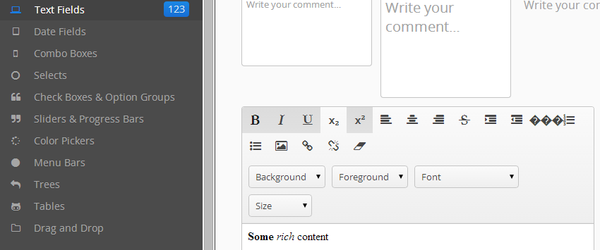
There seems to be something odd with the rich text editor (see attached image “valo.png”)
The font-icon for “insert horizontal rule” seems to be missong (see the three <?><?><?> at the top right of the rich text editor)
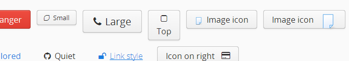
Also, the vertical alignment issues for icons inside buttons that I noticed on the alpha, seem to persist:
The demo’s first “image icon” button has a 16px image that is not really vertically centered, the second “image icon” button has a larger (32px) image that could fit in the button but is clearly not properly aligned.
Both screenshots were taken from valo’s demo app today 11/07/2014, on Chrome version 35.0.1916.153 m, on windows 7 Pro SP1
There is chapter in the updated Book of Vaadin about Valo. You can customize various parameter for animations, fonts, opacity, borders, etc, etc. This should help to build your own theme on top of Valo:
vaadin.com/book/vaadin7/-/page/themes.valo.html
Part of those variables in the Book’s documentation are no longer there (changes from alpha to beta).
Read the rudimentary Valo wiki tutorial for an updated list and descriptions of the variables.
The only detail that bothers me is that the read only aspect of the fields is not as obvious as with the other themes. Background transparency may be too subtle, especially when the fields are used in tabs which have white backgrounds by default.
I believe it would be more obvious that a field is read only if it looked like a label in that mode. A little bit like how it looks in a FormLayout with the “light” style.
The new theme is really nice, and reasonably stable for being a beta.
There seems to be a problem with the Open Sans font, though. While _open-sans.scss apparently supports all five weights of the fonts (light to bolder), you can only see about 3 of them. One can easily verify that in the demo linked above, by taking any caption and playing with the font weight: it seems you can only get light, normal and semibold, even at weight 900.
Also, the Open Sans font included in Valo looks
different at some sizes then the reference rendering at google.com/fonts - we can confirm that because we use Open Sans as main font even with Reindeer, and when we switched to the embedded font in Valo we ended up with a much “higher” 12px font, while our previous result with @font-face was identical to the reference rendering. It should be noted that we use a cached .woff while Valo’s @font-face has multiple options… still, shouldn’t they all look the same?
Buttons that are “borderless” still draw a border when focused. Is this intended or a bug? If intended, what is the best way of preventing that border from drawing?
 ) lines of SCSS you can change how your app looks like. Take a look at: