Did you try setting these variables:
$v-focus-color
and
$v-focus-style
Didn’t try, but they should control the border when focused. Better described here:
https://vaadin.com/wiki/-/wiki/Main/Valo+theme±+Getting+started
Did you try setting these variables:
$v-focus-color
and
$v-focus-style
Didn’t try, but they should control the border when focused. Better described here:
https://vaadin.com/wiki/-/wiki/Main/Valo+theme±+Getting+started
Well I don’t want to disable focus borders for ALL buttons, just the “borderless” ones.
I will add a CSS rule of my own if the current behavior is intentional, otherwise I can wait for a bug fix (we try to keep the CSS customization to a minimum - which was the whole point of moving our application to use Valo, which is a great addition to Vaadin btw.)
Thanks.
BTW- your link goes to the wrong page.
The behavior is intentional. There needs to be some indication of focus for accessibility.
The easiest way to disable it for the borderless button would be:
.v-button-borderless:after {
  display: none;
}
I’ll try to think of a more future-proof way of disabling it, so it won’t break in future releases.
Fixed the link.
Thanks for the feedback!
Valo has all Open Sans weights bundled (including italics), but only those three (light, normal and semibold) are loaded by default. I suppose all of them could be included, since browsers should be smart enough not to download the files if they are not used.
To load all the weights, add the following to your main stylesheet:
@include font-open-sans ($italic: true, $light: true, $regular: true, $medium: true, $bold: true, $black: true);I think the version we have might a bit older, so it might be a good idea for me to update the font files just to be sure. And I also think I’ve put the fonts throught the Font Squirrel @font-face converter, which might’ve altered some font metrics at the same time. I’ll see if I can get a ready made web font bundle from a reliable source (I think Google Fonts only allows you to download the OpenType or TrueType formats).
Not sure about if woff/ttf should look identical, but my relatively noobie guess would be yes.
Edit: so it seems. From Wikipedia: “WOFF is essentially OpenType or TrueType with compression and additional metadata.”
@Jouni: oh, if you really ship an older/modified version that may explain the difference. Sound strange that Google would alter so drastically the design of a well-established font, though. Valo’s Open Sans really looked more like Roboto, not sure why.
Right now we have simply set
$v-font-family: sans-serif;
so that Valo doesn’t register any font (except FontAwesome of course), and then overridden the default font definition for .v-app coming from valo-app-style; that’s because we found that Valo’s @font-face was “interfering” with our own @font-face declared in a normal CSS added via @StyleSheet in the UI (we need the font for our login page, so it has to be included this way). The “interference” even changed between the same browser in Windows and Linux… so, since we don’t need to support old browsers we ended up dumping Valo’s OpenSans altogether 
(maybe a simpler mechanism to turn-off Valo’s automatic @font-face so that it doesn’t try to analyze $font-family could be useful? Then we would not need to override anything, just to supply our own custom @font-faces)
Not 100% sure why it would look different, but I’ll try with freshly downloaded version and see if I can spot any differences. I was just wondering if Font Squirrel had adjusted the font metrics somehow during the conversion.
Sure, that would make sense. The first idea that I got is to add a global variable as a flag whether to use the automatic font loading, like this:
$v-include-custom-fonts: false;Or perhaps a variables per each font family, listing the weights which should be included (or just true to include all):
$v-include-font-open-sans: true;
$v-include-font-roboto: 300, 300 italic, 400, 500;
$v-include-font-lato: false;
// etc.I compared screenshots for the beta1, freshly downloaded Open Sans version and Google Fonts version, and I could only spot very minor differences (Google Fonts version seems to not include the kerning table for the font, possibly for quicker download), but otherwise they looked nigh identical on OS X Safari 7 and Firefox Beta (31).
Can you provide some screenshots and more details about the browsers you saw the difference in Open Sans rendering? Thanks!
You’re absolute correct about the white backgound. Even though the box-shadow is also removed, it’s probably too subtle to not confuse some people.
As for making it look like a label, it’s a bit tricky, since the field’s width won’t grow to accommodate the whole text, so it might get cut off. That’s why there needs to be some sort of indication about the boundaries of the field.
I’ll probably try changing the background or the field and removing the border, and also changing the cursor to the default arrow. The focus outline is also probably redundant.
This is quite tricky to solve properly for all icon sizes in all browsers, but I’ll see if there’s something that can be done.
Sure. You can easily see the problem on the demo, too.
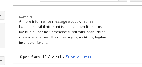
I’m attaching 2 screenshots made with Chrome 36 / Windows, a paragraph from the demo’s first page (“Common UI elements”) where I forced 12px OpenSans from the DevTools, and the very same paragraph rendered at Google Fonts. Minor differences are normal, but those look
very
different to me.
We see the same problem on Firefox and under Linux, too; and in our own application of course, until we moved to custom @font-faces only, which gives us consistent rendering exactly like the one at GFonts.
Yeah, those look different. I did a similar kind of test, and to my eyes it looks like in your “valo_demo_chrome…” screenshot the font size is 13px instead of 12px. See my attachments for reference.
Edit
. Oh, sorry, my mistake. I was still testing with the modified version which used the same font from Google Fonts. Be back shortly for another update.
So it seems that the default option in the Font Squirrel Webfont Generator does some additional “optimizations” that affect the rendering on Windows. The “Fix GASP Table - Better DirectWrite Rendering” options is most likely to blame for the inconsistencies between the rendering.
I did a new conversion with different options (unchecking the GASP table fix), and now the renderings look similar to Google Fonts.
I’ll update the font files for the next beta release. Thanks for the feedback again.
Edit. Here’s the ticket for the Open Sans font issue:
http://dev.vaadin.com/ticket/14336
How do you get a single click upload button in Valo? I.e, without the ‘browse…’ and file name fields?
In the old theme, calling uploadBtn.setImmediate(true) took care of ‘hiding’ the extra components. In Valo, the browse button and file name field reappear ;(
Namely, I am seeking to reproduce this with Vaadin7+Valo:
http://demo.vaadin.com/sampler-for-vaadin6#ImmediateUpload
Hi Iyad,
This is a bug in 7.3.0.beta1. It was recently fixed, and immediate style upload will work like it should in beta2.
Awesome. Thank you very much.
Brilliant! Great work Vaadin. The new Valo rocks!
I noticed that the nicely colored buttons/panels/stuff in the Valo demo source, are implemented via lots of mixins/includes in the mytheme.scss file, whih looks like:
  $color1: hsl(220, 5%, 38%);
  $color2: #5d73c0;
  $color3: #3dbc1a;
  $color4: #d2f4f3;
  $color5: #fe902a;
  $colors: $color1, $color2, $color3, $color4, $color5;

.v-textfield-color1 {
    @include valo-textfield-style($background-color: $color1);
  }

  .v-textfield-color2 {
    @include valo-textfield-style($background-color: $color3);
  }
.
.
.
.v-textarea-color3 {
    @include valo-textarea-style($background-color: $color4);
  }
.
.
.
 .v-filterselect-color1 {
    @include valo-combobox-style($background-color: $color1);
  }
.
.
.
.v-panel-caption-color1 {
    @include valo-panel-caption-style($background-color: $color1);
  }
The end result can be really pretty, as evidenced by the demo, with intense orange, green, yellow, red, blue, etc… on panels, buttons, fields, etc.
However, it seems to me to take a lot of work to create this “color2” that I can then use with xxxx.addStyleName(“color2”).
Perhaps the final valo should come with built-in color styles for all components (panels, buttons, fields, etc) so that one can use them with the ease and convenience of xxxx.addStyleName(Reindeer.LAYOUT_BLUE) and get a beautiful result like the orange panels and blue buttons of the demo.
¿is this possible? are you planning to include this on Valo for 7.3?
I had application with Reindeer theme, now I switched to new version of vaadin 7.3.0.rc1 and valo theme and everything goes scaled and overrides each other 
With Valo:

With Reindeer:

How can I fix this ?
$v-unit-size: 20px; does not affect anything
Having all components with different color variations would bloat the theme quite a bit. And custom colors will most likely differ from user to user anyway, making it difficult to pick suitable colors. But the blue button for instance is included, use the ValoTheme.BUTTON_PRIMARY style for that. The ValoTheme.java class contains all the additional built-in styles available per component.
To get a new color variation for each component quickly, you can try this:
[code]
.my-theme {
@include valo;
.dark {
$v-background-color: #696969;
@include valo-components;
}
}
[/code]Now all components inside a layout with the “dark” style name will look different from the default. Instead of including all components, you can choose to include just a few, either by modifying the $v-included-components list or by including only those component mixins that you need.
[code]
.my-theme {
@include valo;
.dark {
$v-background-color: #696969;
 // Either this...
 $v-included-components: button, combobox;
 @include valo-components;

 // ...or this
 @include valo-button;
 @include valo-combobox;
}
}
[/code]At this point we’re not planning on including these for the built in theme, but I’m not saying never
The unit size setting should be before importing Valo, as it is used to calculate other size values.
Other than that, it looks like your layouts are based on absolute sizes/positions so any change in text/element sizes will have an impact, but it could be close enough to correct with the correct unit size.