We definitely need both. There have been discussions, but have not done anything yet.
BUT, did you notice that you can tune some Valo params in Sampler for individual components?
- joonas
We definitely need both. There have been discussions, but have not done anything yet.
BUT, did you notice that you can tune some Valo params in Sampler for individual components?
Ah, thank you, did not notice that this was possible!
Hi Gregoire
I found a solution for the issue with the immediate upload component.
In your styles.scss, put
.v-upload-immediate input[type="file"]
{
z-index: -99;
width: 0px;
height: 0px;
position: absolute;
left: -100px;
}
The position/size attributes are neccessary to make it work in IE and Chrome, FF is happy without them.
Cheers, Sascha
Hi all,
i have a minor question regarding the included valo-menu I don’t get working:
Basically I want to have the user part of the menu always in the style of the max 800px width-range, independent of the size of the browser window. But the other menu part should stay responsive. Is this somehow possible?
Edit:
maybe I rephrase what I mean: is it possible have a menubar on the top using this valo menu, that only contains the user menu part and the title, nothing else, in the style of the 500-800px range menu (but independent of the resolution of the browser)?
And furthermore a second, separate menu bar that has the default behaviour?
Thank you!
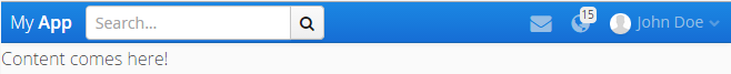
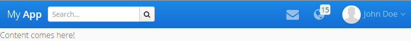
So I was able to answer my question partly myself.
I overrid some of the css of the valo-menu. The result looks like in the attached images (see attachments in next post, attach did not work in the first run).
I am sure that the scss is not perfect (I am no CSS-guru) and that there is a lot of optimization potential, but its just to try it out and to give others a starting point if they need something similar. I even do not know if this is a good solution, but its working at least  mazbe someone has a better solution?
The drawback here is that I still have not looked into a solution on how to additionally have a side-menu. And I am still working on somehow getting the components (like the search bar in the image) to wrap on the smallest screen size and take the full width.
The following source code shows how to use it (basically nearly the same as for the original menu, you just have to assign a style called “top-menu”):
public class CoreView extends VerticalLayout implements View {

    public static final String NAME = "";

    private ComponentContainer topMenuArea;
    private SingleComponentContainer contentArea;

    @PostConstruct
    public void init() {
        setSizeFull();

        initMenuArea();
        initContentArea();

        addMenu(buildMenu());
    }

    private void initMenuArea() {
        topMenuArea = new CssLayout();
        topMenuArea.setPrimaryStyleName(ValoTheme.MENU_ROOT);
        topMenuArea.addStyleName("valo-menu-visible");
        topMenuArea.addStyleName("top-menu");
        addComponent(topMenuArea);
    }

    private void initContentArea() {
        contentArea = new Panel();
        contentArea.addStyleName(ValoTheme.PANEL_BORDERLESS);
        contentArea.addStyleName(ValoTheme.PANEL_SCROLL_INDICATOR);
        contentArea.setSizeFull();
        contentArea.setContent(new Label("Content comes here!"));
        addComponent(contentArea);
        setExpandRatio(contentArea, 1);
    }

    public void addMenu(Component menu) {
        menu.addStyleName(ValoTheme.MENU_PART);
        topMenuArea.addComponent(menu);
    }

    protected Component buildMenu() {
        CssLayout menu = new CssLayout();
        menu.addComponent(buildTitle());
        menu.addComponent(buildUserItems());
        return menu;
    }

    protected ComponentContainer buildTitle() {
        Label title = new Label("My <strong>App</strong>", ContentMode.HTML);
        title.setWidthUndefined();

        CssLayout group = new CssLayout();
        group.addStyleName(ValoTheme.LAYOUT_COMPONENT_GROUP);
        group.setWidth(100, Unit.PERCENTAGE);

        TextField search = new TextField();
        search.addStyleName(ValoTheme.TEXTFIELD_SMALL);
        search.setInputPrompt("Search...");
        group.addComponent(search);

        Button button = new Button("");
        button.addStyleName(ValoTheme.BUTTON_ICON_ONLY);
        button.addStyleName(ValoTheme.BUTTON_SMALL);
        button.setIcon(FontAwesome.SEARCH);
        group.addComponent(button);

        HorizontalLayout wrapper = new HorizontalLayout();
        wrapper.setSpacing(true);
        wrapper.setSizeFull();
        wrapper.setDefaultComponentAlignment(Alignment.MIDDLE_LEFT);
        wrapper.addStyleName(ValoTheme.MENU_TITLE);

        wrapper.addComponent(title);
        wrapper.addComponent(group);
        wrapper.setExpandRatio(group, 1);
        return wrapper;
    }

    protected MenuBar buildUserItems() {
        MenuBar bar = new MenuBar();
        bar.setHtmlContentAllowed(true);
        bar.addStyleName("user-menu");

        // Simple item
        bar.addItem("", FontAwesome.ENVELOPE, null);

        // Item with badge
        bar.addItem("<span class=\"valo-menu-badge\">15</span>", FontAwesome.GLOBE, null);

        // User item
        MenuItem item = bar.addItem("John Doe", new ThemeResource("img/main/profile-pic-300px.jpg"), null);
        item.addItem("Preferences", FontAwesome.GEAR, null);
        item.addSeparator();
        item.addItem("Sign out", FontAwesome.LOCK, null);

        return bar;
    }

    @Override
    public void enter(ViewChangeListener.ViewChangeEvent viewChangeEvent) {

    }
}Somehow the attachment did not work, so here is the scss in code:
@mixin top-menu($bg: $valo-menu-background-color, $badge-border-radius: $v-border-radius) {

  .v-ui {
    .top-menu {
      display: block;
      height: round($v-unit-size * 1.5);

      .valo-menu-part {
        overflow: visible;
        background: none;
        min-width: 0;
        max-width: none;

        @include position(fixed, 0 0 0 0);
        z-index: 100;
        margin: 0;
        padding: 0;
        height: round($v-unit-size * 1.5) !important;

        @include valo-gradient($color: $v-selection-color);
        $font-color: valo-font-color($v-selection-color, 1);
        color: $font-color;
        text-shadow: valo-text-shadow($font-color: $font-color, $background-color: $v-selection-color);
        border-bottom: valo-border($color: $v-selection-color);
        @include box-shadow(valo-bevel-and-shadow($shadow: $v-shadow));
      }

      .valo-menu-title {
        background: none;
        border: none;
        box-shadow: none;

        display: table-cell;
        text-align: left !important;
        padding-top: 0;
        padding-bottom: 0;
        font-size: $v-font-size--large !important;

        &:before {
          content: '';
          display: inline-block;
          height: 100%;
          vertical-align: middle;
          margin-right: -0.25em;
        }

        > * {
          display: inline-block;
          vertical-align: middle;
          @include margin(0 round($v-unit-size/2) 0 auto);
        }

        > *:last-child {
          margin-right: 0;
        }
      }

      .v-menubar-user-menu {
        display: table-cell;
        padding: 0;
        height: round($v-unit-size * 1.5) !important;
        color: valo-font-color($v-selection-color, 0.5);
        max-width: 35% !important;
        font-size: $v-font-size !important;

        .v-menubar-menuitem {
          line-height: round($v-unit-size * 1.5) - 1px !important;
          white-space: nowrap;
        }

        img.v-icon {
          display: inline-block;
          margin: 0 round($v-unit-size / 6) 0 0;
          width: $v-unit-size !important;
          height: $v-unit-size !important;
          border-radius: ceil($v-unit-size / 2) !important;
          border: none;
        }

        .v-icon {
          display: inline-block;
          margin: 0 round($v-unit-size / 6) 0 0;
          line-height: $v-unit-size;
          font-size: round($v-unit-size / 1.5);
          vertical-align: middle;
        }

        .v-menubar-menuitem-caption .valo-menu-badge {
          $badge-font-size: $v-font-size--small;

          display: inline-block;
          overflow: hidden;

          font-size: $badge-font-size;
          text-align: center;
          text-overflow: ellipsis;
          white-space: nowrap;
          line-height: round($badge-font-size * 1.5);

          background-color: valo-font-color($bg, 0.9);
          color: valo-font-color(valo-font-color($bg, 0.9));

          $h-offset: round($v-unit-size / 4) + round($v-unit-size / 6);
          $v-offset: round($v-unit-size / 9.5);

          position: relative;
          right: $h-offset;
          bottom: $v-offset;

          width: round($badge-font-size * 1.5);
          height: round($badge-font-size * 1.5);

          padding: 0;
          margin: 0 -($h-offset) 0 0;
          border-radius: $badge-border-radius;
        }
      }

      .valo-menuitems {
        @include valo-menu-style;
        position: fixed;
        z-index: 200;
        top: $v-unit-size;
        bottom: 0;
        height: auto;
        max-width: 100%;
        overflow: auto;
        padding: round($v-unit-size / 2) 0;
        @include transform(translatex(-100%));
        @include transition(all 300ms);
      }

      .valo-menu-visible .valo-menuitems {
        @include transform(translatex(0%));
      }

      .valo-menu-toggle .v-button-caption {
        display: none;
      }
    }

    @include width-range($max: 800px) {
      .top-menu {
        height: auto;

        .valo-menu-part {
          height: $v-unit-size !important;
        }

        .valo-menu-title {
          position: relative !important;
          font-size: $v-font-size !important;
          height: $v-unit-size !important;
          padding-left: $v-layout-spacing-horizontal;
          padding-right: $v-layout-spacing-horizontal;

          > * {
            margin-right: $v-layout-spacing-horizontal;
          }
        }

        .v-menubar-user-menu {
          position: relative !important;
          font-size: $v-font-size--small !important;
          height: $v-unit-size !important;

          .v-menubar-menuitem {
            line-height: $v-unit-size - 1px !important;
            padding-left: 0px;
          }

          img.v-icon {
            height: round($v-unit-size / 2) !important;
            width: round($v-unit-size / 2) !important;
            border-radius: ceil($v-unit-size / 4) !important;
          }

          .v-icon {
            font-size: round($v-unit-size / 2);
            line-height: round($v-unit-size / 2);
          }

          .v-menubar-menuitem-caption .valo-menu-badge {
            $badge-font-size--small: round($v-font-size--tiny * 0.8);
            font-size: $badge-font-size--small;
            width: round($badge-font-size--small * 1.5);
            height: round($badge-font-size--small * 1.5);
            line-height: round($badge-font-size--small * 1.5);
          }
        }
      }
    }

    @include width-range($max: 500px) {
      .top-menu {
        .v-menubar-user-menu {

          .v-menubar-menuitem-caption{
            display: block !important;
          }

          .v-menubar-menuitem-caption .valo-menu-badge {
            right: floor(($v-unit-size / 2.5) + ($v-unit-size / 5));
          }
        }
      }
    }
  }
}
Hi guys,
We’re using Vaadin 7.3.2 here and I see that the Window component does not render a FontIcon as its caption icon.
On the server side we create a Window and set its icon:
Window window = new Window();
window.setIcon(FontAwesome.WARNING);
The VWindow client side widget has a setCaption method which assumes the icon is an image:
    public void setCaption(String c, String icon) {
        String html = Util.escapeHTML(c);
        if (icon != null) {
            icon = client.translateVaadinUri(icon);
            html = "<img src=\"" + Util.escapeAttribute(icon)
                    + "\" class=\"v-icon\" alt=\"\" />" + html;
        }

        // Provide information to assistive device users that a sub window was
        // opened
        String prefix = "<span class='"
                + AriaHelper.ASSISTIVE_DEVICE_ONLY_STYLE + "'>"
                + assistivePrefix + "</span>";
        String postfix = "<span class='"
                + AriaHelper.ASSISTIVE_DEVICE_ONLY_STYLE + "'>"
                + assistivePostfix + "</span>";

        html = prefix + html + postfix;
        DOM.setInnerHTML(headerText, html);
    }
Is this a known bug, or is it perhaps fixed in a newer version?
Thanks
That bug (
http://dev.vaadin.com/ticket/14481
) was fixed in version 7.3.4
see
http://vaadin.com/download/release/7.3/7.3.4/release-notes.html
Thanks. I’ve updated to 7.3.6. Still, I’ve noticed that when I apply
window.setDraggable(false);The ‘move’ cursor still appears on when hovering on the caption. It would be nice if this cursor would only appear if the window is draggable.
Yup, that’s still a bug which is not fixed I think. Would be great if you could take the time and
make a ticket
for it, please.
Done, see
http://dev.vaadin.com/ticket/15377
.
Think I’ve found another one. When I create an Upload and use setImmediate(true), the element is still present in the right of the layout. It is visually indistinguishable from the background, but still clickable and triggers the upload/file chooser dialog.
Created ticket:
http://dev.vaadin.com/ticket/15404
Hi,
I’ve been testing valo demo project with vaadin 7.4.0.beta3 and menu responsiveness doesn’t work, until vaadin 7.3.9 it works very well, somebody could verify it?.
What exactly is the problem you are experiencing?
Please check also
#14679
- you might need to add
myUi.addStyleName(ValoTheme.UI_WITH_MENU);This should be in the release notes (I didn’t check), but probably easy to miss.
Thank you, that was the problem, I missed that ticket.
Hi Jouni,
i’m using Valo and I have table with progressBar as cutom component i want to change the color of indicator for each row , can you pride me please an example of the modified CSS ?
i tried this but it doesn’t work 
.v-progressbar-red {
@include valo-progressbar-indicator-style($background-color: #red);
}
.v-progressbar-amber {
@include valo-progressbar-indicator-style($background-color: #amber);
}
.v-progressbar-green {
@include valo-progressbar-indicator-style($background-color: #green);
}
Regards
Hi,
Your code is almost correct. You’re just targeting the wrong element with the mixin. This should work:
.v-progressbar-red .v-progressbar-indicator {
     @include valo-progressbar-indicator-style($background-color: #red);
  }

  .v-progressbar-amber .v-progressbar-indicator {
     @include valo-progressbar-indicator-style($background-color: #amber);
  }
  .v-progressbar-green .v-progressbar-indicator {
     @include valo-progressbar-indicator-style($background-color: #green);
}you are right i was targeting the wrong element ! thank you very much for your help
Hello,
As for the Table :
TABLE_NO_STRIPES = "no-stripes";
TABLE_NO_VERTICAL_LINES = "no-vertical-lines";
TABLE_NO_HORIZONTAL_LINES = "no-horizontal-lines";
TABLE_NO_HEADER = "no-header";
TABLE_BORDERLESS = "borderless";
TABLE_COMPACT = "compact";
TABLE_SMALL = "small";
Is there any predefined ValoTheme styles for the Grid component ? is it planned for the futur valo version?
Regards.
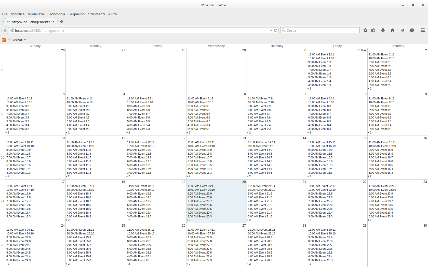
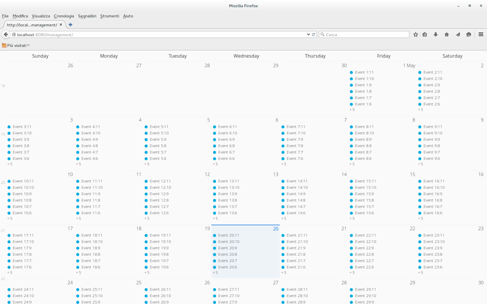
Hi,
I’m using vaadin 7.4.6 and I have a problem with the vaadin calendar when I try to set it to full size. There is something wrong with the height of the cells (see attached images, the default theme works fine).
I tested it with a simple UI
[code]
@Override
protected void init(VaadinRequest request) {
Calendar calendar = new Calendar();
setCalendarContainer(calendar);
setCalendarStartEndDate(calendar);

calendar.setSizeFull();

VerticalLayout v = new VerticalLayout();
v.setSizeFull();
v.addComponent(calendar);
setContent(v);
}
[/code]The custom style scss just contains
@import "../valo/valo.scss";
@mixin my-theme {
    @include valo;
}
Is this a bug or I’m doing something wrong with the css?
Regards.