Julien38
November 10, 2014, 3:31pm
86
Somehow the attachment did not work, so here is the scss in code:
@mixin top-menu($bg: $valo-menu-background-color, $badge-border-radius: $v-border-radius) {

  .v-ui {
    .top-menu {
      display: block;
      height: round($v-unit-size * 1.5);

      .valo-menu-part {
        overflow: visible;
        background: none;
        min-width: 0;
        max-width: none;

        @include position(fixed, 0 0 0 0);
        z-index: 100;
        margin: 0;
        padding: 0;
        height: round($v-unit-size * 1.5) !important;

        @include valo-gradient($color: $v-selection-color);
        $font-color: valo-font-color($v-selection-color, 1);
        color: $font-color;
        text-shadow: valo-text-shadow($font-color: $font-color, $background-color: $v-selection-color);
        border-bottom: valo-border($color: $v-selection-color);
        @include box-shadow(valo-bevel-and-shadow($shadow: $v-shadow));
      }

      .valo-menu-title {
        background: none;
        border: none;
        box-shadow: none;

        display: table-cell;
        text-align: left !important;
        padding-top: 0;
        padding-bottom: 0;
        font-size: $v-font-size--large !important;

        &:before {
          content: '';
          display: inline-block;
          height: 100%;
          vertical-align: middle;
          margin-right: -0.25em;
        }

        > * {
          display: inline-block;
          vertical-align: middle;
          @include margin(0 round($v-unit-size/2) 0 auto);
        }

        > *:last-child {
          margin-right: 0;
        }
      }

      .v-menubar-user-menu {
        display: table-cell;
        padding: 0;
        height: round($v-unit-size * 1.5) !important;
        color: valo-font-color($v-selection-color, 0.5);
        max-width: 35% !important;
        font-size: $v-font-size !important;

        .v-menubar-menuitem {
          line-height: round($v-unit-size * 1.5) - 1px !important;
          white-space: nowrap;
        }

        img.v-icon {
          display: inline-block;
          margin: 0 round($v-unit-size / 6) 0 0;
          width: $v-unit-size !important;
          height: $v-unit-size !important;
          border-radius: ceil($v-unit-size / 2) !important;
          border: none;
        }

        .v-icon {
          display: inline-block;
          margin: 0 round($v-unit-size / 6) 0 0;
          line-height: $v-unit-size;
          font-size: round($v-unit-size / 1.5);
          vertical-align: middle;
        }

        .v-menubar-menuitem-caption .valo-menu-badge {
          $badge-font-size: $v-font-size--small;

          display: inline-block;
          overflow: hidden;

          font-size: $badge-font-size;
          text-align: center;
          text-overflow: ellipsis;
          white-space: nowrap;
          line-height: round($badge-font-size * 1.5);

          background-color: valo-font-color($bg, 0.9);
          color: valo-font-color(valo-font-color($bg, 0.9));

          $h-offset: round($v-unit-size / 4) + round($v-unit-size / 6);
          $v-offset: round($v-unit-size / 9.5);

          position: relative;
          right: $h-offset;
          bottom: $v-offset;

          width: round($badge-font-size * 1.5);
          height: round($badge-font-size * 1.5);

          padding: 0;
          margin: 0 -($h-offset) 0 0;
          border-radius: $badge-border-radius;
        }
      }

      .valo-menuitems {
        @include valo-menu-style;
        position: fixed;
        z-index: 200;
        top: $v-unit-size;
        bottom: 0;
        height: auto;
        max-width: 100%;
        overflow: auto;
        padding: round($v-unit-size / 2) 0;
        @include transform(translatex(-100%));
        @include transition(all 300ms);
      }

      .valo-menu-visible .valo-menuitems {
        @include transform(translatex(0%));
      }

      .valo-menu-toggle .v-button-caption {
        display: none;
      }
    }

    @include width-range($max: 800px) {
      .top-menu {
        height: auto;

        .valo-menu-part {
          height: $v-unit-size !important;
        }

        .valo-menu-title {
          position: relative !important;
          font-size: $v-font-size !important;
          height: $v-unit-size !important;
          padding-left: $v-layout-spacing-horizontal;
          padding-right: $v-layout-spacing-horizontal;

          > * {
            margin-right: $v-layout-spacing-horizontal;
          }
        }

        .v-menubar-user-menu {
          position: relative !important;
          font-size: $v-font-size--small !important;
          height: $v-unit-size !important;

          .v-menubar-menuitem {
            line-height: $v-unit-size - 1px !important;
            padding-left: 0px;
          }

          img.v-icon {
            height: round($v-unit-size / 2) !important;
            width: round($v-unit-size / 2) !important;
            border-radius: ceil($v-unit-size / 4) !important;
          }

          .v-icon {
            font-size: round($v-unit-size / 2);
            line-height: round($v-unit-size / 2);
          }

          .v-menubar-menuitem-caption .valo-menu-badge {
            $badge-font-size--small: round($v-font-size--tiny * 0.8);
            font-size: $badge-font-size--small;
            width: round($badge-font-size--small * 1.5);
            height: round($badge-font-size--small * 1.5);
            line-height: round($badge-font-size--small * 1.5);
          }
        }
      }
    }

    @include width-range($max: 500px) {
      .top-menu {
        .v-menubar-user-menu {

          .v-menubar-menuitem-caption{
            display: block !important;
          }

          .v-menubar-menuitem-caption .valo-menu-badge {
            right: floor(($v-unit-size / 2.5) + ($v-unit-size / 5));
          }
        }
      }
    }
  }
}
Auke2
December 11, 2014, 3:57pm
87
Hi guys,
We’re using Vaadin 7.3.2 here and I see that the Window component does not render a FontIcon as its caption icon.
On the server side we create a Window and set its icon:
Window window = new Window();
window.setIcon(FontAwesome.WARNING);
The VWindow client side widget has a setCaption method which assumes the icon is an image:
    public void setCaption(String c, String icon) {
        String html = Util.escapeHTML(c);
        if (icon != null) {
            icon = client.translateVaadinUri(icon);
            html = "<img src=\"" + Util.escapeAttribute(icon)
                    + "\" class=\"v-icon\" alt=\"\" />" + html;
        }

        // Provide information to assistive device users that a sub window was
        // opened
        String prefix = "<span class='"
                + AriaHelper.ASSISTIVE_DEVICE_ONLY_STYLE + "'>"
                + assistivePrefix + "</span>";
        String postfix = "<span class='"
                + AriaHelper.ASSISTIVE_DEVICE_ONLY_STYLE + "'>"
                + assistivePostfix + "</span>";

        html = prefix + html + postfix;
        DOM.setInnerHTML(headerText, html);
    }
Is this a known bug, or is it perhaps fixed in a newer version?
Thanks
Maxime10
December 11, 2014, 4:03pm
88
Auke2
December 12, 2014, 10:14am
89
Thanks. I’ve updated to 7.3.6. Still, I’ve noticed that when I apply
window.setDraggable(false);The ‘move’ cursor still appears on when hovering on the caption. It would be nice if this cursor would only appear if the window is draggable.
Jouni1
December 12, 2014, 11:28am
90
Thanks. I’ve updated to 7.3.6. Still, I’ve noticed that when I apply
window.setDraggable(false);The ‘move’ cursor still appears on when hovering on the caption. It would be nice if this cursor would only appear if the window is draggable.
Yup, that’s still a bug which is not fixed I think. Would be great if you could take the time and
Auke2
December 12, 2014, 3:12pm
91
Auke2
December 17, 2014, 3:04pm
92
Think I’ve found another one. When I create an Upload and use setImmediate(true), the element is still present in the right of the layout. It is visually indistinguishable from the background, but still clickable and triggers the upload/file chooser dialog.
Created ticket:
Jose_Luis10
February 7, 2015, 6:14pm
93
Hi,
Henri2
February 9, 2015, 9:19am
94
What exactly is the problem you are experiencing?
myUi.addStyleName(ValoTheme.UI_WITH_MENU);This should be in the release notes (I didn’t check), but probably easy to miss.
Jose_Luis10
February 10, 2015, 2:19pm
95
Thank you, that was the problem, I missed that ticket.
lipodido
April 22, 2015, 1:55pm
96
Hi Jouni,
.v-progressbar-red {@include valo-progressbar-indicator-style($background-color: #red );
.v-progressbar-amber {@include valo-progressbar-indicator-style($background-color: #amber );@include valo-progressbar-indicator-style($background-color: #green );
Regards
Jouni1
April 24, 2015, 11:48am
97
Hi,
Your code is almost correct. You’re just targeting the wrong element with the mixin. This should work:
.v-progressbar-red .v-progressbar-indicator {
     @include valo-progressbar-indicator-style($background-color: #red);
  }

  .v-progressbar-amber .v-progressbar-indicator {
     @include valo-progressbar-indicator-style($background-color: #amber);
  }
  .v-progressbar-green .v-progressbar-indicator {
     @include valo-progressbar-indicator-style($background-color: #green);
  }
lipodido
April 24, 2015, 12:07pm
98
Hi,
Your code is almost correct. You’re just targeting the wrong element with the mixin. This should work:
.v-progressbar-red .v-progressbar-indicator {
     @include valo-progressbar-indicator-style($background-color: #red);
  }

  .v-progressbar-amber .v-progressbar-indicator {
     @include valo-progressbar-indicator-style($background-color: #amber);
  }
  .v-progressbar-green .v-progressbar-indicator {
     @include valo-progressbar-indicator-style($background-color: #green);
  }
you are right i was targeting the wrong element ! thank you very much for your help
lipodido
May 18, 2015, 3:15pm
99
Hello,
As for the Table :
TABLE_NO_STRIPES = "no-stripes";
TABLE_NO_VERTICAL_LINES = "no-vertical-lines";
TABLE_NO_HORIZONTAL_LINES = "no-horizontal-lines";
TABLE_NO_HEADER = "no-header";
TABLE_BORDERLESS = "borderless";
TABLE_COMPACT = "compact";
TABLE_SMALL = "small";
Is there any predefined ValoTheme styles for the Grid component ? is it planned for the futur valo version?
Michele23
May 20, 2015, 2:55pm
100
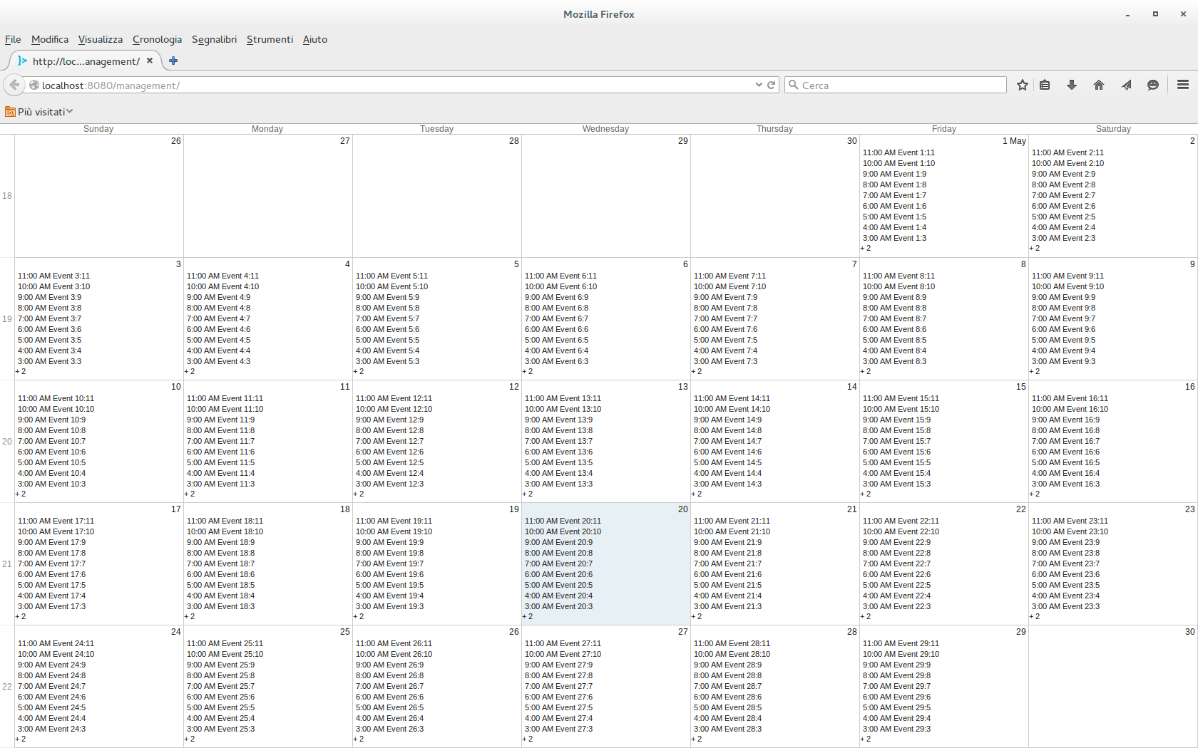
Hi,
I tested it with a simple UI
[code]@Override
setCalendarContainer(calendar);
setCalendarStartEndDate(calendar);

calendar.setSizeFull();

VerticalLayout v = new VerticalLayout();
v.setSizeFull();
v.addComponent(calendar);
setContent(v);
}
@import "../valo/valo.scss";
@mixin my-theme {
    @include valo;
}
Is this a bug or I’m doing something wrong with the css?
Emmanuelle
May 20, 2015, 3:05pm
101
It looks like this is Valo’s calendar normal look. Please see the scss of the calendar component. Must be the line height I guess. You can then override it in your theme if you want.
Michele23
May 21, 2015, 9:19am
102
Thank you for the suggestion, the following rule seems to work for me (but I don’t think is the correct way)
    .v-calendar-bottom-spacer,
    .v-calendar-spacer,
    .v-calendar-bottom-spacer-empty,
    .v-calendar-event-month {
        margin-bottom: 0px;
    }
Anyway, I think the calendar should be able to correctly resize himself just like every other component (ex. a Table).
Emmanuelle
May 22, 2015, 5:27am
103
Seems like a bug. Please file a ticket for this.
jeff147
July 6, 2015, 11:06am
104
Hi everyone,
I’m using Calendar of 7.5.0 version.
BUT, when I do anything - listener, open a pop-up, scroll in a combo, then the height size change.
Could anyone confirm that ?
Auke2
October 20, 2015, 7:27am
105
Hi all,
There does not seem to be a css style for a borderless Grid component. I found a ticket about it:
Are there any plans for implementing this?
Cheers!


