However, in vaadin 24, the style does not apply for some reason and seems like the element got some changes.
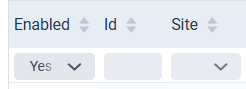
When I do an inspect, for select field, it becomes vaadin-input-container?
Are you still using the `themes/[my-theme]/components? folder to inject the styles into the shadow DOM of the components?
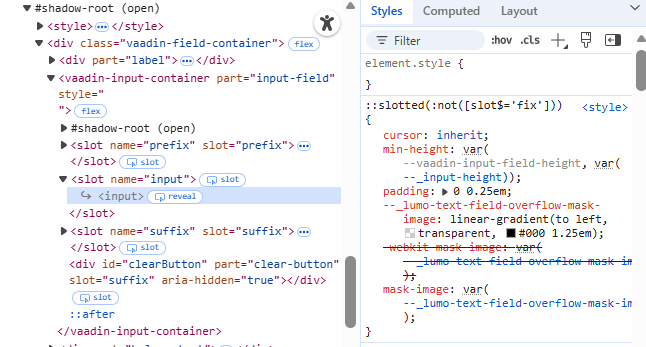
The :host selector only works inside the shadow DOM. Conversely, the ::part() selector only works outside shadow DOM, i.e., light DOM, with stylesheets that are not inside the components folder.
Nothing has changed regarding the parts of those components, so I’m not sure why your styles no longer work. Did you change something related to them?
I assume you updated the Vaadin version. Which version are you using now?
so I followed the migration guide Recommended Changes | Upgrading | Vaadin Docs
and created a vaadin-grid.css under the component folder,
I believe I should put these style in vaadin-grid.css since these style are only going to be apply on Grid Filters
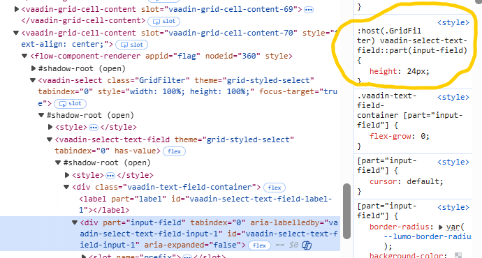
Also, I believe I probably need to specify the class :host(.GridFilter) since I added the class for the fields filterField.addClassName("GridFilter"); filterSelect.addClassName("GridFilter");?
so putting the code you provide to styles.css work(without adding :host(.GridFilter) ), but I expect them to work in vaadin-grid.css under the component folder, but it does not.
Why is that?
Actually things have changed since V23, and it’s now recommended to not use the components folder, and instead style components using normal (non-shadow-DOM) css. Here’s the V24 styling docs: How to style components in Vaadin
The gist of it is to just have everything in styles.css, not use the components folder (unless you already have a bunch of shadow DOM stylesheets, in which you can of course keep using them, but at least write any new css elsewhere).
The benefit of the V24 way is that shadow DOM styling of components is, in most cases, more complicated, and we don’t have any documentation for how to target their various parts etc.
I can explain why your code doesn’t work, and help you get it working, but I strongly recommend going the V24 way. In this case that means putting the CSS I proposed in your styles.css or some other stylesheet imported through it.
Since you are applying a classname to them anyway, there is no need for further scoping of the styles, so just add that classname to the selectors:
vaadin-text-field.GridFilter {
--vaadin-input-field-value-font-size: 12px;
--lumo-text-field-size: 24px;
}
vaadin-select.GridFilter {
--vaadin-input-field-value-font-size: 12px;
}
/* The usual field sizing properties don't work with Select because it's internally a kind of button */
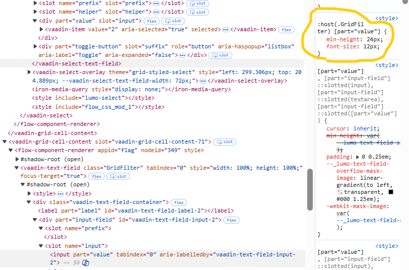
vaadin-select.GridFilter > vaadin-select-item {
min-height: 24px;
}
Note that I haven’t tested this css, so I’m not 100% sure the Select styling works correctly like that (as mentioned, Select is different from other fields and styling it is a bit trickier), but at least the TextField should work.
Thank you for the explanation, it makes more sense now.
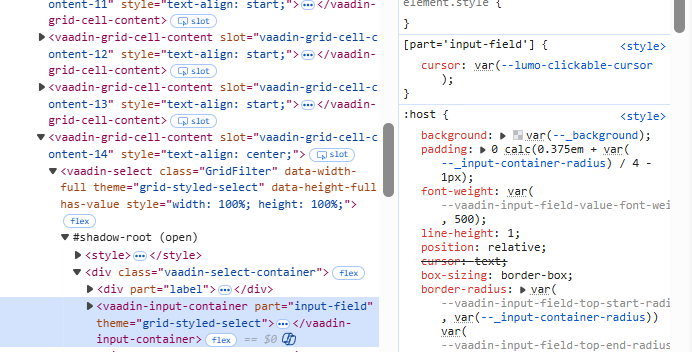
I was still having some trouble styling the select component (the TextField is working fine). I experimented a bit, and eventually this fixed the select height.