Hi,
In basic example for TextField - https://vaadin.com/components/vaadin-text-field/java-examples - label is on top of the input field. Is is possible to change label position on the left side of input field?
Regards,
Matic
Form layout might be a suitable option: vaadin.com/components/vaadin-form-layout
If you just want one field label to be on the side, here’s a solution: https://jsfiddle.net/72kt8tfw/
Notice, that it uses one unsupported CSS selector, which is not guaranteed to work in the future.
Hi,
Thank you for idea. I have now user Form Layout, but labels are still on the tip - see image. About CSS solution - i would really prefer some standard Vaadin solution. The whole point of using Vaadin for use is “Java developers building beautiful web app”.

You need to use the Form Layout’s API for setting the labels for the components (vs. textField.setLabel(...)).
formLayout.addFormItem(textField, "Label");
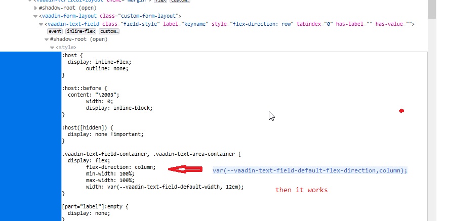
Hi, I’m using Vaadin 13.0.0 mit vaadin-text-field Version 2.3.4
I would like too to receive a label and a value in one line.
I write
.vaadin-text-field-container {
flex-direction: row;
}
But it does not change flex-direction.
Perhaps the problem in the style by default.
See file.
Help to get the title and value in one line. (I will also need to change the width a label and a value)


I just did a quick test without any stylings in Vaadin 13.0.1 and this seems to work OK for me:
        FormLayout formLayout = new FormLayout();
        TextField firstNameTF = new TextField();
        TextField lastNameTF = new TextField();
        formLayout.addFormItem(firstNameTF, "First name");
        formLayout.addFormItem(lastNameTF, "Last name");
        verticalLayout.add(formLayout);
Hi.
I have two textAreas. For 1st one i want to make labels align row center, for the 2nd column flew-start. I give for every of them own Id and created separate html files for each. But when 1st textarea changes the 2nd one changes like the 1st, i can’t give them their own label align.
How can i do it?
Hi, for interested:
I took Jouni Koivuviita nice proposition and slightly improved it (I made the error-message to be always under input-field so as to input-field never shrinks ie. in case of input error, and removed some unnecessary margin from top). And I used theming for input-field, so you can just add theme=“left-label” for any component based on vaadin-text-field (textfield, datepicker, combobox etc.).
For <dom-module> template styling:
<dom-module id="vaadin-text-field-theme" theme-for="vaadin-text-field">
	<template>
		<style>
			:host([theme~="left-label"]
) {
				--vaadin-text-field-default-width: 18em;
			}

			:host([theme~="left-label"]
[has-label]
)::before {
    			margin-top: 0;
    		}

			:host([theme~="left-label"]
) .vaadin-text-field-container {
				flex-direction: row;
				flex-wrap: wrap;
			}

			:host([theme~="left-label"]
) [part="label"]
 {
				align-self: baseline;
				flex: none;
			}

			:host([theme~="left-label"]
:not([required]
)) [part="label"]
 {
			    padding-right: 1em;
			}

			:host([theme~="left-label"]
) [part="input-field"]
 {
				align-self: baseline;
				flex: 1 0;
			}

			:host([theme~="left-label"]
:not([invalid]
)) [part="error-message"]
 {
				display: none;
			}

			:host([theme~="left-label"]
) [part="error-message"]
 {
				align-self: baseline;
				min-width: 10em;
				flex-basis: 100%;
			}
		</style>
	</template>
</dom-module>
i upgraded a little …
  :host([theme~="left-label"]
) .vaadin-text-field-container  {
            flex-direction: row;
            flex-wrap: wrap;
        }

        :host([theme~="left-label"]
) .vaadin-text-area-container {
            flex-direction: row;
            flex-wrap: wrap;
        }

        :host([theme~="left-label"]
) [part="label"]
 {
            align-self: center;
            flex: none;
            white-space:pre-line;
            width:220px;
            text-align:right;
        }
, but i propose to use FormLayout for that stuff…