Hello.
Is it possible to add a custom suffix component for the input field for ComboBox? I know ComboBox implements HasPrefix for setting the prefix but our use case require it to be a suffix.
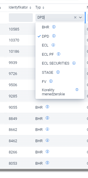
We use this ComboBox for grid filtering. Currently it looks like this:
In the combobox dropdown items and the grid cells the info icon has attached tooltip that explains what those BHR, DPD etc. values mean. We also wanted to add this icon to the ComboBox input field.
I have tried approach described on Stack Overflow. It works for prefix but when I change to “suffix” it does not. I suspect it’s because the close and dropdown icons ocuppy this slot.
The underlying web component indeed doesn’t support a suffix. Thinking outside the box, would a Select work for your use-case? With Select you can show the same item renderer for the selected value as in the dropdown, so you get the same icon and tooltip.
Is it possible to type in Select’s input field to filter a value? If not then our web app will have inconsisten dropdown fields. It will be confusing for users because why on some they can type on others they can’t.
Thank you very much. Your solution works but in our case I am not sure if I want to tinker with the JS and CSS styling of this suffix component because at this state it is not consistent with other icons and frankly I am fed up with JS and CSS.
I wanted to note that Java has a feature called Text Blocks. You can put your custom JS code written in Java file without the need to break it over multiple concatenated strings.
I wanted to note that Java has a feature called Text Blocks. You can put your custom JS code written in Java file without the need to break it over multiple concatenated strings.
Nope, that’s the trade-off with that solution. If you have fields where there are a lot of values so that input filtering makes them more usable, and you want all fields to be consistent, then you should keep using a combo box.
Another idea might be to show the icon to the right side of the combo box, with the trade-off that there’s a visual mismatch between items in the dropdown and the column header.
Vaadin 24.5 will also include a popover component that allows rich content. With that you could add a help icon next to the combo box, and clicking it opens a popover with a legend explaining what all these different values mean.