@useful-whale, in Grid, when I generate the editor, I do hasSize.setWidthFull() on all, but it would be better if grid did that itself.
But, that would only make sure the input + chrome was visible. Since we fit columns to their text, the editor chrome would normally mean that the input content is clipped, so, especially for DatePicker, TimePicker, DateTimePicker I have to set column width in pixels anyway.
In other places, I’d prefer setting the input width in chars, partly because it is “cleaner”, but it also part of another issue: For any kind of field, when we have label above the field, make sure label is not clipped.
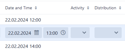
This is especially an issue in our “navigator”, where we want the fields to be narrow, but not too narrow.
Earlier I calculated a pixel width for all fields as max(label width in pixels, input field + chrome in pixels). That was calculated from a letter-width lookup table I had in code. Ugly as f, and not accurate, so I got some minor label clipping.
Discussing it with your expert chat some time back, I got the following suggestion:
code:
field.getStyle().set(“–length”, Integer.toString(charWidth) + “ch”);
css:
.navigator {
–vaadin-field-default-width: min-content;
& vaadin-text-field > input {
    width: var(--length, 10ch);
}
}
So… based on that I thought I could set width on “> input” everywhere. However, it looks like I have to accept that each context has its own requirements.
Back to FormLayout - Having each column in a separate VerticalLayout would break two things; colspan and aligning fields in the two columns.
If we wanted to be “mobile first”, we’d switch to laying out fields in rows and having the label above.
That would be a huge change, and would make the desktop version worse, and we are definitely “desktop first”.
So, I don’t like it, but I’m leaning towards generating a
. Thankfully you’ve made it trivial to add support for any tags that you’ve left out.