After three days of work, I’ll post you a preview of the result of this kind of “simple-yet-functional” theme, that you can customize yourself.
The theme isn’t nearly finished, but I thought I’d ask for feedback at an early point, so I won’t end up doing work that pleases nobody.
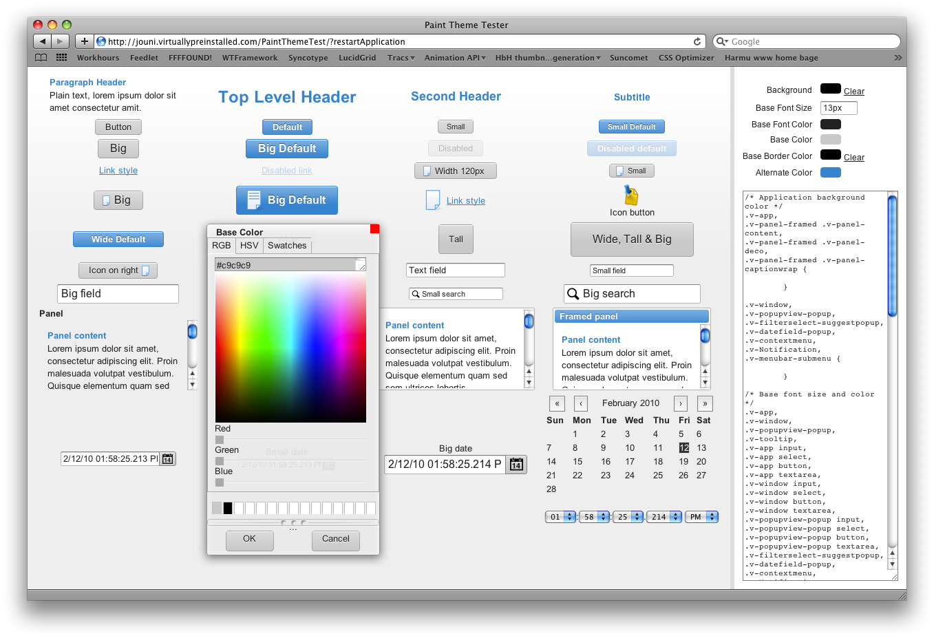
So, I built a little theme editor on top of the flexible theme (currently called “Paint” theme), go ahead and try it out:
Paint Theme Tester
[/size]
Note: try with either Safari or Chrome, Firefox has some issues updating the color changes instantly. Internet Explorer does work too, but the ColorPicker component is a bit unusable there.
As you can see, I started by making quite a few different button styles that can be combined together freely. TextFields were next, then a couple of Panels (the default Panel style being totally transparent), finally starting some DateField styles. So loads of components still unstyled, but I hope you can get the feeling of the theme from this small subset.
So what I need to hear, is that this theme is something you guys would want to use in some future applications, or at least would want to base your own theme on (the CSS of this theme is not nearly as complex as Reindeer’s, since there are almost no images involved).
Nice set of buttons and well balanced beginnings of a theme, but not exactly what I was looking for as “simple and functional” theme. On the other hand - this could be the beginnings of a great “simple and functional” theme.
IMO “simple and functional” theme should strive to be (look) as functional and simple as possible. This means no gradients. Use images only where absolutely necessary. Round corners should be used with care (to maintain fair consistency over browsers). While functionality is the essence, some (minimalistic) character could be added, but then it is there only to make the user to feel that the application is even more efficient and easy to use.
One of the important things is that the “simple and functional” should be a complete theme. Even when the styling is minimalistic, all widgets should be styled (somehow) and many of them (windows, panels, tabsheets, buttons, …) should probably provide difference variety of styles to choose from.
I think that Google really shines on this kind of styling. While some people think that Google “looks” is just bare-bones and a bit clumsy - many users just appreciate how the style excels in being “out of their way” and gives room for the content and functionality.
Thanks for the critique, duly noted. Critique is almost always more constructive than praises
But I’ll have to correct/tackle some issues you raised…
It’s exactly that, a beginning. Most of the time went to building the editor, not the actual styles. And…
That’s exactly my goal: a complete theme, with multiple different styles for some of the components (not all, for starters at least). Try not to judge the completeness just yet
This is where I disagree completely. As I see it, the “simple” part refers mostly to the actual implementation: the CSS. The “functional” part then refers to the actual look and feel of the theme.
Functional does not mean it has to be ugly (but neither does “imageless” and “gradientless”, I’ll give you that), quite the opposite. With functional, I strive mostly for “usable”, but that’s a though goal to tackle with a simple theme alone, so my weapons are quite limited. Hence, using a few well selected gradients will hugely benefit the overall usability and affordance of the theme. With the words of Stephen P. Anderson:
I encourage you to read his article,
In Defence Of Eye Candy , and look at the slides
on his website . There’s even scientific evidence to justify the use of gradients
And aren’t you indirectly saying OS X’s theme isn’t functional? I hope that’s not what you mean to say.
Again, I disagree.
Do websites need to look exactly the same in every browser? No. Small differences will do no harm, and lowering the bar because of lesser browser makes no sense to me. And to quote another well respected web professional:
Only web desingners and developers look at websites/webapps with two different browsers to see if they differ. We musn’t promise end users pixel perfect results across all browsers, which is impossible for many reasons. And that’s why
we should stop showing static visuals to clients (I’m still guilty of this, but slowly working towards a different working process). So why lower the visual/usability bar on all browsers just because few of them fail to render one aspect of the design that will not ruin the overall experience (because they’re not knowing something’s missing)?
See for yourself, Google uses gradients and rounded corners, I dare you
Now, I think my theme tester might be a bit misleading in it’s presentations currently, when the “alternate” color is used so prominently. But the idea of course with the “default” buttons is that you use them sparingly, i.e. only one such button per screen. Same goes for all the more prominent styles in the theme. But I’ll be tweaking the colors, borders, spacings etc. next week.
Now things start to fall more into the personal tastes category, but I’ll bite it: I think Google Maps looks really good, largely due to the good looking maps themselves, but in general the controls are polished. Still, I’ll take a dozen
github’s before
googlecode’s , but I’m sure it’s just a personal preference not applicaple to everyone
As for me (if talk about preferences I like both minimalistic Google apps UI and as well as current mockup. To my mind, minimalistic theme should not be heaavy-css-ed like reindeer, in order to simplify Vaadin user life when adjusting styles. However, this does not mean it should not use round corners, images, etc at all.
I think, that main purpose of the minilaistic theme is to provide lighweight but nice and professional looking style and have as much substyle variations for every widget as possible - this will allow Vaadin users to just use that theme for daily apps, reducing css adjustments to a minimum. That would be great.
Regarding the Google, I think, this could be a great idea to create a separate theme, which will mimic the google apps look and feel
Refined lots of details. Now includes more widgets, plus a couple of presets for you to switch back and forth to get a feeling how different color schemes might look like.
Maybe I should have selected a better wording for “functional”. What I meant was that many people associate no frills simplicity with functional focus. I think that this is what Google have tried to achieve and succeeded. It doesn’t mean that everyone should agree - I for one prefer sophistication of GitHub over Google Code, but still Google Code somehow
feels more lightweight (I have no idea which theme actually
is more lightweight.
You are right (and I wrong) about round corners and gradients. As long as they are technically lightweight, the only question is how subtle they are and how that affects the
perception of functionality, simplicity and effectiveness.
And to be clear - I like your theme and newer intended to criticize it. My purpose has been to describe an idea for a theme what I call “simple and functional”. You are free to disagree with the usefulness of the idea :)
[quote]
Regarding the Google, I think, this could be a great idea to create a separate theme, which will mimic the google apps look and feel
[/quote].
Actually - it could be good idea to just duplicate the look and feel and call it “Google Theme” (or “Spectacles Theme” to avoid misusing their trademark).
Played around with the PaintTheme color editor. I must say the theme is
extremely flexible and “download my color scheme version” button idea is really amazing. Still - should it output properly packaged theme addon instead of a zip?
Thanks, I really hope this will be useful for many users.
Generating a proper add-on for the download is a good idea. I just threw this thing together quite hastily, just wanted to allow people to experiment more with the generated themes. I’ll finish the actual theme first, then I’ll but more muscles to the editor, if I have time.
And regarding the “simple and functional” “debate”: I might have taken a bit too seriously But no harm done, I guess. Good points on your half, I agree too that a Google imitation theme would be a good idea. And I like the simplicity of some of the Google apps as well, just preferring a more polished and richer experience.
Thanks for the info, I haven’t set up the automated bootup script for my Tomcat (lazy me).
The Paint theme was renamed to Chameleon theme, and it’s now available in the Directory:
Vaadin Chameleon Theme .
The editor was also relocated (I’ve placed an automated redirect on the original site at jouni.virtually…), and you can now find it here:
demo.vaadin.com/chameleontheme .
Guys tell me onething how to set new theme left algin logo and basically in professional way where is use in
logos design ? please get in touch with this giving link.