Behind a feature flag for now: com.vaadin.experimental.dashboardComponent
Can be used both as a static layout and a databound, user-editable dashboard
It’s shipped behind a feature flag in 24.6 as we might still want to make some minor but breaking changes to it e.g. based on feedback we get, but we feel that it’s stable enough that you can start using it in your projects already today. (The only thing that might change significantly or even be removed altogether is the Section feature.)
Feedback about the Dashboard’s features, API, UX, a11y, etc are welcome either as issues in GitHub or right here in this thread.
That component is exactly what I need right now. Excellent timing. I have enabled the feature in vaadin-featureflags.properties. But I cannot use it: “Vaadin Dashboard is not included in your Hilla Pro subscription. You need a Pro Subscription, …” What does that mean? Is there another type of Pro subscription?
Hi Olaf, Hilla Pro is a limited version of the normal Vaadin Pro subscription that doesn’t include Pro features for Flow. We no longer offer Hilla Pro, but those who have it should continue to get access to new Hilla features, including components. We’re looking into why it doesn’t have Dashboard yet.
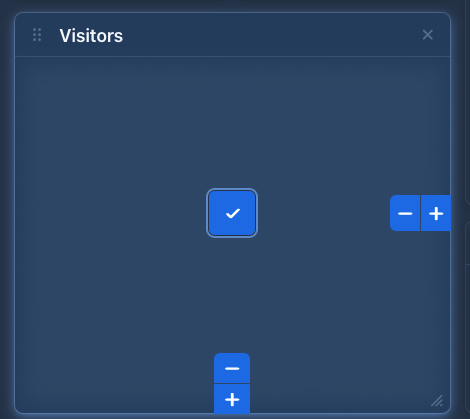
@rofa Big kudos to the team! Really cool component - especially the build-into accessibility was well throughout! Only nitpicking I would have… would be in those modes where you have your +/- actions to increase the size of the component.
When I press arrow keys in this mode - I would expect to move between the visible buttons - but the card is moving… it took some time (seconds) to use the tab key instead to get to the buttons.
Yeah, the interaction details of those modes was tricky to decide on. In the end, we decided that reassigning arrow keys to move between those would be confusing since you’ve already used tab to move between the normal buttons in the widget, and also annoying to users who’ve already gotten used to the arrow-keys (and shift arrow-keys) for moving and resizing the widget outside of the accessibility modes (which they might accidentally trigger), since those also work in these modes.
The idea is that most keyboard-users would use the (shift) arrow key shortcuts, and that these accessibility modes would mainly be there to support those screen reader users who are unable to use or discover them.
But we’ll certainly continue tracking feedback about that and can definitely consider changing it later if opinions lean in that direction.
Yesterday i got a question why some components are only available with a subscription and could not be bought seperately or are already in the smallest plan available. I couldnt answer the question; are there any plans to have Pro Components available already in the “copilot plan”?
Dashboard looks like a component that would be used almost by every vaadin user :)
Well, the simple answer is that we somehow need to make a bit of money to pay the salaries of the developers and other people working on the Vaadin platform. Pro components is one of those ways. Pro components are typically ones that provide enterprise-grade functionality that would be otherwise quite difficult for people to build themselves, and that also takes us a lot of effort to build.

