I have a Dialog with a FormLayout (labelsAside = true) and some input fields, added with addFormItem().
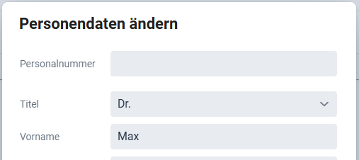
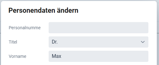
Now if the label is a bit too long, it grows in height, see screenshots:
Is this intended?
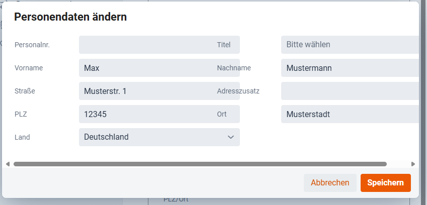
On the other hand, if I make the dialog wider to display two columns of form items, the labels are overlapping the inputs:
The first issue, with the extra vertical space, is probably due to the required indicator (which is not displayed as the field is not required, but takes a little bit of space regardless) wrapping to a new line below the label itself.
This can be solved by increasing the label column with with the setLabelWidth method on a specific FormLayout, or globally with the --vaadin-form-item-label-width css property.
The second issue, with labels overlapping the fields in the previous column, is probably caused by your fields being wider than the FormLayout’s columns.
FormLayout does not automatically size its columns based on the width of the fields in it – there is some default width determined either by the responsiveSteps (if you’re using the default layout mode), or by the column width configured for the new autoResponsive mode.
This can be solved by either setting your fields to be 100% in width, or, if you need them to be that wide, by increasing the FormLayout’s column width. That is much easier to do in the new autoResponsive mode, which was introduced in V24.8, so I would recommend using that if you can.
And thanks for the question. I think we should improve the docs a bit to be more clear about this. Right now you kind of need to read between the lines to figure it out, and it’s a common problem.
That explanation from Rolf was super useful for figuring out those FormLayout quirks!
Key takeaways for anyone else hitting this-
Vertical Space- If the label jumps, increase the label column width using setLabelWidth or the --vaadin-form-item-label-width CSS property (it’s likely the required indicator wrapping).
Overlapping Fields: Make sure your fields are set to 100% width, or adjust the column width. He recommends the new autoResponsive mode (V24.8+) for easier column control.
For a long time for textfields, selects, comboboxes etc. It looks good in a two column layout and looks good in responsive modes. If you need more than 2 columns in your app, you may need to decrease the max-width (depending on your end-user’s screen resolutions).