Sergio9
(Sergio Szychowski)
1
Hi,
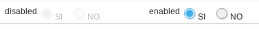
we need to style OptionGroup for when the components was disabled
the user can see it. Now when was disabled the component is almost invisible.
We try these but not work:
.v-select-optiongroup
.v-select-option.v-checkbox
.v-select-option.v-radiobutton
.v-disabled {
opacity: 1.0;
}
.v-select-optiongroup
.v-select-option.v-checkbox
.v-select-option.v-radiobutton
.v-readonly {
opacity: 1.0;
}
Thanks in advance
Katri
(Katri Haapalinna)
2
Hi, the correct CSS selectors to get both the label and the icon of the item seem to be
.v-radiobutton.v-disabled > label, .v-radiobutton.v-disabled > .v-icon { ... }
.v-checkbox.v-disabled > label, .v-checkbox.v-disabled > .v-icon { ... }
Best,
Katri
Sergio9
(Sergio Szychowski)
3
Hi Katri,
I thank you very much for your prompt response
I try with this
.v-radiobutton.v-disabled > label, .v-radiobutton.v-disabled > .v-icon {
border: 1px solid #b6b6b6;
border-top-color: #9d9d9d;
border-bottom-color: #d6d6d6;
border-right-color: #d6d6d6;
color: #464f52;
opacity: 1.0;
}
and this
.v-radiobutton.v-disabled>.v-label, .v-radiobutton.v-disabled > .v-icon {
border: 1px solid #b6b6b6;
border-top-color: #9d9d9d;
border-bottom-color: #d6d6d6;
border-right-color: #d6d6d6;
color: #464f52;
opacity: 1.0;
}
but nothing change.
Maybe I’m doing something wrong.
I need the radiobutton disabled look almost equal to the enabled.
Thanks in advance
Best regards
ollit.1
(Olli Tietäväinen)
4
Which Vaadin version are you using? In Vaadin 8, radio button and checkbox groups got separated into their own components from OptionGroup.