The Aura theme looks quite plain by default. I know it can be customized (I have seen some actually good looking apps based on it), but the docs makes tuning look hard and I would rather trust somebody elses taste on color selections etc
I have heard rumours there are some presets available, but didn’t find them through docs. Any good presets somebody would like to share for an OSS utility library?
The easiest thing you can do, is apply one of the accent color classnames on the <html> element. For example: <html class="aura-accent-purple">. I don’t remember if there’s a convenient Flow/Java API to do that.
But this old fart still somehow feels Lumo looks better. Maybe it is the gray background still somehow feels a big “heavy” for my taste, need to try to tune that as well somehow.
With Aura, you should ideally place your content in some container, commonly App Layout, so that you get at least one level of “elevation” with the surface colors, on top of the default gray background.
Related to your commit: you should also set the --aura-accent-color-dark property. Or did you intentionally only apply the purple accent for the light mode?
Yeah, I guess dark color should be also added. I think I tried first --aura-accent-color only that I found from some docs, but that didn’t “stick”.
Regarding, AppLayout, do you have some quick tips for small “apps”? E.g. in one tool that I used nowdays almost daily to inpect maven dependency tree, there is essentially only one view. App layout for such cases feels quite an overkill
Yeah, the --aura-accent-color property is “read-only” (thanks to Safari 17 support), and you should always override the corresponding *-light and *-dark properties: How to use color properties of the Aura theme in Vaadin
For small apps, you can add the aura-surface classname on the html or body element. That’ll essentially add the same elevation as the App Layout content area does.
Opened the my jbang tooling for hacking with these, it was easies to add aura-surface to the “UI element” directly. And as a bonus, you get a lighter background color seems to be selected with a way better taste than I’ll ever have😎
I wonder if “something breaks”, if I make that as default (e.g. in AppLAyout if some app use that)
Sounds like you need to have a quite intimate knowledge of Aura’s internals to get to a nice default. How could we make it easier? A Java API for the above would at least be one step in the right direction, and perhaps considering if our starters would have them already set with some example values to make them more discoverable.
Sounds like you need to have a quite intimate knowledge of Aura’s internals to get to a nice default.
That’s subjective, I would say, if the biggest impact comes from choosing another default accent color. Now it’s neutral/grayscale, which isn’t uncommon (shadcn/ui, for example).
The idea with Aura is that our starters could indeed showcase the customizability by adjusting the defaults. I say we should invest in making proper theme and layout presets/templates, and allow devs to choose when they’re downloading a starter. We can’t make defaults that satisfy everyone anyway.
Adding a classname to the <html> element needs a new API to make it easier. Adding the accent color classname on the <body> element isn’t enough to adjust all colors in Aura.
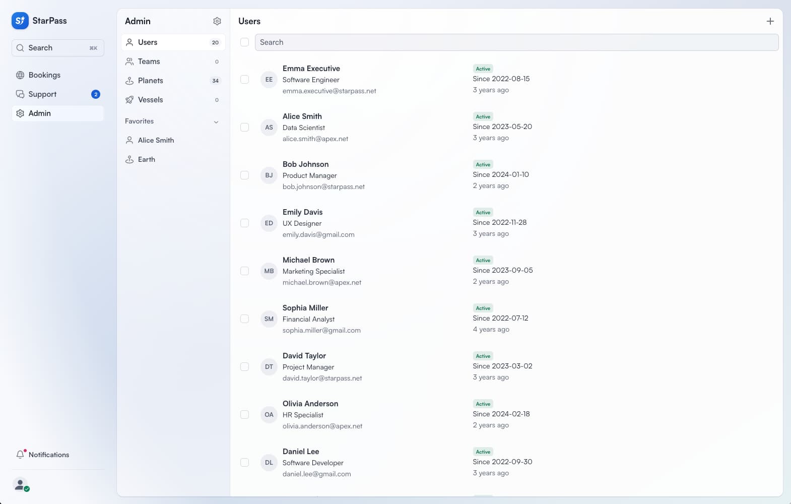
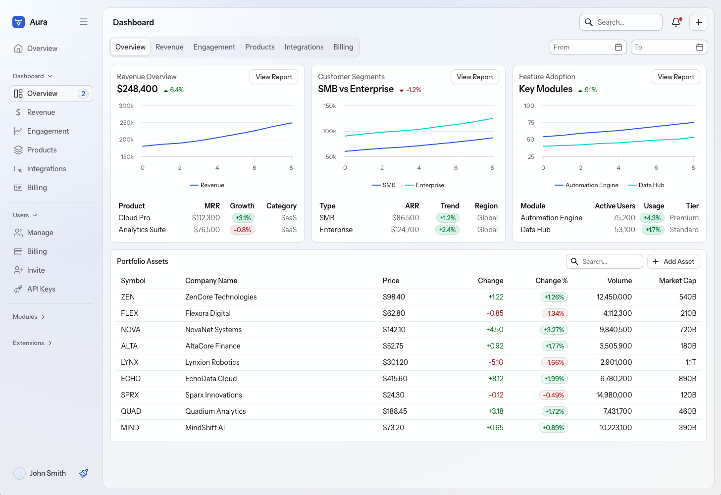
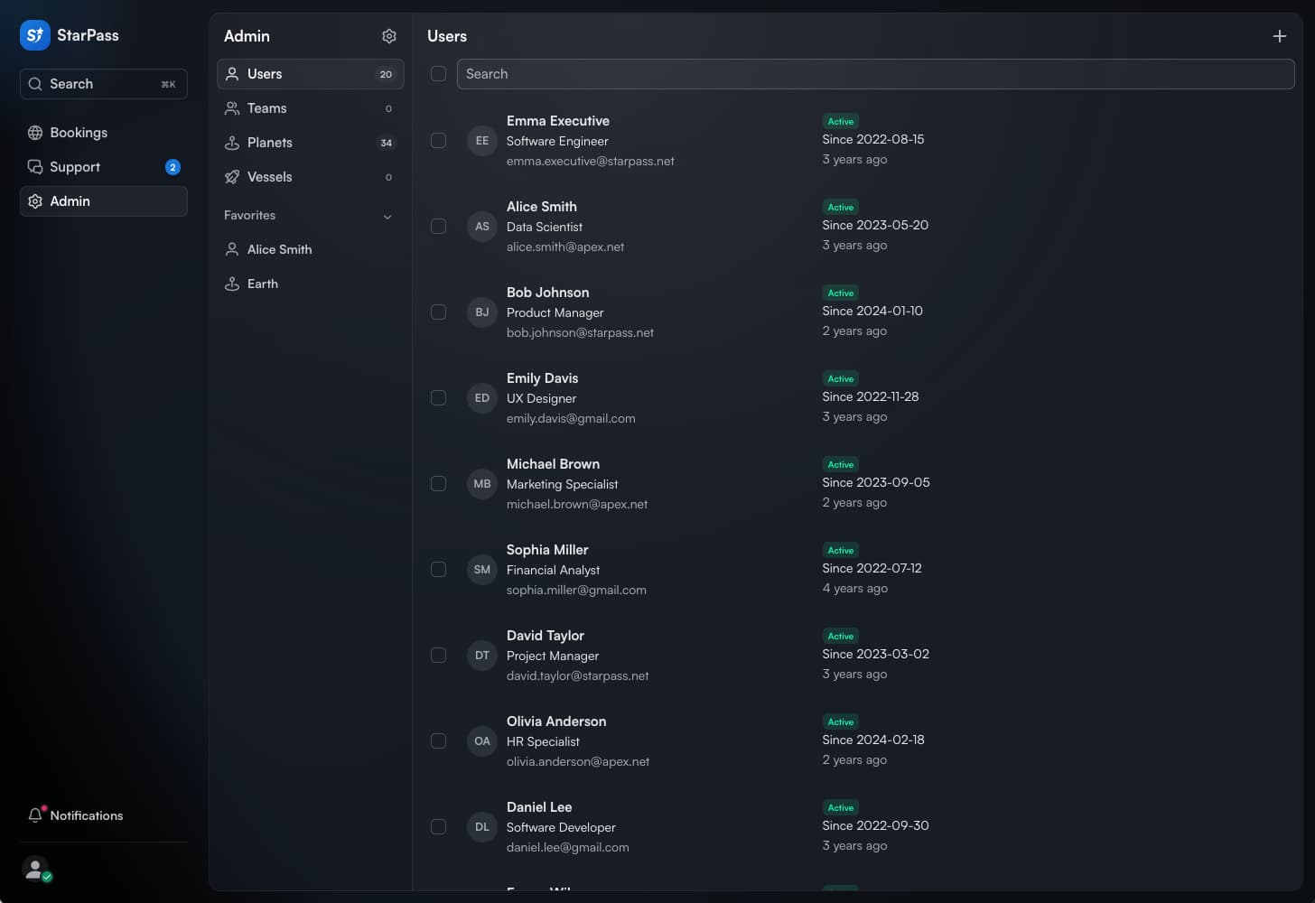
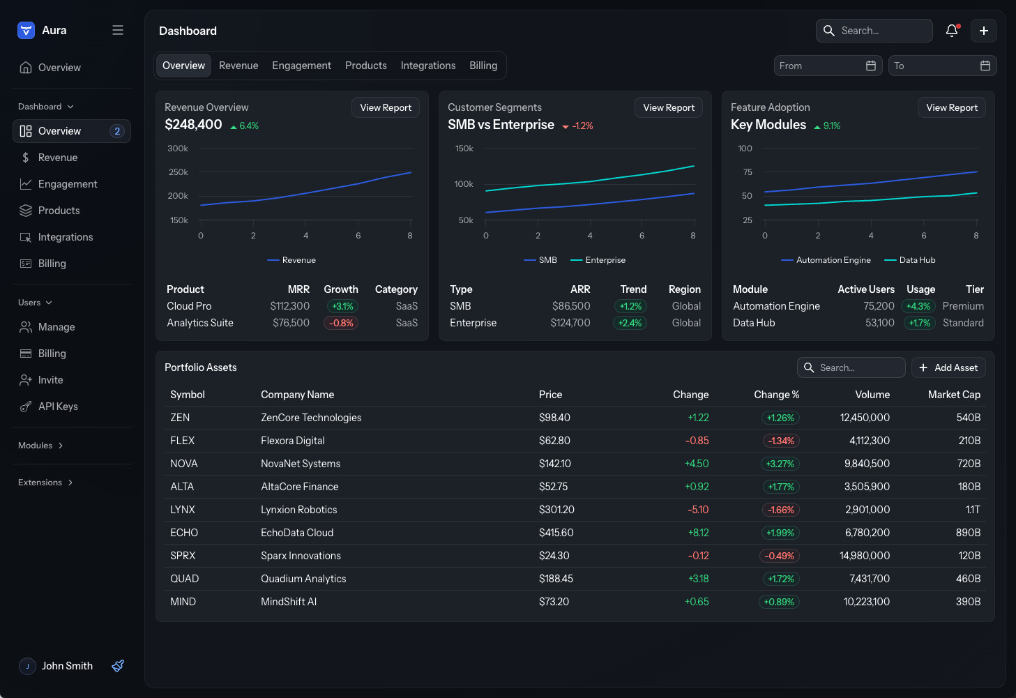
I think that many Vaadin users (maybe some vaadiners too?!) have been thinking for a year that Vaadin 25 was bringing the Aura theme to be very similar to the StarPass theme by default. The reality is that the stardard Aura is far away from StarPass and many devs have not enough skills/time to reach that level of UI. So, in my opinion at least a set of base CSS rule to provide to reach a StarPass similar theme would be really appreciated.
Nothing specific. It’s more the general look and feel, which in its default setting makes it almost seem as if the new theme hasn’t been applied. I’m using StarPass as a reference, because the new Aura theme was advertised based on that solution. My feeling is that if I start from scratch, using the default Aura theme, I’ll need a lot of CSS to get to the StarPass theme.
The rest is content and layout. The Master-Detail Layout is coming up, which helps, but we still need at least the “view layout” to make it easy to implement the common view scaffolding with the view title and content area with unified text styles and paddings.
The defaults in Aura are purposefully very neutral, as to not force too many opinions. I hope we’ll still get to offering many pre-made templates and themes to choose your starting point from, without forcing everyone to the same mold from the beginning.
That blue based variant looks nice, but still colorful enough, maybe I’ll make that the default in my utility library after all. Purple is maybe bit too pink for me
Is that gradient coming from AppLayout I don’t see that in my utility app.
No, it’s set on the <html> element. The gradient becomes more prominent the more saturated --aura-background-color-light (-dark) color you use (it’s less visible in dark mode). If you use a completely gray (unsaturated) color, there’s no gradient. You can also remove the gradient by overriding the --aura-app-background property.