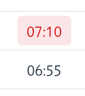
In the past we had a Span with a default text and if I wanted to show it as an error I added the theme liste badge error:
Now with the new Badge component it is not possible to have a normal text anymore, as new Badge() renders at least the blue style:
Can we have a BadgeVariant.NONE that renders like a normal Span?
Background is, that I want to have a Badge component that shows normal value span-like and changes badge style on conditions for example:
public class TimeComponent extends Badge {

    public TimeComponent(Duration time) {
        super(time.toString());

        if (time.isNegative()) {
            addThemeVariants(BadgeVariant.ERROR);
        }
    }
}
Or can I somehow remove the blue badge style in my constructor?
Unfortunately, the new Badge component is for this reason not a drop-in replacement for the old span based badge approach.
or, I suppose, inline it with Java: getStyle().set("--vaadin-badge-background", "transparent"); (but the former is better for your case where a lot of badges are rendered in a Grid, since the inline style doesn’t have to be repeated in the DOM for each row.
Alternatively, you could of course just render a Span where you don’t need badge styling at all, and apply the badge’s padding and font-size to it:
And to control the text color, you can use the --vaadin-badge-text-color property (e.g., to make it follow the body text color, use --vaadin-badge-text-color: var(--lumo-body-text-color);)