Hello,
i want to display a day planer for our team. Every person should have a row along the Y axis and the time is on the X axis. If a person has two overlapping appointments, i want to set 2 items in same row an different positions on Y axis. Is this possible?
I tried it with PlotOptionsGantt.setGrouping and the items get smaller, but they still overlap, because they are on the same height.
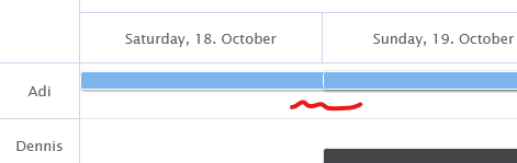
How it is:
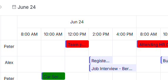
How it should be:
Hi, it’s possible. The trick is that grouping distributes different series within a category, so two items in the same series will always render at the same height. Put each overlapping item in its own GanttSeries, both pointing at the same row via setY(), and enable grouping explicitly (it isn’t on by default for gantt). I did a quick test:
YAxis yAxis = configuration.getyAxis();
yAxis.setCategories("Adi", "Dennis");

PlotOptionsGantt plotOptionsGantt = new PlotOptionsGantt();
plotOptionsGantt.setGrouping(true);
configuration.setPlotOptions(plotOptionsGantt);

// lane 0
GanttSeries lane0 = new GanttSeries();
GanttSeriesItem taskA = new GanttSeriesItem("Task A",
        Instant.parse("2014-10-20T00:00:00Z"),
        Instant.parse("2014-10-25T00:00:00Z"));
taskA.setY(0);              // row "Adi"
lane0.add(taskA);
configuration.addSeries(lane0);

// lane 1 - same row, rendered below
GanttSeries lane1 = new GanttSeries();
GanttSeriesItem taskB = new GanttSeriesItem("Task B",
        Instant.parse("2014-10-20T00:00:00Z"),
        Instant.parse("2014-10-23T00:00:00Z"));
taskB.setY(0);              // same row as Task A
lane1.add(taskB);
configuration.addSeries(lane1);
Both items start on the same date and render one above the other inside the “Adi” row.
Note that the number of lanes is global: with two series every row is split in two, even for a person with a single appointment, and bars get thinner as you add more series.
Another option, if you check the Highcharts documentation (Highcharts is the core of Vaadin Charts), is to use the XRange chart type with a categorized yAxis and the same one-series-per-lane approach. That works as well, but it comes with its own limitations: you lose the gantt-specific features that you might be using.
Hope this helps.
1 Like
