Content Overflow issue

Using vaadinplus KeyvaluePair I created some key value pair values. The problem is, the content is overflowing as shown in the image

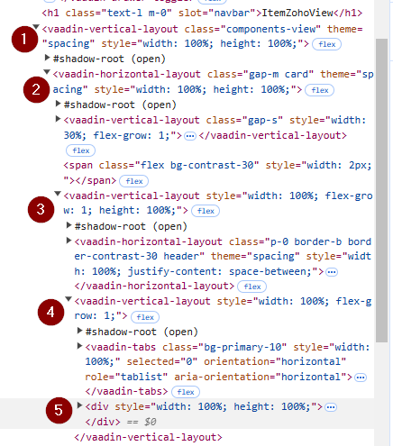
All parent layouts are set height = 100% and there is a scrollder as well in the brower right side but the content area is not extending automatically. What could be the issue?

Go through each layout and check for any height differences. If you’ve set each layout to 100% height, only the scroller’s content should have a different size.

This is how it looks initially.

When I click the tab overview, it gets several column values from DB and using KeyValuePair component I add it to a Div and show here like

I’ve checked all parent layouts and everything is set to 100% height. And starangely, once there is more content than the initial view size, it is overflowing and If I remove the root layout’s height, then it is working as expecting. IDK, how that is working

Difficult to say without looking at the code or the DOM.

image

Here is the dom

You’re mixing flex-grow and height: 100%. You probably want to use one or the other.

I think on some point you need to add overflow-y: auto; to enable vertical scrolling.

Ah, my bad.

I misunderstood “there is a scrollder” as if you were using the Scroller component.

You can use that or add LumoUtility.Overflow.AUTO using addClassName.

Yes, the Scroller component works pretty well

I just tested it yesterday with the vaadin plus profile example.

Looks having both values is not causing any issues and no difference. I removed one another but see same result

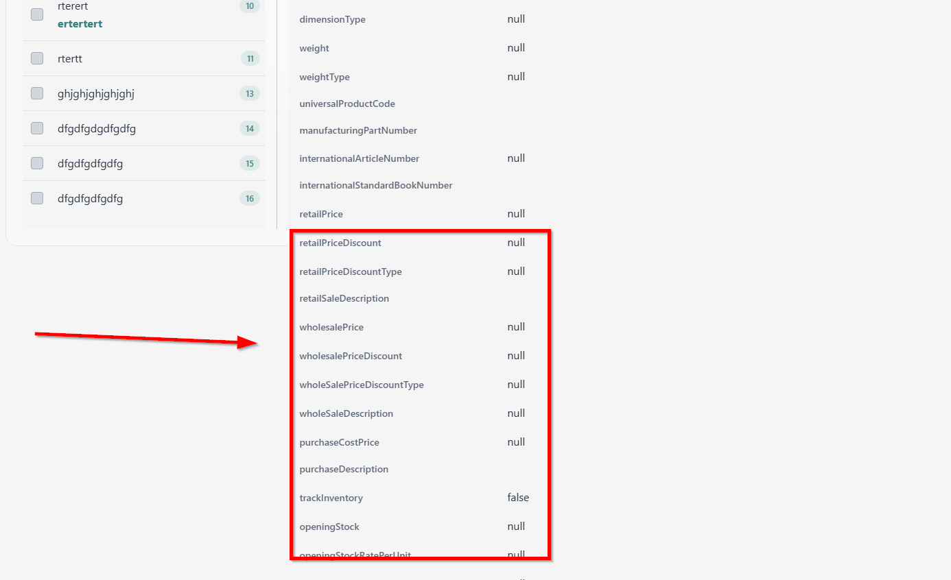
This one worked parially. The righ side one is auto expanding now. But the left side grid component stays in same size though it is also set to fullSize ( width = height = 100 % ). That one also should expand as the right side does

The left side is a VL and left side is also another VL. Both are inside a HL. All are set to fullSize.

When the right side VL is expanding, the left side also should also expand with the same size

This clue helped me to get this working as I wanted

<HorizontalLayout style={{ flexGrow: 1, display: 'flex' }}>
  <VerticalLayout style={{ flexGrow: 1, display: 'flex', alignItems: 'stretch' }}>
    {/* Content for the left VerticalLayout */}
    <Button>Left Button 1</Button>
    <Button>Left Button 2</Button>
  </VerticalLayout>

  <VerticalLayout style={{ flexGrow: 1, display: 'flex', alignItems: 'stretch' }}>
    {/* Content for the right VerticalLayout */}
    <Button>Right Button 1</Button>
    <Button>Right Button 2</Button>
  </VerticalLayout>
</HorizontalLayout>

image