Component arrangement horizontal

Hi everyone,

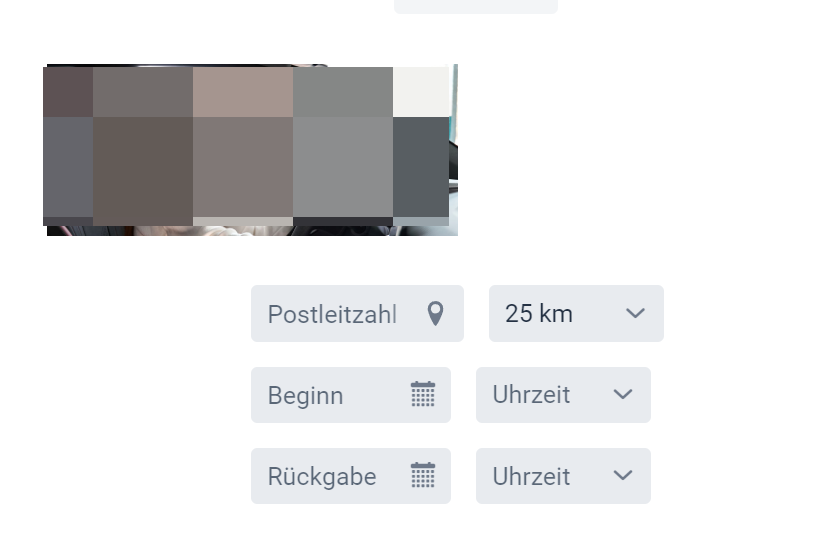
i have a Component which shows an image on the left and on the right are some inputs.

Currently i have it like the code below, but i think there must be a better way. On smaller devices the image gets not resized.

Has anyone a hint how to improve it?

 private Component createTop() {
        Div div = new Div();
        div.addClassNames(LumoUtility.Display.FLEX, LumoUtility.FlexWrap.WRAP, LumoUtility.FlexDirection.COLUMN,
                LumoUtility.FlexDirection.Breakpoint.Medium.ROW, LumoUtility.Gap.MEDIUM);
        div.setWidthFull();

        Image image = new Image("/images/banner2.png", "");
        image.setMaxWidth("50%");
        div.add(image);

        Div searchBox = new Div();
        searchBox.addClassNames(LumoUtility.FlexDirection.COLUMN);
        searchBox.getStyle().set("margin", "0 auto");

        searchBox.getStyle().setJustifyContent(Style.JustifyContent.CENTER);
        searchBox.getStyle().setAlignItems(Style.AlignItems.CENTER);
        searchBox.getStyle().setAlignSelf(Style.AlignSelf.CENTER);
        searchBox.getStyle().setTextAlign(Style.TextAlign.CENTER);

        searchBox.setMaxWidth("100%");

        HorizontalLayout horizontalLayoutCity = new HorizontalLayout();
        horizontalLayoutCity.add(tfZip, selectDistance);
        searchBox.add(horizontalLayoutCity);

        div.add(searchBox);
        return div;
    }

If you want to make that responsive with resizing, check this blog post: Building responsive layouts with Vaadin utility classes | Vaadin

Yeah that page i already read several times

i added following to my DIV to get it splited into a row on smaller screens, this works.

div.addClassNames(LumoUtility.Display.FLEX, LumoUtility.FlexWrap.WRAP, LumoUtility.FlexDirection.COLUMN,
LumoUtility.FlexDirection.Breakpoint.Medium.ROW, LumoUtility.Gap.MEDIUM);

The question i have is, that the image keept beeing small on small screens, but should be centered above the searchbox div

Think i got it! i had a setwidth(“50%”) at the Divs which reduced their size on small screens.

The mentioned page is a game changer and the only page you need to study when trying to understand how to make vaadin apps responsive, isnt it?

But one question @Tatu2 is there any advice when to use a div and when a layout?

I think both are same. The layout is just a conveneiet way to get the desited direction

1 Like

A Layout has a server-side Java API for controlling its behavior (and sensible defaults). A Div is a plain component container where it’s expected you use CSS to define the layout.