Table
The Table component is for presenting tabular
data organized in rows and columns. The Table
is one of the most versatile components in IT Mill Toolkit. It comes
in three styles: the default style allows scrolling the data with a
scrollbar, and list and
paging styles divide the rows of a table into
separate pages. Some of the settings for the
Table are specific to different styles, or
have different meaning, so these settings are detailed for the
particular styles in their respective subsections below. Table cells
can include text or arbitrary UI components. They can be editable,
for example clicking on a cell can change it to a text field for
editing.
The data contained in a Table is managed using
the Data Model of IT Mill Toolkit (see Chapter 7, Data Model), through the
Container interface of the
Table. This makes it possible to bind a table
directly to a data souce such as a database query. The rows of the
table are items in the container and the columns
are properties. Each table row (item) is
identified with an item identifier (IID), and
each column (property) with a property
identifier (PID).
When constructing a table, you first need to define columns with
addContainerProperty. This method comes in
two flavours. The simpler one takes the property ID of the column and
uses it also as the caption of the column. The more complex one
allows differing PID and header for the column. This may make, for
example, internationalization of table headers easier, because if a
PID is internationalized, the internationalization has to be used
everywhere where the PID is used. The complex form of the method also
allows defining an icon for the column from a resource.
import com.itmill.toolkit.ui.*;

public class TableExample extends CustomComponent {
    /* Create the table with a caption. */
    Table table = new Table("This is a Table");

    /* A layout needed for the example. */
    OrderedLayout layout = new OrderedLayout(OrderedLayout.ORIENTATION_VERTICAL);

    TableExample () {
        setCompositionRoot (layout);
        layout.addComponent(table);

        /* Define the names, data types, and default values of columns. */
        table.addContainerProperty("First Name", String.class, "(no first name)");
        table.addContainerProperty("Last Name", String.class, "(no last name)");
        table.addContainerProperty("Year", Integer.class, null);

        /* We use these entries to generate random items in a table. */
        final String[] firstnames = new String[]{"Donald", "Patty", "Sally", "Douglas"};
        final String[] lastnames  = new String[]{"Smith", "Jones", "Adams", "Knuth"};

        /* Add some items in the table and assign them an Item ID (IID). */
        for (int i=0; i<500; i++) {
            /* Add a randomly generated item in the Table. */
            table.addItem(new Object[]{firstnames[(int) (Math.random() * (firstnames.length-0.01))],
                                       lastnames [(int) (Math.random() * (lastnames.length-0.01))],
                                       (int) (1900+Math.random() * 100)}, i);
        }
    }
}
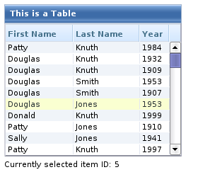
The Table allows selecting one or more
items. We user selects an item, the IID of the item will be set as
the property of the table and a
ValueChangeEvent is triggered. To enable
selection, you need to set the table
selectable. You will probably also need to set
it immediate, as we did above, because without
it, the change in the property will not be communicated immediately to
the server.
The following example shows how to enable selection of items in a
Table and how to handle
ValueChangeEvent events that are caused by
changes in selection.
/* Let us add an implementation of the ValueChangeListener interface. */
public class TableExample extends CustomComponent implements Property.ValueChangeListener {
...
TableExample () {
...
    /* Allow selecting a row in the table.
     * The selected item will be the property of the table. */
    table.setSelectable(true);

    /* By default, the change event is not communicated immediately
     * but only after some other event. */
    table.setImmediate(true);

    /* Listen for changes in the selection. */
    table.addListener(this);
}

/* Respond to change in the selection. */
public void valueChange(Property.ValueChangeEvent event) {
    /* The event.getProperty() returns the Item ID (IID) of the
     * currently selected item in the table. */
    status.setValue("Currently selected item ID: " + event.getProperty());
}
A table can also be in multiselect mode, where a
user can select and unselect any item by clicking on it. The mode is
enabled with the setMultiSelect() method of
the Select interface of
Table. Selecting an item triggers a
ValueChangeEvent, which will have as its
parameter an array of item identifiers.
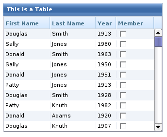
The entries in a Table can be any user
interface components, not just strings. The extended example below
includes a column with a checkbox, that is a
Button with
setSwitchMode() set to
true.
import com.itmill.toolkit.ui.*;

/* This example demonstrates use of a UI component,
 * namely a checkbox (Button), in a table column. */
public class TableExample3 extends CustomComponent {
    /* Create the table with a caption. */
    Table table = new Table("This is a Table");

    /* A layout needed for the example. */
    OrderedLayout layout = new OrderedLayout(OrderedLayout.ORIENTATION_VERTICAL);
    Label status = new Label("-");

    TableExample3 () {
        setCompositionRoot (layout);
        layout.addComponent(table);

        /* Define the names, data types, and default values of columns. */
        table.addContainerProperty("First Name", String.class, "(no first name)");
        table.addContainerProperty("Last Name", String.class, "(no last name)");
        table.addContainerProperty("Year", Integer.class, null);

        /* Add a column containing Button components.
         * Use differing PID (ismember) and column header ("Member"). */
        table.addContainerProperty("ismember", Button.class, null, "Member", null, null);

        /* We use these entries to generate random items in a table. */
        final String[] firstnames = new String[]{"Donald", "Patty", "Sally", "Douglas"};
        final String[] lastnames  = new String[]{"Smith", "Jones", "Adams", "Knuth"};

        /* Add some items in the table and assign them an Item ID (IID). */
        for (int i=0; i<500; i++) {
            /* Create a button and bind it to a button click listener method. */
            Button button = new Button("", this, "checkboxClick");

            /* Set the button to be a two-state checkbox. */
            button.setSwitchMode(true);

            /* Add a randomly generated item to the Table. */
            table.addItem(new Object[]{firstnames[(int) (Math.random() * (firstnames.length-0.01))],
                                       lastnames [(int) (Math.random() * (lastnames.length-0.01))],
                                       (int) (1900+Math.random() * 100),
                                       button}, i);
        }

        layout.addComponent(status);
    }

    public void checkboxClick(Button.ClickEvent event) {
        /* Notice that the event or the button does not know which item
         * the Button is in. */
        status.setValue("A button was clicked. New value:" + event.getButton().getValue());
    }
}
Notice that the event nor the Button object
itself does not know about the table or item it is included it.
Therefore the handling method must use some other means for finding
out the Item ID of the item. There are a few possibilities, such as
subclassing the Button and including the
identity information there, or by simply searching the table for the
item with the button, although that solution may not be scalable. The
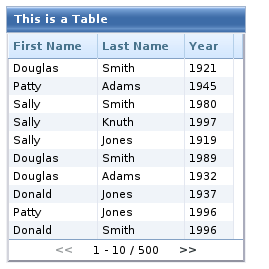
table of the example is shown in the figure below.
As the items in a Table are not indexed,
iterating over the items has to be done using an iterator. The
getItemIds() method of the
Container interface of
Table returns a
Collection of item identifiers over which you
can iterate using an Iterator. For an example
about iterating over a Table, please see the section called “Collecting items in Containers”. Notice that you may not modify
the Table during iteration, that is, add or
remove items. Changing the data is allowed.
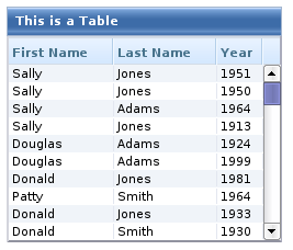
The default style for Table provides a
table with a scrollbar. The scrollbar is located at the right
side of the table and becomes visible when the number of items in
the table exceeds the page length. The page length can be set
with setPageLength() as with the other
styles that use actual pages. Only the visible part of the table
is loaded into browser and moving the visible window with the
scrollbar loads content from the server. While the data is being
loaded, a tooltip will be displayed that shows the current range
and total number of items in the table.
The default scrollable style supports most of the table
features. User can resize the columns by dragging their borders,
change the sorting by clicking on the column headers, collapse
the columns if columnCollapsingAllowed is
true, and reorder them if
columnReorderingAllowed is
true. You can set the column width of
individual columns with
setColumnWidth().
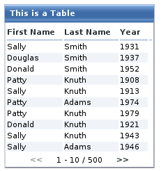
Tables with the paging style show the items as pages each
containing the number of items defined with
setPageLength(). A user can navigate the
pages using the forward and backward buttons at the bottom of the
table. The bottom row also shows the current visibly range.
The paging style does not support
setColumnReorderingAllowed() or
setColumnWidth() in IT Mill Toolkit
version 4.0.2.