Select
The Select component allows selecting one or
more items from a list of items. The items are
Item objects contained in a
Container. Styles and the selection mode
affect the appearance of the Select component
greatly. The default style is a drop-down list for single selection
and a multi-line list for multiselect mode, the
optiongroup style shows the items as a radio
button group for single selection and as check boxes for multiselec,
and the twincol style for multiselect shows
two lists side by side, where the user can select items from the list
on the left to the list on the right.
The component provides the current selection as an item identifier
from the Property interface of the component,
that is, as the value of the component. You can get the value, which
is an item identifier object, with
getValue() of the
Property interface. In multiselect mode, the
property will be an unmodifiable set of item identifiers. If no item
is selected, the property will be null in
single selection mode or an empty collection in multiselect mode.
The Select component will show "-" selection
when no actual item is selected. This is the null selection
item identifier. You can set an alternative ID with
setNullSelectionItemId. Setting the
alternative null ID is merely a visual text; the
getValue() will still return
null value if no item is selected, or an empty
set in multiselect mode.
New items are added with the addItem()
method, implemented for the Container
interface. The method takes the item identifier
(IID) object as a parameter, and by default uses the identifier also
as the caption of the item. The identifier is typically a
String. The addItem()
method also creates an empty Item, which
itself has little relevance in the Select
component, as the properties of an item are not used in any way by
the component.
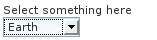
/* Create a Select component and add it to a layout. */
Select select = new Select ("Select something here");
main.addComponent(select);

/* Fill the component with some items. */
final String[] planets = new String[] {"Mercury", "Venus", "Earth", "Mars",
                                       "Jupiter", "Saturn", "Uranus", "Neptune"};
for (int i=0; i<planets.length; i++)
    select.addItem(planets[i]);
We could as well have added the item identifiers as integers, for example, and set the captions explicitly.
The item identifier of the currently selected item will be set as the
property of the Select object. You can
access it with the getValue method of the
Property interface of the component. Also,
when handling changes in a Select component
with the Property.ValueChangeListener
interface, the Property.ValueChangeEvent will
have the selected item as the property of the event, accessible with
getProperty method.
The item and its identifier can be of any object type. The caption
of the items can be retrieved from various sources, as defined with
the caption mode of the component, which you can set with the
setItemCaptionMode() method. The default
mode is
ITEM_CAPTION_MODE_EXPLICIT_DEFAULTS_ID. In
addition to a caption, an item can have an icon. The icon of an item
is set with setItemIcon().
Table 4.2. Caption Modes for Select Component
ITEM_CAPTION_MODE_EXPLICIT_DEFAULTS_ID |
This is the default caption mode and its flexibility
allows using it in most cases. By default, the item
identifier will be used as the caption. The caption
is retrieved with toString()
method of the item identifier object. If the caption
is specified explicitly with
setItemCaption(), it
overrides the item identifier.
|
ITEM_CAPTION_MODE_EXPLICIT |
Captions must be explicitly specified with
setItemCaption(). If they are
not, the caption will be empty. Such items with empty
captions will nevertheless be displayed in the
Select component as empty
rows. If they have an icon, they will be visible.
|
ITEM_CAPTION_MODE_ICON_ONLY | Only icons are shown, captions are hidden. Notice that icons are not supported in the themes in IT Mill Toolkit version 4 (see below). |
ITEM_CAPTION_MODE_ID |
String representation of the item identifier object is used as caption. This is useful when the identifier is actually an application specific object. For example: class Planet extends Object {
String planetName;
Planet (String name) {
planetName = name;
}
public String toString () {
return "The Planet " + planetName;
}
}
...
SelectExample (Application application) {
...
for (int i=0; i<planets.length; i++)
select.addItem(new Planet(planets[i]));
...
}
|
ITEM_CAPTION_MODE_INDEX |
Index number of item is used as caption. This caption
mode is applicable only to data sources that
implement the
Container.Indexed
interface. If the interface is not available, the
component will throw a
ClassCastException. The
Select component itself does
not implement this interface, so the mode is not
usable without a separate data source. A
IndexedContainer, for example,
would work.
|
ITEM_CAPTION_MODE_ITEM |
String representation of item,
acquired with toString(), is
used as the caption. This is applicable mainly when
using a custom Item class,
which also requires using a custom
Container that is used as a
data source for the Select
component.
|
ITEM_CAPTION_MODE_PROPERTY |
Item captions are read from the
String representation of the
property with the identifier specified with
setItemCaptionPropertyId(). This
is useful, for example, when you have a
Table component that you use
as the data source for the
Select, and you want to use a
specific table column for captions.
|
Notice that while the Select component allows
associating an icon with each item with
setItemIcon(), the icons are not supported
in the themes in IT Mill Toolkit version 4. This is because HTML does
not support images inside select elements. Icons
are also not really visually applicable for
optiongroup and twincol
styles.
The Select component allows for adding new
items by the user, with a user interface similar to combo boxes
in desktop user interfaces (HTML does not allow exactly identical
element). If the newItemsAllowed mode is
enabled with setNewItemsAllowed()
method, an text box for entering new items will be displayed
besides the selection component. Clicking on the "+" button adds
the item to the component.
The identifier of an item added by the user will be a
String object identical to the caption of
the item. You should take this into account if the item
identifier of automatically filled items is some other type or
otherwise not identical to the caption.
Adding new items is possible in both single and multiple
selection modes and in all styles. Adding new items may not be
possible if the Select is bound to an
external Container that does not allow
adding new items.
Setting the Select in multiple selection
mode with the setMultiSelect() method
changes the appearance to a scrollable list box. By holding the
Ctrl or Shift key pressed, the
user can select multiple items.
See also the behaviour of the component in
multiSelect mode with other styles
below. With the twincol style,
the selection is done by moving items from a list to a list of
selected items. With the optiongroup
style, the items are displayed as check boxes.
myselect.setMultiSelect(true);

In multiple selection mode, the property of a
Select object will be an array of
currently selected items.
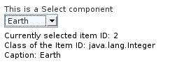
/* Let us add an implementation of the ValueChangeListener interface. */
public class SelectExample extends CustomComponent implements Property.ValueChangeListener {
    /* Create a Select object with a caption. */
    Select select = new Select("This is a Select component");

    OrderedLayout layout = new OrderedLayout(OrderedLayout.ORIENTATION_VERTICAL);
    Label status = new Label("-");

    SelectExample () {
        setCompositionRoot (layout);
        layout.addComponent(select);

        /* Fill the component with some items. */
        final String[] planets = new String[] {"Mercury", "Venus", "Earth", "Mars",
                                               "Jupiter", "Saturn", "Uranus", "Neptune"};
        for (int i=0; i<planets.length; i++)
            select.addItem(planets[i]);

        /* By default, the change event is not triggered immediately
         * when the selection changes. This enables it. */
        select.setImmediate(true);

        /* Listen for changes in the selection. */
        select.addListener(this);

        layout.addComponent(status);
    }

    /* Respond to change in the selection. */
    public void valueChange(Property.ValueChangeEvent event) {
        /* The event.getProperty() returns the Item ID (IID) of the
         * currently selected item in the component. */
        status.setValue("Currently selected item ID: " + event.getProperty());
    }
}
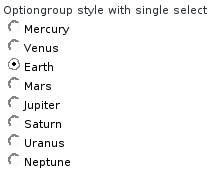
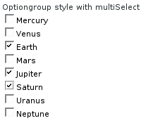
The optiongroup style of the
Select component shows the items as radio
buttons for single selection.
myselect.setStyle("optiongroup");
The optiongroup style of the
Select component shows the items as check
boxes when multiSelect mode is enabled.
Another way to use check boxes is to use the
switchMode mode of a
Button object to make it look like a check
box. See the section called “Check Box”. The
advantages of the Select component is that
it maintains the individual check box objects, you can get the
array of all currently selected items easily, and that you can
easily change the appearance of the component to another style.
myselect.setStyle("optiongroup");
myselect.setMultiSelect(true);
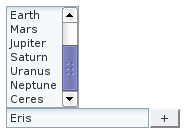
The twincol style of the
Select component enables a multiple selection
component that shows two lists side by side. The user can select
items from the list on the left and click on the ">>" button to
move them to the list on the right. Items can be moved back by
selecting them and clicking on the "<<" button.
myselect.setStyle("twincol");
myselect.setMultiSelect(true);
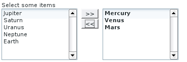
The component has little meaning for single selection.
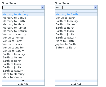
The Select component allows powerful dynamic
filtering of the items available for selection. The select component shows
like a combo box for entering text. The text entered in the input box will
be used for filtering the available items shown in a drop-down
list. Pressing Enter will complete the item in the input
box. Pressing Up- and Down-arrows can be
used for selecting an item from the drop-down list. The drop-down list is
paged and clicking on the scroll buttons, or moving with the keyboard,
will jump to the next or previous page. The shown items are loaded from
the server as needed, so the number of items held in the component can be
quite large.
Filters are classes that implement the OptionFilter
interface. IT Mill Toolkit provides two filters: the
ContainsFilter for matching any item that contains
the given string and StartsWithFilter for matching
items that begin with the given string.
The filtering mode of the Select component is
enabled with the setLazyLoading(true) method. It
changes the appearance of the item to include the text input field. The
filter may be set with setOptionFilter(), which
takes as a parameter an object that has the
OptionFilter interface. If the filter is not set,
the default filter (StartsWithFilter) will be used.
/* Create the Select component. */
Select select = new Select("Filter Select");

/* Enable Filter Select functionality with lazyLoading attribute. */
select.setLazyLoading(true);

/* Use a specific filter. */
select.setOptionFilter(new ContainsFilter(select));

/* Add some items in the component. */
String planets[] = new String[]{"Mercury", "Venus", "Earth", "Mars", "Jupiter", "Saturn"};
for (int i=0; i<planets.length; i++)
    for (int j=0; j<planets.length; j++)
        select.addItem(planets[i] + " to " + planets[j]);
The above example uses the ContainsFilter filter
that matches to all items containing the input string. As shown in Figure 4.15, “Filtered Selection” below, when we type some text in the
input area, the drop-down list will show all the matching items.
The FilterSelect demo of the IT Mill Toolkit Demo Application provides an
example of filtering of the items in Select
component. It also demontrates the creation of a custom filter.