19.4. Mobile User Interface Components
TouchKit introduces a number of components special to mobile device user interfaces.
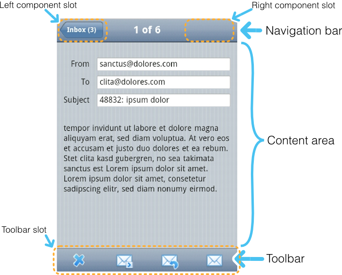
The NavigationView is a layout component that consists
of a navigation bar and a content area. The content area is scrollable, so
there is no need to use an inner panel component. In addition, there can be an
optional toolbar component at the bottom of the
view. A NavigationView is often used inside a
NavigationManager to get view change animations.
NavigationView has a full size by default. The content
area is expanding, so that it takes all the space left over from the navigation
bar and toolbar.
The navigation bar at the top of NavigationView is
a NavigationBar component. It has two component
slots, with one on the left and one on the right. The caption is displayed
in the middle. The NavigationBar can be used elsewhere
as well, such as for a view containing a form with save and cancel buttons
in the upper right and left corners.
When the NavigationBar is used for navigation and you
set the previous component with
setPreviousComponent(), the left slot is
automatically filled with a button. This is
done automatically if you use the NavigationView
inside a NavigationManager.
You can get access to the navigation bar component with
getNavigationBar() to use its manipulator methods
directly, but NavigationView also offers some
shorthand methods: setLeftComponent(),
setRightComponent(), and a setter and a getter
for the caption.
A slot for an optional toolbar is located at the bottom of the
NavigationView. The toolbar can be any component,
but a Toolbar component made for this purpose is
included in TouchKit. It is described in Section 19.4.2, “Toolbar”. You could also use a
HorizontalLayout or
CssLayout.
You usually fill the tool bar with Button
components with an icon and no textual caption. You set the toolbar with
setToolbar().
.v-touchkit-navview { }
  .v-touchkit-navview-wrapper {}
  .v-touchkit-navview-toolbar {}
.v-touchkit-navview .v-touchkit-navview-notoolbar {}
The root element has the v-touchkit-navview class. The
content area is wrapped inside a
v-touchkit-navview-wrapper element. If the view has a
toolbar, the toolbar slot has the
v-touchkit-navview-toolbar style, but if not, the
top-level element has the v-touchkit-navview-notoolbar
style.
The Toolbar is a layout component that extends
CssLayout, usually containing
Button components. The toolbar has by default 100%
horizontal width and a fixed height. The components are spread evenly
in the horizontal direction. Toolbar is typically used
in a NavigationView, as described in Section 19.4.1.
For a description of the inherited features, please refer to Section 6.3, “VerticalLayout and HorizontalLayout”.
The NavigationManager is a visual effect component that
gives sliding animation when switching between views. You can register
three components: the currently displayed component,
the previous one on the left, and the next component on the right. You can set
these components with setCurrentComponent(),
setPreviousComponent(), and
setNextComponent(), respectively.
The NavigationManager component is illustrated in Figure 19.2, “NavigationManager with Three NavigationViews”.
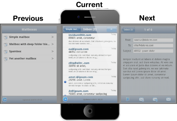
The navigation manager is important for responsiveness, because the previous and next components are cached and the slide animation started before server is contacted to load the new next or previous views.
Switching between the views is done programmatically according to user interaction; swipe gestures are not supported at the moment.
While you can put any components in the manager, some special features are
enabled when using the NavigationView. When a view
becomes visible, the onBecomingVisible() method
in the view is called. You can override it, just remember to call the
superclass method.
@Override
protected void onBecomingVisible() {
    super.onBecomingVisible();

    ...
}
NavigationManager also handles
breadcrumb tracking. The
navigateTo() pushes the current view on the top
of the breadcrumb stack and navigateBack() can be
called to return to the previous breadcrumb level.
Notice that calling navigateTo() with the
"previous" component is equivalent to calling
navigateBack().
The NavigationButton is a special version of the
regular Button designed for navigation inside a
NavigationManager, as described in Section 19.4.3. Clicking the button will automatically navigate to
the defined target view. The view change animation does not need to make a
server request first, but starts immediately after clicking the button. If you
leave the target view empty, an empty placeholder view is shown in the
animation. The view is filled after it gets the content from the server.
You can give the target view either in the constructor or with
setTargetView().
NavigationView view = new NavigationView("A View");
...
NavigationButton button = new NavigationButton("Click");
button.setTargetView(view);
...
Notice that the automatic navigation will only work if the button is inside a
NavigationManager (in a view inside it). If you just
want to use the button as a visual element, you can use it like a regular
Button and handle the click events with a
ClickListener.
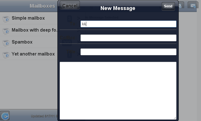
Popover is much like a regular Vaadin sub-window,
useful for quickly displaying some options or a small form related to an
action. Unlike regular sub-windows, it does not support dragging or resizing
by the user. It can have a caption, but usually does not. As sub-windows
usually require a rather large screen size, the Popover
is mainly applicable to tablet devices. When used on smaller devices, such as
phones, the Popover automatically fills the entire
screen.
In the following example, we extend Popover to use it. It
is modal by default. Notice that the screen size is not available in the
constructor, so we have to postpone using it to the
attach() method.
Popover windows are added to an application-level Window
object with addWindow(), just like sub-windows in a
regular Vaadin application.
if (event.getButton() == emailButton) {
    ComposeView composeView = new ComposeView(smartphone);
    getWindow().addWindow(composeView);
    return;
}
The resulting user interface in a tablet device is shown in Figure 19.3, “Popover in a Tablet Device”.
Alternatively, you can call the showRelativeTo(),
which displays the sub-window relative to an existing component in the user
interface.
Popover popover = new Popover();
popover.setContent(mailboxHierarchyView);
popover.setClosable(true);
popover.showRelativeTo(showMailboxHierarchyButton);
popover.setHeight(getParent().getHeight() - 100, UNITS_PIXELS);
In this case, you should not call addWindow()
explicitly.
.v-touchkit-popover .v-touchkit-fullscreen { }
  .v-touchkit-popover .v-touchkit-relative { }
  .v-touchkit-popover .v-touchkit-plain { }
The component has an overall v-touchkit-popover style. If
full-screen, it also has the v-touchkit-fullscreen style, if
positioned relatively it has v-touchkit-relative, and if not,
the v-touchkit-plain style.
The Switch component is a
CheckBox that looks like the switch button in Apple
iOS.
Switch switch = new Switch();
switch.setCaption("Do I look like iOS?");
layout.addComponent(switch);
The VerticalComponentGroup is a layout component for grouping
components in the vertical stack. The most typical use of the
VerticalComponentGroup is to make vertical navigation menus
containing NavigationButtons for the mobile application.
The VerticalComponentGroup and
HorizontalComponentGroup both extend
AbstractComponentGroup which is inherited from the
AbstractComponentContainer.
In the client side both component group widgets are extending the lightweigth
FlowPanel.
The HorizontalComponentGroup is mainly intended to group buttons
inside the VerticalComponentGroup slots.
HorizontalComponentGroup horizontalCGroup = new HorizontalComponentGroup();
horizontalCGroup.addComponent(new Button("First"));
horizontalCGroup.addComponent(new Button("Another"));

NavigationButton navButton = new NavigationButton();
button.setIcon(new ThemeResource("../runo/icons/32/ok.png"));

VerticalComponentGroup verticalCGroup = new VerticalComponentGroup();
verticalCGroup.setMargin(true);

verticalCGroup.addComponent(horizontalCGroup);
verticalCGroup.addComponent(new Button("Button"));
verticalCGroup.addComponent(new TextField("TF's caption"));
verticalCGroup.addComponent(navButton);
The TabBarView is a layout component that consist of
a tab bar and content area. Each tab will have it's own content area which
will be displayed when a correspoding tab is selected. TabBarView is inherited
from the ComponentContainer but uses it's own specialized
API for monipulating tabs. removeComponent() and
addComponent() will throw an
UnsupportedOperationException if used.
TabBarView bar = new TabBarView();

//Create some Vaadin Component to use as content
Label content = new Label("Really simple content");

//Create a tab for it
Tab tab = bar.addTab(label);

//Set tab name and/or icon
tab.setCaption("tab name");
tab.setIcon(new ThemeResource(...));

//Programmatically modify tab bar
Tab selectedTab = bar.getSelectedTab();
bar.setSelectedTab(selectedTab); //same as user clicking the tab
bar.removeTab(selectedTab);
The EmailField is just like the regular
TextField, except that it has automatic capitalization
and correction turned off. Mobile devices also recognize the field as an email
field and can offer a virtual keyboard for the purpose, so that it includes
the at (@) and period (.) characters,
and possibly a shorthand for .com.
The NumberField is just like the regular
TextField, except that it is marked as a numeric input
field for mobile devices, so that they will show a numeric virtual keyboard
rather than the default alphanumeric.
The UrlField is just like the regular
TextField, except that it is marked as a URL input
field for mobile devices, so that they will show a URL input virtual keyboard
rather than the default alphanumeric. It has convenience methods
getUrl() and setUrl(URL url)
for converting input value from and to java.net.URL.