6.7. HorizontalSplitPanel and VerticalSplitPanel
HorizontalSplitPanel and
VerticalSplitPanel are a two-component containers that
divide the available space into two areas to accomodate the two
components. HorizontalSplitPanel makes the split
horizontally with a vertical splitter bar, and
VerticalSplitPanel vertically with a horizontal
splitter bar. The user can drag the bar to adjust its position.
You can set the two components with the
setFirstComponent() and
setSecondComponent() methods, or with the regular
addComponent() method.
 |
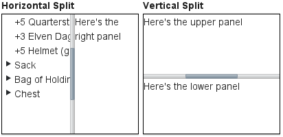
// Have a panel to put stuff in
Panel panel = new Panel("Split Panels Inside This Panel");

// Have a horizontal split panel as its root layout
HorizontalSplitPanel hsplit = new HorizontalSplitPanel();
panel.setContent(hsplit);

// Put a component in the left panel
Tree tree = new Tree("Menu", TreeExample.createTreeContent());
hsplit.setFirstComponent(tree);

// Put a vertical split panel in the right panel
VerticalSplitPanel vsplit = new VerticalSplitPanel();
hsplit.setSecondComponent(vsplit);

// Put other components in the right panel
vsplit.addComponent(new Label("Here's the upper panel"));
vsplit.addComponent(new Label("Here's the lower panel"));
The result is shown in Figure 6.10, “HorizontalSplitPanel and VerticalSplitPanel”. Observe that
the tree is cut horizontally as it can not fit in the layout. If its height
exceeds the height of the panel, a vertical scroll bar will appear
automatically. If horizontal scroll bar is necessary, you could put the
content in a Panel, which can have scroll bars in both
directions.
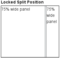
You can set the split position with
setSplitPosition(). It accepts any units defined in
the Sizeable interface, with percentual size relative
to the size of the component.
|
// Have a horizontal split panel
HorizontalSplitPanel hsplit = new HorizontalSplitPanel();
hsplit.setFirstComponent(new Label("75% wide panel"));
hsplit.setSecondComponent(new Label("25% wide panel"));

// Set the position of the splitter as percentage
hsplit.setSplitPosition(75, Sizeable.UNITS_PERCENTAGE);
Another version of the setSplitPosition() method
allows leaving out the unit, using the same unit as previously. The method
also has versions take take a boolean parameter,
reverse, which allows defining the size of the right or
bottom panel instead of the left or top panel.
The split bar allows the user to adjust the split position by dragging the bar
with mouse. To lock the split bar, use
setLocked(true). When locked, the move handle in the
middle of the bar is disabled.
// Lock the splitter
hsplit.setLocked(true);
Setting the split position programmatically and locking the split bar is illustrated in Figure 6.11, “A Layout With Nested SplitPanels”.
Notice that the size of a split panel must not be undefined in the split direction.
/* For a horizontal SplitPanel. */
.v-splitpanel-horizontal {}
.v-splitpanel-hsplitter {}
.v-splitpanel-hsplitter-locked {}

/* For a vertical SplitPanel. */
.v-splitpanel-vertical {}
.v-splitpanel-vsplitter {}
.v-splitpanel-vsplitter-locked {}

/* The two container panels. */
.v-splitpanel-first-container {}  /* Top or left panel. */
.v-splitpanel-second-container {} /* Bottom or right panel. */
The entire split panel has the style
v-splitpanel-horizontal or
v-splitpanel-vertical, depending on the panel direction. The
split bar or splitter between the two content panels
has either the ...-splitter or
...-splitter-locked style, depending on whether its
position is locked or not.