6.8. TabSheet
The TabSheet is a multicomponent container that
allows switching between the components with "tabs". The tabs are
organized as a tab bar at the top of the tab sheet. Clicking on a tab
opens its contained component in the main display area of the layout.
You add new tabs to a tab sheet with the addTab()
method. The simple version of the method takes as its parameter the root
component of the tab. You can use the root component to retrieve its
corresponding Tab object. Typically, you put a layout
component as the root component.
// Create an empty tab sheet.
TabSheet tabsheet = new TabSheet();

// Create a component to put in a tab and put
// some content in it.
VerticalLayout myTabRoot = new VerticalLayout();
myTabRoot.addComponent(new Label("Hello, I am a Tab!"));

// Add the component to the tab sheet as a new tab.
tabsheet.addTab(myTabRoot);

// Get the Tab holding the component and set its caption.
tabsheet.getTab(myTabRoot).setCaption("My Tab");
Each tab in a tab sheet is represented as a Tab object,
which manages the tab caption, icon, and attributes such as hidden and
visible. You can set the caption with setCaption()
and the icon with setIcon(). If the component added
with addTab() has a caption or icon, it is used as
the default for the Tab object. However, changing the
attributes of the root component later does not affect the tab, but you must
make the setting through the Tab object. The
addTab() returns the new Tab
object, so you can easily set an attribute using the reference.
// Set an attribute using the returned reference
tabsheet.addTab(myTab).setCaption("My Tab");
You can also give the caption and the icon as parameters for the
addTab() method. The following example demonstrates
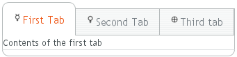
the creation of a simple tab sheet, where each tab shows a different
Label component. The tabs have an icon, which are (in
this example) loaded as Java class loader resources from the application.
TabSheet tabsheet = new TabSheet();

// Make the tabsheet shrink to fit the contents.
tabsheet.setSizeUndefined();

tabsheet.addTab(new Label("Contents of the first tab"),
          "First Tab",
          new ClassResource("images/Mercury_small.png", this));
tabsheet.addTab(new Label("Contents of the second tab"),
          "Second Tab",
          new ClassResource("images/Venus_small.png", this));
tabsheet.addTab(new Label("Contents of the third tab"),
          "Third tab",
          new ClassResource("images/Earth_small.png", this));
The hideTabs() method allows hiding the tab bar
entirely. This can be useful in tabbed document interfaces (TDI) when there is
only one tab. An individual tab can be made invisible by setting
setVisible(false) for the Tab
object. A tab can be disabled by setting
setEnabled(false).
Clicking on a tab selects it. This fires a
TabSheet.SelectedTabChangeEvent, which you can handle
by implementing the TabSheet.SelectedTabChangeListener
interface. The source component of the event, which you can retrieve with
getSource() method of the event, will be the
TabSheet component. You can find the currently selected
tab with getSelectedTab() and select (open) a
particular tab programmatically with
setSelectedTab(). Notice that also adding the first
tab fires the SelectedTabChangeEvent, which may cause
problems in your handler if you assume that everything is initialized before
the first change event.
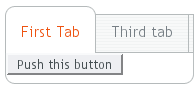
The example below demonstrates handling TabSheet
related events and enabling and disabling tabs. The sort of logic used in
the example is useful in sequential user interfaces, often called
wizards, where the user goes through the tabs one by
one, but can return back if needed.
import com.vaadin.ui.*;
import com.vaadin.ui.Button.ClickEvent;
import com.vaadin.ui.TabSheet.SelectedTabChangeEvent;

public class TabSheetExample extends CustomComponent implements
      Button.ClickListener, TabSheet.SelectedTabChangeListener {
    TabSheet tabsheet = new TabSheet();
    Button tab1 = new Button("Push this button");
    Label tab2 = new Label("Contents of Second Tab");
    Label tab3 = new Label("Contents of Third Tab");

    TabSheetExample() {
        setCompositionRoot(tabsheet);

        // Listen for changes in tab selection.
        tabsheet.addListener(this);

        // First tab contains a button, for which we
        // listen button click events.
        tab1.addListener(this);

        // This will cause a selectedTabChange() call.
        tabsheet.addTab(tab1, "First Tab", null);

        // A tab that is initially invisible.
        tabsheet.addTab(tab2, "Second Tab", null);
        tabsheet.getTab(tab2).setVisible(false);

        // A tab that is initially disabled.
        tabsheet.addTab(tab3, "Third tab", null);
        tabsheet.getTab(tab3).setEnabled(false);
    }

    public void buttonClick(ClickEvent event) {
        // Enable the invisible and disabled tabs.
    	tabsheet.getTab(tab2).setVisible(true);
    	tabsheet.getTab(tab3).setEnabled(true);

        // Change selection automatically to second tab.
        tabsheet.setSelectedTab(tab2);
    }

    public void selectedTabChange(SelectedTabChangeEvent event) {
        // Cast to a TabSheet. This isn't really necessary in
    	// this example, as we have only one TabSheet component,
    	// but would be useful if there were multiple TabSheets.
        final TabSheet source = (TabSheet) event.getSource();

        if (source == tabsheet) {
            // If the first tab was selected.
            if (source.getSelectedTab() == tab1) {
                // The 2. and 3. tabs may not have been set yet.
                if (tabsheet.getTab(tab2) != null
                    && tabsheet.getTab(tab3) != null) {
            	    tabsheet.getTab(tab2).setVisible(false);
                    tabsheet.getTab(tab3).setEnabled(false);
                }
            }
        }
    }
}
.v-tabsheet {}
.v-tabsheet-tabs {}
.v-tabsheet-content {}
.v-tabsheet-deco {}
.v-tabsheet-tabcontainer {}
.v-tabsheet-tabsheetpanel {}
.v-tabsheet-hidetabs {}

.v-tabsheet-scroller {}
.v-tabsheet-scrollerPrev {}
.v-tabsheet-scrollerNext {}
.v-tabsheet-scrollerPrev-disabled{}
.v-tabsheet-scrollerNext-disabled{}

.v-tabsheet-tabitem {}
.v-tabsheet-tabitem-selected {}
.v-tabsheet-tabitemcell {}
.v-tabsheet-tabitemcell-first {}

.v-tabsheet-tabs td {}
.v-tabsheet-spacertd {}
The entire tabsheet has the v-tabsheet style.
A tabsheet consists of three main parts: the tabs on the top, the
main content pane, and decorations around the tabsheet.
The tabs area at the top can be styled with
v-tabsheet-tabs,
v-tabsheet-tabcontainer and
v-tabsheet-tabitem*.
The style v-tabsheet-spacertd is used for any
empty space after the tabs. If the tabsheet has too little space to
show all tabs, scroller buttons enable browsing the full tab list.
These use the styles v-tabsheet-scroller*.
The content area where the tab contents are shown can be styled with
v-tabsheet-content, and the surrounding decoration
with v-tabsheet-deco.