6.4. GridLayout
GridLayout container lays components out on a grid,
defined by the number of columns and rows. The columns and rows of the grid
serve as coordinates that are used for laying out components on the grid. Each
component can use multiple cells from the grid, defined as an area
(x1,y1,x2,y2), although they typically take up only a single grid cell.
The grid layout maintains a cursor for adding components in left-to-right, top-to-bottom order. If the cursor goes past the bottom-right corner, it will automatically extend the grid downwards by adding a new row.
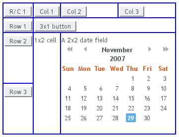
The following example demonstrates the use of
GridLayout. The
addComponent takes a component and optional
coordinates. The coordinates can be given for a single cell or for an area
in x,y (column,row) order. The coordinate values have a base value of
0. If coordinates are not given, the cursor will be used.
// Create a 4 by 4 grid layout.
GridLayout grid = new GridLayout(4, 4);
grid.addStyleName("example-gridlayout");

// Fill out the first row using the cursor.
grid.addComponent(new Button("R/C 1"));
for (int i = 0; i < 3; i++) {
    grid.addComponent(new Button("Col " + (grid.getCursorX() + 1)));
}

// Fill out the first column using coordinates.
for (int i = 1; i < 4; i++) {
    grid.addComponent(new Button("Row " + i), 0, i);
}

// Add some components of various shapes.
grid.addComponent(new Button("3x1 button"), 1, 1, 3, 1);
grid.addComponent(new Label("1x2 cell"), 1, 2, 1, 3);
InlineDateField date = new InlineDateField("A 2x2 date field");
date.setResolution(DateField.RESOLUTION_DAY);
grid.addComponent(date, 2, 2, 3, 3);
The resulting layout will look as follows. The borders have been made visible to illustrate the layout cells.
A component to be placed on the grid must not overlap with existing
components. A conflict causes throwing a
GridLayout.OverlapsException.
You can define the size of both a grid layout and its components in either fixed or percentual units, or leave the size undefined altogether, as described in Section 5.3.9, “Sizing Components”. Section 6.12.1, “Layout Size” gives an introduction to sizing of layouts.
The size of the GridLayout component is
undefined by default, so it will shrink to fit the size of the
components placed inside it. In most cases, especially if you set a
defined size for the layout but do not set the contained components to
full size, there will be some unused space. The position of the
non-full components within the grid cells will be determined by their
alignment. See Section 6.12.2, “Layout Cell Alignment” for details on how to align the
components inside the cells.
The components contained within a GridLayout
layout can be laid out in a number of different ways depending on how
you specify their height or width. The layout options are similar to
HorizontalLayout and
VerticalLayout, as described in Section 6.3, “VerticalLayout and HorizontalLayout”.
A layout that contains components with percentual size must have a defined size!
If a layout has undefined size and a contained component has, say, 100% size, the component would fill the space given by the layout, while the layout would shrink to fit the space taken by the component, which is a paradox. This requirement holds for height and width separately. The debug mode allows detecting such invalid cases; see Section 12.4.1, “Debug Mode”.
Often, you want to have one or more rows or columns that take all the
available space left over from non-expanding rows or columns. You need
to set the rows or columns as expanding with
setRowExpandRatio() and
setColumnExpandRatio(). The first parameter
for these methods is the index of the row or column to set as
expanding. The second parameter for the methods is an expansion ratio,
which is relevant if there are more than one expanding row or column,
but its value is irrelevant if there is only one. With multiple
expanding rows or columns, the ratio parameter sets the relative
portion how much a specific row/column will take in relation with the
other expanding rows/columns.
GridLayout grid = new GridLayout(3,2);

// Layout containing relatively sized components must have
// a defined size, here is fixed size.
grid.setWidth("600px");
grid.setHeight("200px");

// Add some content
String labels [] = {
        "Shrinking column<br/>Shrinking row",
        "Expanding column (1:)<br/>Shrinking row",
        "Expanding column (5:)<br/>Shrinking row",
        "Shrinking column<br/>Expanding row",
        "Expanding column (1:)<br/>Expanding row",
        "Expanding column (5:)<br/>Expanding row"
};
for (int i=0; i<labels.length; i++) {
    Label label = new Label(labels[i], Label.CONTENT_XHTML);
    label.setWidth(null); // Set width as undefined
    grid.addComponent(label);
}

// Set different expansion ratios for the two columns
grid.setColumnExpandRatio(1, 1);
grid.setColumnExpandRatio(2, 5);

// Set the bottom row to expand
grid.setRowExpandRatio(1, 1);

// Align and size the labels.
for (int col=0; col<grid.getColumns(); col++) {
    for (int row=0; row<grid.getRows(); row++) {
        Component c = grid.getComponent(col, row);
        grid.setComponentAlignment(c, Alignment.TOP_CENTER);

        // Make the labels high to illustrate the empty
        // horizontal space.
        if (col != 0 || row != 0)
            c.setHeight("100%");
    }
}
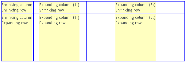
If the size of the contained components is undefined or fixed, the
expansion ratio is of the excess space, as in
Figure 6.5, “Expanding Rows and Columns in GridLayout” (excess
horizontal space is shown in white). However, if the size of the all the
contained components in the expanding rows or columns is defined as a
percentage, the ratio is calculated from the
overall space available for the percentually
sized components. For example, if we had a 100 pixels wide grid layout
with two columns with 1.0 and 4.0 respective expansion ratios, and all
the components in the grid were set as
setWidth("100%"), the columns would have
respective widths of 20 and 80 pixels, regardless of the minimum size
of their contained components.
.v-gridlayout {}
.v-gridlayout-margin {}
The v-gridlayout is the root element of the
GridLayout component. The
v-gridlayout-margin is a simple element inside it
that allows setting a padding between the outer element and the cells.
For styling the individual grid cells, you should style the components
inserted in the cells. The implementation structure of the grid can
change, so depending on it, as is done in the example below, is not
generally recommended. Normally, if you want to have, for example, a
different color for a certain cell, just make set the component inside
it setSizeFull(), and add a style name for
it. Sometimes you may need to use a layout component between a cell
and its actual component just for styling.
The following example shows how to make the grid borders visible, as
in Figure 6.5, “Expanding Rows and Columns in GridLayout”.
.v-gridlayout-gridexpandratio {
    background: blue; /* Creates a "border" around the grid. */
    margin:     10px; /* Empty space around the layout. */
}

/* Add padding through which the background color shows. */
.v-gridlayout-gridexpandratio .v-gridlayout-margin {
    padding: 2px;
}

/* Add cell borders and make the cell backgrounds white.
 * Warning: This depends heavily on the HTML structure. */
.v-gridlayout-gridexpandratio > div > div > div {
    padding:    2px;   /* Layout background will show through. */
    background: white; /* The cells will be colored white. */
}

/* Components inside the layout are a safe way to style cells. */
.v-gridlayout-gridexpandratio .v-label {
    text-align: left;
    background: #ffffc0; /* Pale yellow */
}
You should beware of margin,
padding, and border settings in
CSS as they can mess up the layout. The dimensions of layouts are
calculated in the Client-Side Engine of Vaadin and some
settings can interfere with these calculations. For more information,
on margins and spacing, see Section 6.12.3, “Layout Cell Spacing”
and Section 6.12.4, “Layout Margins”