Grid
- Overview
- Binding to Data
- Handling Selection Changes
- Configuring Columns
- Generating Columns
- Column Renderers
- Header and Footer
- Sorting
- Editing Items Inside Grid
- Drag and Drop of Rows
- Generating Row or Cell Styles
- Styling with CSS
Overview
Grid is for displaying and editing tabular data laid out in rows and columns. At the top, a header can be shown, and a footer at the bottom. In addition to plain text, the header and footer can contain HTML and components. Having components in the header allows implementing filtering easily. The grid data can be sorted by clicking on a column header; shift-clicking a column header enables secondary sorting criteria.
The data area can be scrolled both vertically and horizontally. The leftmost columns can be frozen, so that they are never scrolled out of the view. The data is loaded lazily from the server, so that only the visible data is loaded. The smart lazy loading functionality gives excellent user experience even with low bandwidth, such as mobile devices.
|
Tip
| Watch the Vaadin 8: Data Providers and Grid free training video to learn more about the DataProvider API, Grid, sorting and filtering. |
The grid data can be edited with a row-based editor after double-clicking a row. The fields are set explicitly, and bound to data.
Grid is fully themeable with CSS and style names can be set for all grid elements. For data rows and cells, the styles can be generated with a row or cell style generator.
Binding to Data
Grid is normally used by binding it to a data provider, described in "Showing Many Items in a Listing". By default, it is bound to List of items. You can set the items with the setItems() method.
For example, if you have a list of beans, you show them in a Grid as follows
Source code
Java
// Have some data
List<Person> people = Arrays.asList(
    new Person("Nicolaus Copernicus", 1543),
    new Person("Galileo Galilei", 1564),
    new Person("Johannes Kepler", 1571));

// Create a grid bound to the list
Grid<Person> grid = new Grid<>();
grid.setItems(people);
grid.addColumn(Person::getName).setCaption("Name");
grid.addColumn(Person::getBirthYear).setCaption("Year of birth");

layout.addComponent(grid);
Handling Selection Changes
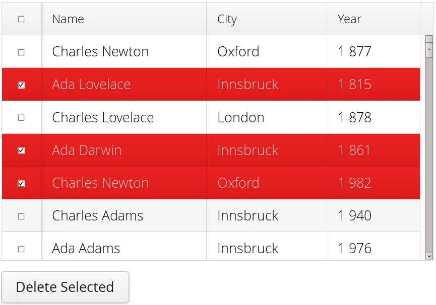
Selection in Grid is handled a bit differently from other selection components, as it is not a HasValue. Grid supports single, multiple, or no-selection, each defined by a specific selection model. Each selection model has a specific API depending on the type of the selection.
For basic usage, switching between the built-in selection models is possible by using the setSelectionMode(SelectionMode). Possible options are SINGLE (default), MULTI, or NONE.
Listening to selection changes in any selection model is possible with a SelectionListener, which provides a generic SelectionEvent which for getting the selected value or values. Note that the listener is actually attached to the selection model and not the grid, and will stop getting any events if the selection mode is changed.
Source code
Java
Grid<Person> grid = new Grid<>();

// switch to multiselect mode
grid.setSelectionMode(SelectionMode.MULTI);

grid.addSelectionListener(event -> {
    Set<Person> selected = event.getAllSelectedItems();
    Notification.show(selected.size() + " items selected");
});
Programmatically selecting the value is possible via select(T). In multiselect mode, this will add the given item to the selection.
Source code
Java
// in single-select, only one item is selected
grid.select(defaultPerson);

// switch to multi select, clears selection
grid.setSelectionMode(SelectionMode.MULTI);
// Select items 2-4
people.subList(2,3).forEach(grid::select);
The current selection can be obtained from the Grid by getSelectedItems(), and the returned Set contains either only one item (in single-selection mode) or several items (in multi-selection mode).
|
Warning
|
If you change selection mode for a grid, it will clear the selection and fire a selection event. To keep the previous selection you must reset the selection afterwards using the select() method. |
|
Warning
|
If you change the grid’s items with setItems() or the used DataProvider, it will clear the selection and fire a selection event. To keep the previous selection you must reset the selection afterwards using the select() method. |
Selection Models
For more control over the selection, you can access the used selection model with getSelectionModel(). The return type is GridSelectionModel which has generic selection model API, but you can cast that to the specific selection model type, typically either SingleSelectionModel or MultiSelectionModel.
The selection model is also returned by the setSelectionMode(SelectionMode) method.
Source code
Java
// the default selection model
SingleSelectionModel<Person> defaultModel =
      (SingleSelectionModel<Person>) grid.getSelectionModel();

// Use multi-selection mode
MultiSelectionModel<Person> selectionModel =
      (MultiSelectionModel<Person>) grid.setSelectionMode(SelectionMode.MULTI);
Single Selection Model
By obtaining a reference to the SingleSelectionModel, you can access more fine grained API for the single-select case.
The addSingleSelect(SingleSelectionListener) method provides access to SingleSelectionEvent, which has some extra API for more convenience.
In single-select mode, it is possible to control whether the empty (null) selection is allowed. By default it is enabled, but can be disabled with setDeselectAllowed().
Source code
Java
// preselect value
grid.select(defaultItem);

SingleSelectionModel<Person> singleSelect =
      (SingleSelectionModel<Person>) grid.getSelectionModel();
// disallow empty selection
singleSelect.setDeselectAllowed(false);
Multi-Selection Model
In the multi-selection mode, a user can select multiple items by clicking on the checkboxes in the leftmost column, or by using the Space to select/deselect the currently focused row. Space bar is the default key for toggling the selection, but it can be customized.
By obtaining a reference to the MultiSelectionModel, you can access more fine grained API for the multi-select case.
The MultiSelectionModel provides addMultiSelectionListener(MultiSelectionListener) access to MultiSelectionEvent, which allows to easily access differences in the selection change.
Source code
Java
// Grid in multi-selection mode
Grid<Person> grid = new Grid<>()
grid.setItems(people);
MultiSelectionModel<Person> selectionModel
      = (MultiSelectionModel<Person>) grid.setSelectionMode(SelectionMode.MULTI);

selectionModel.selectAll();

selectionModel.addMultiSelectionListener(event -> {
    Notification.show(selection.getAddedSelection().size()
                      + " items added, "
                      + selection.getRemovedSelection().size()
                      + " removed.");

    // Allow deleting only if there's any selected
    deleteSelected.setEnabled(
         event.getNewSelection().size() > 0);
});
Focus and Clicks
In addition to selecting rows, you can focus individual cells. The focus can be moved with arrow keys and, if editing is enabled, pressing Enter opens the editor. Normally, pressing Tab or Shift+Tab moves the focus to another component, as usual.
When editing or in unbuffered mode, Tab or Shift+Tab moves the focus to the next or previous cell. The focus moves from the last cell of a row forward to the beginning of the next row, and likewise, from the first cell backward to the end of the previous row. Note that you can extend DefaultEditorEventHandler to change this behavior.
With the mouse, you can focus a cell by clicking on it. The clicks can be handled with an ItemClickListener. The ItemClickEvent object contains various information, most importantly the ID of the clicked row and column.
Source code
Java
grid.addItemClickListener(event ->
    Notification.show("Value: " + event.getItem()));
The clicked grid cell is also automatically focused.
The focus indication is themed so that the focused cell has a visible focus indicator style by default, while the row does not. You can enable row focus, as well as disable cell focus, in a custom theme. See Styling with CSS.
Configuring Columns
The addColumn() method can be used to add columns to Grid.
Column configuration is defined in Grid.Column objects, which are returned by addColumn and can also be obtained from the grid with getColumns().
The setter methods in Column have fluent API, so you can easily chain the configuration calls for columns if you want to.
Source code
Java
grid.addColumn(Person::getBirthDate, new DateRenderer())
      .setCaption("Birth Date")
      .setWidth("100px")
      .setResizable(false);
In the following, we describe the basic column configuration.
Automatically Adding Columns
You can configure Grid to automatically add columns based on the properties in a bean.
To do this, you need to pass the Class of the bean type to the constructor when creating a grid.
You can then further configure the columns based on the bean property name.
Source code
Java
Grid<Person> grid = new Grid<>(Person.class);

grid.getColumn("birthDate").setWidth("100px");

grid.setItems(people);
Column Order
You can set the order of columns with setColumnOrder() for the grid. Columns that are not given for the method are placed after the specified columns in their natural order.
Source code
Java
grid.setColumnOrder(firstnameColumn, lastnameColumn,
                    bornColumn, birthplaceColumn,
                    diedColumn);
Note that the method can not be used to hide columns. You can hide columns with the removeColumn(), as described later.
Hiding and Removing Columns
Columns can be hidden by calling setHidden() in Column. Furthermore, you can set the columns user hidable using method setHidable().
Columns can be removed with removeColumn() and removeAllColumns(). To restore a previously removed column, you can call addColumn().
Column Captions
Column captions are displayed in the grid header. You can set the header caption explicitly through the column object with setCaption().
Source code
Java
Column<Date> bornColumn = grid.addColumn(Person::getBirthDate);
bornColumn.setCaption("Born date");
This is equivalent to setting it with setText() for the header cell; the HeaderCell also allows setting the caption in HTML or as a component, as well as styling it, as described later in Header and Footer.
Column Widths
Columns have by default undefined width, which causes automatic sizing based on the widths of the displayed data. You can set column widths explicitly by pixel value with setWidth(), or relatively using expand ratios with setExpandRatio().
When using expand ratios, the columns with a non-zero expand ratio use the extra space remaining from other columns, in proportion to the defined ratios. Do note that the minimum width of an expanded column by default is based on the contents of the column (the initially rendered rows). To allow the column to become narrower than this, use setMinimumWidthFromContent(false) (introduced in 8.1).
You can specify minimum and maximum widths for the expanding columns with setMinimumWidth() and setMaximumWidth(), respectively.
The user can resize columns by dragging their separators with the mouse. When resized manually, all the columns widths are set to explicit pixel values, even if they had relative values before.
Frozen Columns
You can set the number of columns to be frozen with setFrozenColumnCount(), so that they are not scrolled off when scrolling horizontally.
Source code
Java
grid.setFrozenColumnCount(2);Setting the count to 0 disables frozen data columns; setting it to -1 also disables the selection column in multi-selection mode.
Generating Columns
Columns with values computed from other columns can be simply added by using lambdas:
Source code
Java
// Add generated full name column
Column<String> fullNameColumn = grid.addColumn(person ->
    person.getFirstName() + " " + person.getLastName());
fullNameColumn.setCaption("Full name");
Column Renderers
A renderer is a feature that draws the client-side representation of a data value. This allows having images, HTML, and buttons in grid cells.
Renderers implement the Renderer interface. Renderers require a specific data type for the column. You set the column renderer in the Grid.Column object as follows:
Source code
Java
// the type of birthYear is a number
Column<Person, Integer> bornColumn = grid.addColumn(Person::getBirthYear,
      new NumberRenderer("born in %d AD"));
Changing the renderer during runtime is also possible, but for type safety you should store the column reference with data types for doing this. When you change the renderer, the content of Grid is refreshed.
Source code
Java
Column<Person, Integer> ageColumn = grid.addColumn(Person::getBirthYear);
// The default renderer is TextRenderer
addComponent(new Button("Change renderer",
	clickEvent -> ageColumn.setRenderer(new NumberRenderer())
));
The following renderers are available, as defined in the server-side com.vaadin.ui.renderers package:
- TextRenderer
-
The default renderer, displays plain text as is. Any HTML markup is quoted.
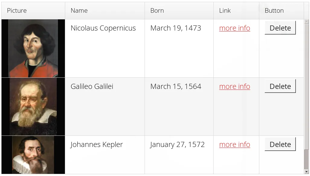
- ButtonRenderer
-
Renders the data value as the caption of a button. A RendererClickListener can be given to handle the button clicks.
Typically, a button renderer is used to display buttons for operating on a data item, such as edit, view, delete, etc. It is not meaningful to store the button captions in the data source, rather you want to generate them, and they are usually all identical.
Source code
Java
List<Person> people = new ArrayList<>(); people.add(new Person("Nicolaus Copernicus", 1473)); people.add(new Person("Galileo Galilei", 1564)); people.add(new Person("Johannes Kepler", 1571)); // Create a grid Grid<Person> grid = new Grid<>(people); // Render a button that deletes the data row (item) grid.addColumn(person -> "Delete", new ButtonRenderer(clickEvent -> { people.remove(clickEvent.getItem()); grid.setItems(people); })); - ImageRenderer
-
Renders the cell as an image. The column type must be a Resource, as described in "Images and Other Resources"; only ThemeResource and ExternalResource are currently supported for images in Grid.
Source code
Java
Column<Person, ThemeResource> imageColumn = grid.addColumn( p -> new ThemeResource("img/"+p.getLastname()+".jpg"), new ImageRenderer()); - DateRenderer
-
Formats a column with a Date type using string formatter. The format string is same as for String.format() in Java API. The date is passed in the parameter index 1, which can be omitted if there is only one format specifier, such as "%tF".
Source code
Java
Column<Person, Date> bornColumn = grid.addColumn(Person::getBirthDate,
      new DateRenderer("%1$tB %1$te, %1$tY",
                     Locale.ENGLISH));
Optionally, a locale can be given. Otherwise, the default locale (in the component tree) is used.
- HTMLRenderer
-
Renders the cell as HTML. This allows formatting the cell content, as well as using HTML features such as hyperlinks.
Set the renderer in the Grid.Column object:
Source code
Java
Column<Person, String> htmlColumn = grid.addColumn(person -> "<a href='" + person.getDetailsUrl() + "' target='_top'>info</a>", new HtmlRenderer()); - NumberRenderer
-
Formats column values with a numeric type extending Number: Integer, Double, etc. The format can be specified either by the subclasses of java.text.NumberFormat, namely DecimalFormat and ChoiceFormat, or by String.format().
For example:
Source code
Java
// Use decimal format Column<Integer> birthYear = grid.addColumn(Person::getBirthYear, new NumberRenderer(new DecimalFormat("in #### AD"))); - ProgressBarRenderer
-
Renders a progress bar in a column with a Double type. The value must be between 0.0 and 1.0.
- LocalDateRenderer
-
Formats a column with the LocalDate type. The renderer can be constructed with a DateTimeFormatter, or with a custom pattern string. The locale is either given explicitly with the pattern, resolved from the given DateTimeFormatter or from the grid the renderer is attached to, if neither of the previous are given. For the pattern string syntax, refer to the following documentation: docs.oracle.com/javase/8/docs/api/java/time/format/DateTimeFormatter.html#patterns. Note we should use
SerializableProvider<DateTimeFormatter>or lambda in the first case, becauseDateTimeFormatteris not serializable, and that may lead to problems in certain cases, for instance in a cluster environment.Source code
Java
LocalDateRenderer renderer = new LocalDateRenderer(() -> DateTimeFormatter .ofLocalizedDate(FormatStyle.LONG) .withLocale(Locale.ENGLISH)); Column<Person, LocalDate> bornColumn = grid.addColumn( Person::getBirthDate, renderer); // Alternatively, with a custom pattern: Column<Person, LocalDate> bornColumn = grid.addColumn( Person::getBirthDate, new LocalDateRenderer("yyyy MM dd")); - LocalDateTimeRenderer
-
Otherwise the same as LocalDateRenderer, except for the LocalDateTime type.
Source code
Java
LocalDateTimeRenderer renderer = new LocalDateTimeRenderer( () -> DateTimeFormatter .ofLocalizedDateTime(FormatStyle.LONG, FormatStyle.SHORT) .withLocale(Locale.ENGLISH)); Column<Person, LocalDateTime> bornColumn = grid.addColumn(Person::getBirthDateAndTime, renderer); // Alternatively, with a custom pattern: Column<Person, LocalDateTime> bornColumn = grid.addColumn( Person::getBirthDateAndTime, new LocalDateTimeRenderer("yyyy.MM.dd 'at' hh:mm")); - ComponentRenderer
-
Renders a Vaadin Component in a column. Since components are quite complex, the ComponentRenderer comes with possible performance issues. To use it efficiently you should use as few nested components as possible. If the components used are of a different size than the default row height, Grid.setBodyRowHeight() can be used to adjust the height of all rows in the Grid.
Use Button in Grid:
Source code
Java
grid.addComponentColumn(person -> {
      Button button = new Button("Click me!");
      button.addClickListener(click ->
            Notification.show("Clicked: " + person.toString()));
      return button;
});
// make sure the buttons fit in the cells of the Grid
grid.setBodyRowHeight(40);
Components will occasionally be generated again during runtime. If you have a state in your component and not in the data object, you need to handle storing it yourself. Below is a simple example on how to achieve this.
Store a TextField with changed value.
Source code
Java
Map<Person, TextField> textFields = new HashMap<>();
grid.addColumn(person -> {
      // Check for existing text field
      if (textFields.containsKey(person)) {
            return textFields.get(person);
      }
      // Create a new one
      TextField textField = new TextField();
      textField.setValue(person.getLastname());
      // Store the text field when user updates the value
      textField.addValueChangeListener(change ->
            textFields.put(person, textField));
      return textField;
      }, new ComponentRenderer());
Components in Grid ComponentRenderer are wrapped in a div with the style name component-wrap. This can be used to style the alignment and size of the Component.
Custom Renderers
Renderers are component extensions that require a client-side counterpart. See "Renderers" for information on implementing custom renderers.
Header and Footer
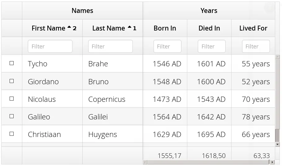
A grid by default has a header, which displays column names, and can have a footer. Both can have multiple rows and neighbouring header row cells can be joined to feature column groups.
Adding and Removing Header and Footer Rows
A new header row is added with prependHeaderRow(), which adds it at the top of the header, appendHeaderRow(), which adds it at the bottom of the header, or with addHeaderRowAt(), which inserts it at the specified 0-base index. All of the methods return a HeaderRow object, which you can use to work on the header further.
Source code
Java
// Group headers by joining the cells
HeaderRow groupingHeader = grid.prependHeaderRow();
...

// Create a header row to hold column filters
HeaderRow filterRow = grid.appendHeaderRow();
...
Similarly, you can add footer rows with appendFooterRow(), prependFooterRow(), and addFooterRowAt().
Joining Header and Footer Cells
You can join two or more header or footer cells with the join() method. For header cells, the intention is usually to create column grouping, while for footer cells, you typically calculate sums or averages.
Source code
Java
// Group headers by joining the cells
HeaderRow groupingHeader = grid.prependHeaderRow();
HeaderCell namesCell = groupingHeader.join(
    groupingHeader.getCell("firstname"),
    groupingHeader.getCell("lastname")).setText("Person");
HeaderCell yearsCell = groupingHeader.join(
    groupingHeader.getCell("born"),
    groupingHeader.getCell("died"),
    groupingHeader.getCell("lived")).setText("Dates of Life");
Text and HTML Content
You can set the header caption with setText(), in which case any HTML formatting characters are quoted to ensure security.
Source code
Java
HeaderRow mainHeader = grid.getDefaultHeaderRow();
mainHeader.getCell("firstname").setText("First Name");
mainHeader.getCell("lastname").setText("Last Name");
mainHeader.getCell("born").setText("Born In");
mainHeader.getCell("died").setText("Died In");
mainHeader.getCell("lived").setText("Lived For");
To use raw HTML in the captions, you can use setHtml().
Source code
Java
namesCell.setHtml("<b>Names</b>");
yearsCell.setHtml("<b>Years</b>");
Components in Header or Footer
You can set a component in a header or footer cell with setComponent(). Often, this feature is used to allow filtering.
|
Note
|
Note, when you use setComponent(TextField), the TextField will be rendered in compact mode without caption and icon. If you need to override this behavior, you need to wrap the TextField e.g. into HorizontalLayout. |
Sorting
A user can sort the data in a grid on a column by clicking the column header. Clicking another time on the current sort column reverses the sort direction. Clicking on other column headers while keeping the Shift key pressed adds a secondary or more sort criteria.
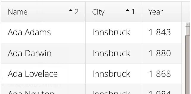
Defining sort criteria programmatically can be done with the various alternatives of the sort() method. You can sort on a specific column with sort(Column column), which defaults to ascending sorting order, or sort(Column column, SortDirection direction), which allows specifying the sort direction.
Source code
Java
grid.sort(nameColumn, SortDirection.DESCENDING);To sort by multiple columns, you need to use the fluid sort builder API GridSortOrderBuilder, which allows you to easily construct sorting information to be passed to grid’s setSortOrder() method. A sort builder is created with the static methods asc() and desc(), and additional sorting information can by chained with thenAsc() and thenDesc().
Source code
Java
// Sort first by city (ascending) and then by name (descending)
grid.setSortOrder(GridSortOrder.asc(cityColumn).thenDesc(nameColumn))
Editing Items Inside Grid
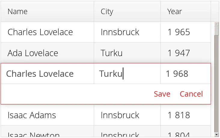
Grid supports line-based editing, where double-clicking a row opens the row editor. In the editor, the input fields can be edited, as well as navigated with Tab and Shift+Tab keys. If validation fails, an error is displayed and the user can correct the inputs.
The Editor is accessible via getEditor(), and to enable editing, you need to call setEnabled(true) on it.
The editor is based on Binder which is used to bind the data to the editor.
See "Binding Beans to Forms" for more information on setting up field components and validation by using Binder.
For each column that should be editable, a binding should be created in the editor binder and then the column is configured to use that binding.
For simple cases where no conversion or validation is needed, it is also possible to directly use setEditorComponent on a Column to only define the editor component and a setter that updates the row object when saving.
Source code
Java
List<Todo> items = Arrays.asList(new Todo("Done task", true),
        new Todo("Not done", false));

Grid<Todo> grid = new Grid<>();

TextField taskField = new TextField();
CheckBox doneField = new CheckBox();

Binder<Todo> binder = grid.getEditor().getBinder();

Binding<Todo, Boolean> doneBinding = binder.bind(
    doneField, Todo::isDone, Todo::setDone);

Column<Todo, String> column = grid.addColumn(
    todo -> String.valueOf(todo.isDone()));
column.setWidth(75);
column.setEditorBinding(doneBinding);

grid.addColumn(Todo::getTask).setEditorComponent(
    taskField, Todo::setTask).setExpandRatio(1);

grid.getEditor().setEnabled(true);
Buffered / Unbuffered Mode
Grid supports two editor modes - buffered and unbuffered. The default mode is buffered. The mode can be changed with setBuffered(false).
In the buffered mode, editor has two buttons visible: a button that commits the modifications to the bean and closes the editor and a button discards the changes and exits the editor.
Editor in buffered mode is illustrated in Editing a Grid Row.
In the unbuffered mode, the editor has no buttons and all changed data is committed directly to the data provider. If another row is clicked, the editor for the current row is closed and a row editor for the clicked row is opened.
Customizing Editor Buttons
In the buffered mode, the editor has two buttons: and . You can set their captions with setEditorSaveCaption() and setEditorCancelCaption(), respectively.
In the following example, we demonstrate one way to translate the captions:
Source code
Java
// Localize the editor button captions
grid.getEditor().setSaveCaption("Tallenna");
grid.getEditor().setCancelCaption("Peruuta"));
Handling Validation Errors
The input fields are validated when the value is updated. The default error handler displays error indicators in the invalid fields, as well as the first error in the editor.
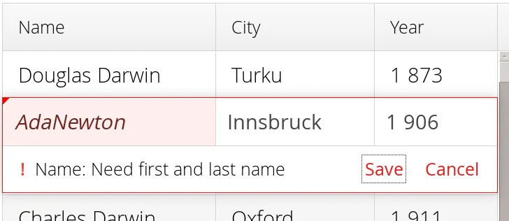
You can modify the error message by implementing a custom EditorErrorGenerator with for the Editor.
Presentation Value Providers
By default, a renderer displays the column value. If you want to edit an internal value (such as an address object) but show a simpler representation when not editing a row, a presentation value provider can be used.
A presentation value provider converts the value of a cell (obtained with a value provider, and used by the editor) to a different representation to be shown by renderers when the cell is not being edited. A custom renderer can optionally be used for the presentation values.
In the following example, we demonstrate one way to use a simplified presentation of an address column while allowing editing the full address:
Source code
Java
Column<Person, Address> column = grid.addColumn(Person::getAddress);
// alternatively, the presentation provider can be given as an extra parameter
// to addColumn()
column.setRenderer(
    address -> address.getCity() + " " + address.getCountry(),
    new TextRenderer());
column.setCaption("Address");
column.setEditorComponent(new AddressField(), Person::setAddress);
Drag and Drop of Rows
Please refer to the "Drag and Drop Rows in Grid" documentation.
Generating Row or Cell Styles
You can style entire rows or individual cells with a StyleGenerator, typically used through Java lambdas.
Generating Row Styles
The easiest way to style rows is to make a lambda and set it with setStyleGenerator() to a grid. The lambda gets a data item, and should return a style name or null if no style is generated.
For example, to add a style names to rows having certain values in one property of an item, you can style them as follows:
Source code
Java
grid.setStyleGenerator(person ->
    // Style based on alive status
    person.isAlive() ? null : "dead"
);
You could then style the rows with CSS as follows:
Source code
CSS
.v-grid-row.dead {
    color: gray;
}
Generating Cell Styles
You set a StyleGenerator to a grid with setStyleGenerator(). The getStyle() method gets a CellReference, which contains various information about the cell and a reference to the grid, and should return a style name or null if no style is generated.
For example, to add a style name to a specific column, you can match on the column as follows:
Source code
Java
// Static style based on column
bornColumn.setStyleGenerator(person -> "rightalign");
You could then style the cells with a CSS rule as follows:
Source code
CSS
.v-grid-cell.rightalign {
    text-align: right;
}
Styling with CSS
Source code
CSS
.v-grid {
  .v-grid-scroller, .v-grid-scroller-horizontal { }
  .v-grid-tablewrapper {
    .v-grid-header {
      .v-grid-row {
        .v-grid-cell, .frozen, .v-grid-cell-focused { }
      }
    }
    .v-grid-body {
      .v-grid-row,
      .v-grid-row-stripe,
      .v-grid-row-has-data {
        .v-grid-cell, .frozen, .v-grid-cell-focused { }
      }
    }
    .v-grid-footer {
      .v-grid-row {
        .v-grid-cell, .frozen, .v-grid-cell-focused { }
      }
    }
  }
  .v-grid-header-deco { }
  .v-grid-footer-deco { }
  .v-grid-horizontal-scrollbar-deco { }
  .v-grid-editor {
    .v-grid-editor-cells { }
    .v-grid-editor-footer {
      .v-grid-editor-message { }
      .v-grid-editor-buttons {
        .v-grid-editor-save { }
        .v-grid-editor-cancel { }
      }
    }
  }
}
A Grid has an overall v-grid style. The actual grid has three parts: a header, a body, and a footer. The scrollbar is a custom element with v-grid-scroller style. In addition, there are some decoration elements.
Grid cells, whether thay are in the header, body, or footer, have a basic v-grid-cell style. Cells in a frozen column additionally have a frozen style. Rows have v-grid-row style, and every other row has additionally a v-grid-row-stripe style.
The focused row has additionally v-grid-row-focused style and focused cell v-grid-cell-focused. By default, cell focus is visible, with the border stylable with $v-grid-cell-focused-border parameter in Sass. Row focus has no visible styling, but can be made visible with the $v-grid-row-focused-background-color parameter or with a custom style rule.
In editing mode, a v-grid-editor overlay is placed on the row under editing. In addition to the editor field cells, it has an error message element, as well as the buttons.