5.21. Slider
The Slider is a vertical or horizontal bar that allows
setting a numeric value within a defined range by dragging a bar handle with
the mouse. The value is shown when dragging the handle.
Slider has a number of different constructors that take
a combination of the caption, minimum and
maximum value, resolution, and the
orientation of the slider.
// Create a vertical slider
final Slider vertslider = new Slider(1, 100);
vertslider.setOrientation(Slider.ORIENTATION_VERTICAL);
Slider Properties
- min
-
Minimum value of the slider range. The default is 0.0.
- max
-
Maximum value of the slider range. The default is 100.0.
- resolution
-
The number of digits after the decimal point. The default is 0.
- orientation
-
The orientation can be either horizontal (
Slider.ORIENTATION_HORIZONTAL) or vertical (Slider.ORIENTATION_VERTICAL). The default is horizontal.
As the Slider is a field component, you can handle
value changes with a ValueChangeListener. The value of
the Slider field is a Double
object.
// Shows the value of the vertical slider
final Label vertvalue = new Label();
vertvalue.setSizeUndefined();

// Handle changes in slider value.
vertslider.addListener(new Property.ValueChangeListener() {
    public void valueChange(ValueChangeEvent event) {
        double value = (Double) vertslider.getValue();

        // Use the value
        box.setHeight((float) value, Sizeable.UNITS_PERCENTAGE);
        vertvalue.setValue(String.valueOf(value));
    }
});

// The slider has to be immediate to send the changes
// immediately after the user drags the handle.
vertslider.setImmediate(true);
You can set the value with the setValue() method
defined in Slider that takes the value as a native
double value. The setter can throw a
ValueOutOfBoundsException, which you must handle.
// Set the initial value. This has to be set after the
// listener is added if we want the listener to handle
// also this value change.
try {
	vertslider.setValue(50.0);
} catch (ValueOutOfBoundsException e) {
}
Alternatively, you can use the regular
setValue(Object), which does not do bounds checking.
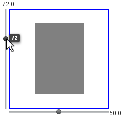
Figure 5.68, “The Slider Component” shows both vertical (from
the code examples) and horizontal sliders that control the size of a box. The
slider values are displayed also in separate labels.
.v-slider {}
.v-slider-base {}
.v-slider-handle {}
The enclosing style for the Slider is
v-slider. The slider bar has style
v-slider-base. Even though the handle is higher (for
horizontal slider) or wider (for vertical slider) than the bar, the handle
element is nevertheless contained within the slider bar element. The
appearance of the handle comes from a background image defined in the
background CSS property.