Composition with Composite and CustomComponent
The ease of making new user interface components is one of the core features of Vaadin. Typically, you simply combine existing built-in components to produce composite components. In many applications, such composite components make up the majority of the user interface.
As described earlier in "Compositing Components", you have two basic ways to create a composite - either by extending a layout component or by using a composition component (a Composite or a CustomComponent), which typically wraps around a layout component. The benefit of wrapping a layout composite is mainly encapsulation - hiding the implementation details of the composition. Otherwise, a user of the composite could rely on implementation details, which would create an unwanted dependency.
To create a composite, you need to inherit Composite or CustomComponent and set the composition root component in the constructor. The composition root is typically a layout component that contains other components.
The difference between the two composition classes is that a CustomComponent introduces another layer in the DOM on the browser, which can be used e.g. for styling but does require its own size setting etc. On the other hand, a Composite is a more light-weight version that has no visual representation in the browser, and is effectively replaced by its contents.
For example:
Source code
Java
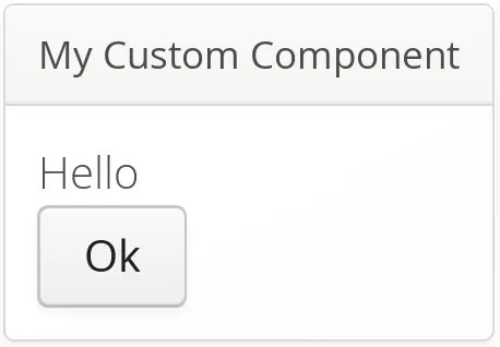
class MyComposite extends CustomComponent {
    public MyComposite(String message) {
        // A layout structure used for composition
        Panel panel = new Panel("My Custom Component");
        VerticalLayout panelContent = new VerticalLayout();
        panel.setContent(panelContent);

        // Compose from multiple components
        Label label = new Label(message);
        panelContent.addComponent(label);
        panelContent.addComponent(new Button("Ok"));

        // The composition root MUST be set
        setCompositionRoot(panel);

        // Set the size as undefined at all levels
        panelContent.setSizeUndefined();
        panel.setSizeUndefined();
        // this is not needed for a Composite
        setSizeUndefined();
    }
}
Take note of the sizing when trying to make a customcomponent that shrinks to fit the contained components. You have to set the size as undefined at all levels. In the case of CustomComponent, the sizing of the composite component and the composition root are separate, whereas Composite delegates its size management to its composition root.
You can use the component as follows:
Source code
Java
MyComposite mycomposite = new MyComposite("Hello");The rendered component is shown in A custom composite component.
You can also inherit any other components, such as layouts, to attain similar composition. Even further, you can create entirely new low-level components, by integrating pure client-side components or by extending the client-side functionality of built-in components. Development of new components is covered in "Integrating with the Server-Side".