I have a case where the LayoutManager is forcing a 14 pixel padding at the top of a component that I don’t want and I’d like to understand why it’s doing so in order to correct my styling (or whatever is causing the problem).
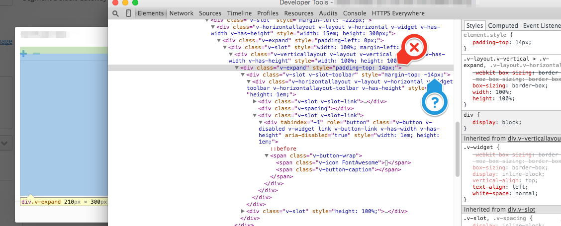
Here’s an image of the way the LayoutManager wants it to be:

The padding marked by the red X indicates what I don’t want. If I manually remove that via developer tools it renders the way I want:

However, the LayoutManager will usually put this value right back after I uncheck it (presumably since it’s doing constant analysis and determining it should be there).
So, a couple questions:
- What goes into that determination that the padding is needed? I’m not sure what to even look at. Why does it think it should be on that div specifically?
- Is the margin-top on the nested slot (see the question mark on the images) related? Same question: why does it think that’s necessary? I do need it to be there in order for the components to be positioned as they should be, though I’m not sure why.
- Is there a blog post or anything about how the LayoutManager determines where things should go. The code is pretty sparse as to explanations of logic.
EDIT: I figured out that there’s a margin on an ancestor DIV that is clearly the reason for things being positioned where they are and it is “correct” from the LayoutManager’s point of view. I guess the questions still stand though. For example, why does this particular component get a positive padding with a negative margin inside it? I’m just curious why it’s making the decisions it does.