Using data labels for bar charts lets the chart use the available space in an optimal way.
NiceDataLables.jpg is an example implemented with Google Charts.
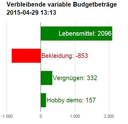
The result achieved with Vaadin Charts /High Charts is not always convincing. See SubOptimalDataLabels.jpg.
I miss a
Labels attribute “DisplayTextOutsideAreaInContrastingColorIfNoRoomInsideArea”.
There is no immediate option to do this right now, unfortunately. What you can do, as of the current 2.1-SNAPSHOT, is to
enable the “inside” property of the data labels in the plot options
set align to right in the same data labels as in #1
on each bar (value) that is too small to fit the label, override the data labels “inside” property to false
It’s an ugly workaround, and not very nice as it may be very hard to know whether a label fits inside the bar or not, but unfortunately it’s the only thing you can do right now.
Another thing you can do is to set the color of the labels to something that contrasts with the bar color and then when a label cannot fit inside the bar it will be rendered with the same color as you specified, but it will be rendered with a shadow behind it, to make it readable.
Your suggested workaround probably could not go for an example of good design, but I cold live with it;-)
Nevertheless, I don’t see how to set data labels for individual bars/columns. Data labels are set for PlotOptions, which are set for the Series a a whole. Maybe I’ve missed something?
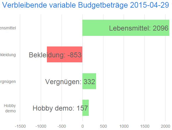
However I was experimenting a bit and found a parameter combination, which produced a nicer looking result:
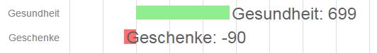
The only remaining problem is columns with negative values. The data label aligns left with the column value, and the alignment is weighted higher than the “inside” attribute. See Rather-nice-data-labels.jpg.
Do you see any possibility to resolve this remaining problem? Maybe it would have to be fixed in HighCharts?
Or could you explain how to affect the data labels per individual column?
Configuring data labels per data point is a feature of the upcoming 2.1.0 release (the beta is available now). In that release, you can set the labels for DataSeriesItems. This might help with the negative value issue you mention. However, as you said, this is not an example of great design, but more of making due with what we have