Vaadin application is not responsive across various devices

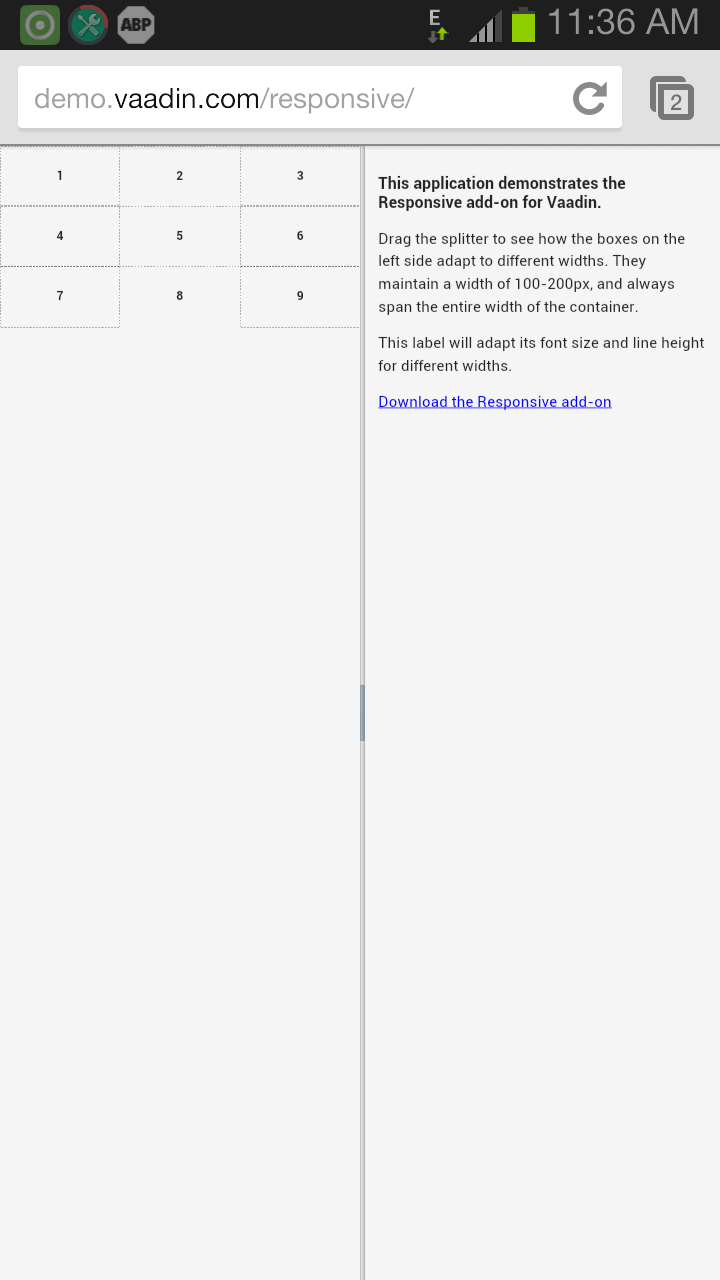
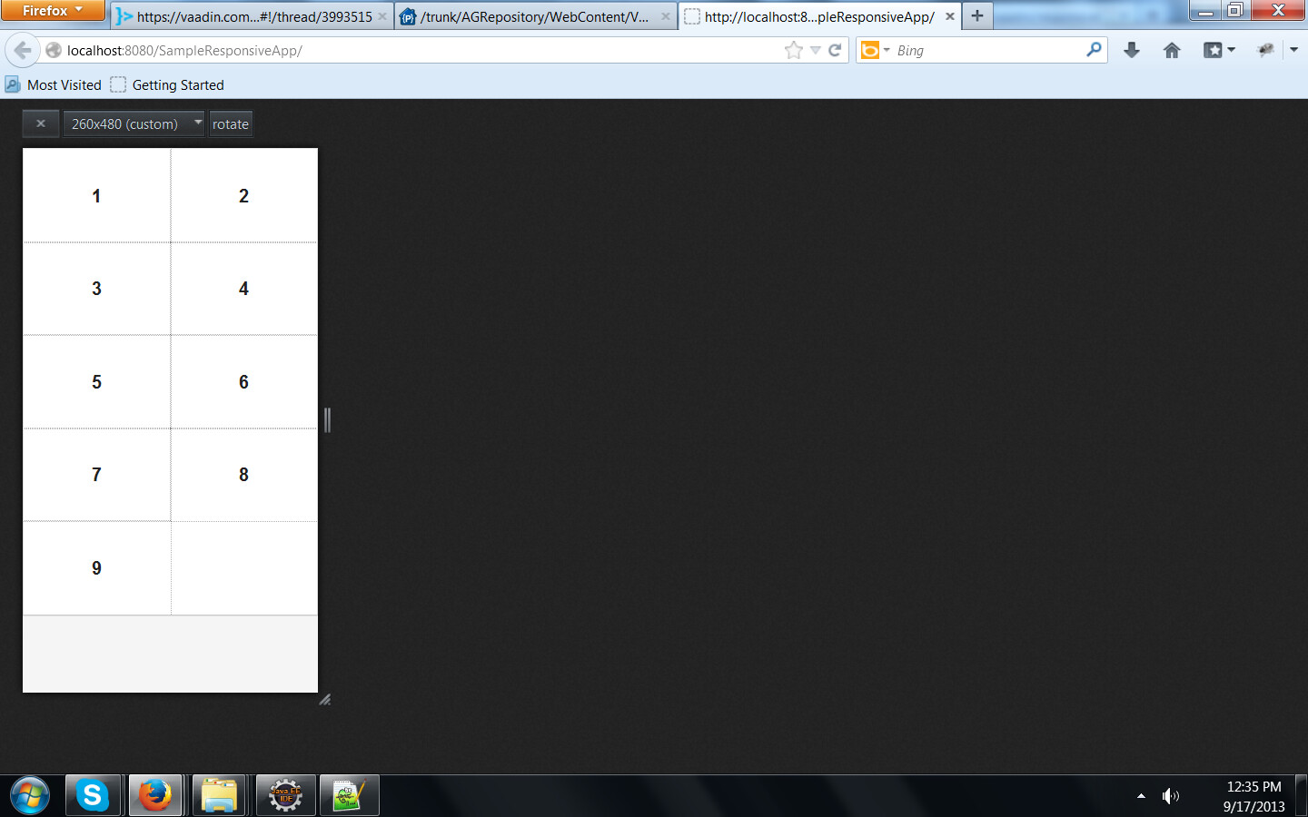
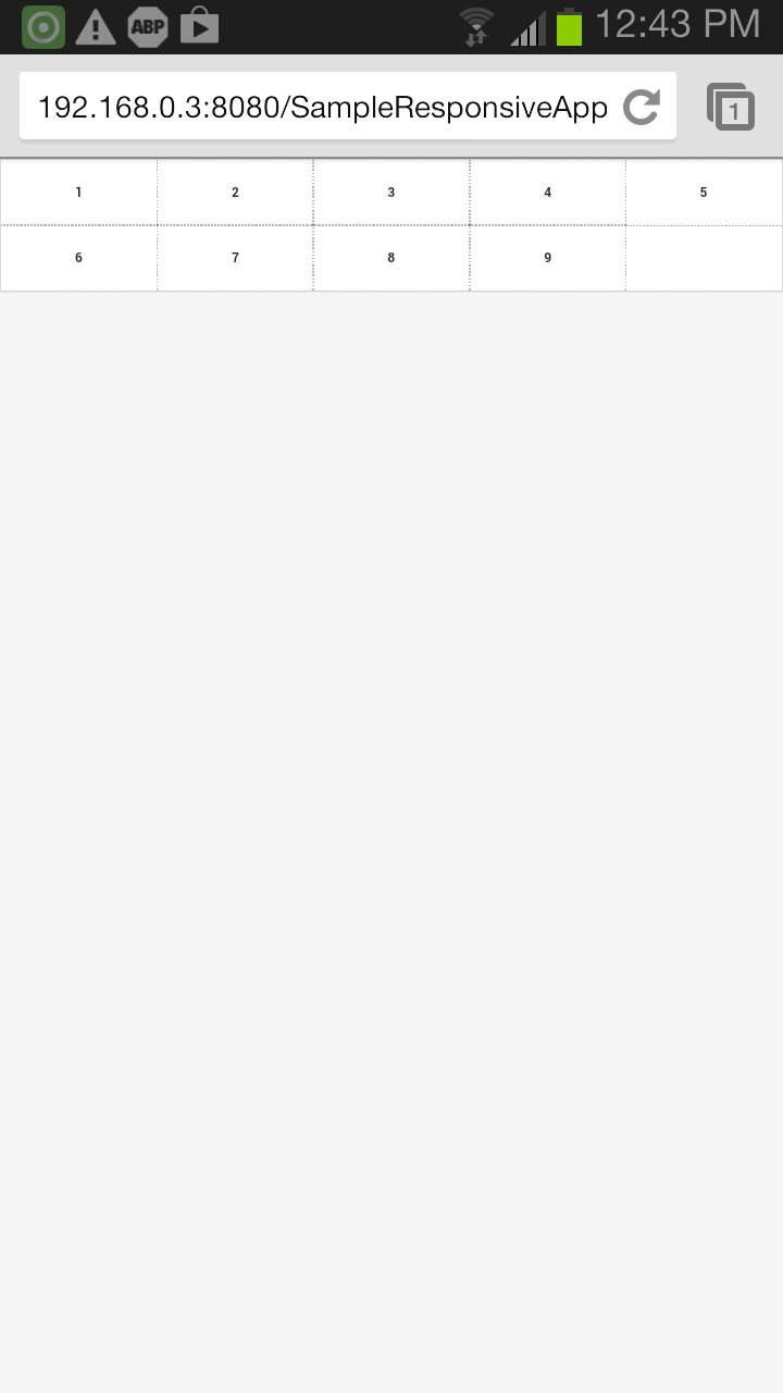
Responsive Layout is not working for my Vaadin application.

In the main init() method of the main program, I set “my-responsive-layout” as the style name for the main CSSLayout being used in the application.

@Theme(“mytheme”)
public class HomePage extends UI {

protected void init(VaadinRequest request) {

	CssLayout mainCssLayout = new CssLayout();
	mainCssLayout.setImmediate(true);
	mainCssLayout.setWidth("100%");
	mainCssLayout.setHeight("100%");
	mainCssLayout.setStyleName("my-responsive-layout");

	setContent(mainCssLayout);
	setSizeUndefined();

	_mainLayout = new VerticalLayout();
	_mainLayout.setSpacing(true);
	_mainLayout.setStyleName(Reindeer.LAYOUT_BLUE);

	 new Responsive(mainCssLayout);

	 _lblTitle = new Label("Home");
	 _lblTitle.setContentMode(ContentMode.HTML);
	 HorizontalLayout horizLayoutForTitle = new HorizontalLayout();
	 horizLayoutForTitle.setPrimaryStyleName("titlepanel");
	 horizLayoutForTitle.addComponent(_lblTitle);
	 horizLayoutForTitle.setComponentAlignment(_lblTitle, Alignment.MIDDLE_CENTER);
	 horizLayoutForTitle.setHeight("30px");
	 horizLayoutForTitle.setWidth("100%");
	 Panel panel = new Panel();
	 panel.setContent(horizLayoutForTitle);
	 panel.setStyleName(Reindeer.LAYOUT_BLACK);
	 panel.setPrimaryStyleName("titlepanel");
	 _mainLayout.addComponent(panel);
	 
	 
	btnLogin = new Button("Login");
	 btnLogin.setDescription("Click this to login and view your notifications.");
	 btnLogin.setPrimaryStyleName("mybutton");
	 btnLogin.setWidth(125, Unit.PIXELS);
	 btnLogin.addClickListener(new Button.ClickListener() {
		 private static final long serialVersionUID = 1L;
		 public void buttonClick(ClickEvent event) {
			 if (null != validateUser()){
				 viewNotificationsWindow(loggedInUser);
			 }
		 }
	 });
	 
	 ...........
	 ...........
	 ...........
	 ...........
	 ...........

I defined the responsive-layout in styles.scss for widths ranging from: 0-320, 320-480, 480-600, 600-768, 800-900, 900-1200.
First of all I’m trying to change only the background colors for the titlepanel and mybutton across different widths.
But the background colors are not changing as per the widths.

Given below are the styles used for the title panel and button.

@import “mytheme.scss”;

.mytheme {
@include mytheme;
}

@import “…/reindeer/reindeer.scss”;

.my-responsive-layout[width-range~=“0-320px”]
{
// Styles for 0-320px width
@include base-panel($primaryStyleName: titlepanel);
.titlepanel {
background:steelblue;
color: #FFFFFF;
font: #FFFFFF;
line-height: normal;
border-radius: 4px;
font-family: arial;
font-size: 15px;
font-weight: bold;
text-align: center;
text-decoration: none;
}

@include base-button($primaryStyleName: mybutton);
.mybutton {
background: steelblue;
zoom: 1;
display: inline-block;
text-align: center;
text-decoration: none;
cursor: pointer;
white-space: nowrap;
margin: 0;
padding: .2em 1em;
color: #FFFFFF;
font: #FFFFFF;
line-height: normal;
border-radius: 4px;
font-family: arial;
font-size: 12px;
font-weight: bold;
}
}

.my-responsive-layout[width-range~=“320-480px”]
{
// Styles for 320-480px width
@include base-panel($primaryStyleName: titlepanel);
.titlepanel {
background:pink;
color: #FFFFFF;
font: #FFFFFF;
line-height: normal;
border-radius: 4px;
font-family: arial;
font-size: 15px;
font-weight: bold;
text-align: center;
text-decoration: none;
}

@include base-button($primaryStyleName: mybutton);
.mybutton {
background: blue;
zoom: 1;
display: inline-block;
text-align: center;
text-decoration: none;
cursor: pointer;
white-space: nowrap;
margin: 0;
padding: .2em 1em;
color: #FFFFFF;
font: #FFFFFF;
line-height: normal;
border-radius: 4px;
font-family: arial;
font-size: 12px;
font-weight: bold;
}
}

.my-responsive-layout[width-range~=“480-600px”]
{
@include base-panel($primaryStyleName: titlepanel);
.titlepanel {
background:red;
color: #FFFFFF;
font: #FFFFFF;
line-height: normal;
border-radius: 4px;
font-family: arial;
font-size: 15px;
font-weight: bold;
text-align: center;
text-decoration: none;
}
@include base-button($primaryStyleName: mybutton);
.mybutton {
background: pink;
zoom: 1;
display: inline-block;
text-align: center;
text-decoration: none;
cursor: pointer;
white-space: nowrap;
margin: 0;
padding: .2em 1em;
color: #FFFFFF;
font: #FFFFFF;
line-height: normal;
border-radius: 4px;
font-family: arial;
font-size: 12px;
font-weight: bold;
}
}

.my-responsive-layout[width-range~=“600-768px”]
{
@include base-panel($primaryStyleName: titlepanel);
.titlepanel {
background:yellow;
color: #FFFFFF;
font: #FFFFFF;
line-height: normal;
border-radius: 4px;
font-family: arial;
font-size: 15px;
font-weight: bold;
text-align: center;
text-decoration: none;
}
@include base-button($primaryStyleName: mybutton);
.mybutton {
background:red;
zoom: 1;
display: inline-block;
text-align: center;
text-decoration: none;
cursor: pointer;
white-space: nowrap;
margin: 0;
padding: .2em 1em;
color: #FFFFFF;
font: #FFFFFF;
line-height: normal;
border-radius: 4px;
font-family: arial;
font-size: 12px;
font-weight: bold;
}
}

.my-responsive-layout[width-range~=“800-900px”]
{
// Styles for 0-900px width
@include base-panel($primaryStyleName: titlepanel);
.titlepanel {
background:green;
color: #FFFFFF;
font: #FFFFFF;
line-height: normal;
border-radius: 4px;
font-family: arial;
font-size: 15px;
font-weight: bold;
text-align: center;
text-decoration: none;
}
@include base-button($primaryStyleName: mybutton);
.mybutton {
background:yellow;
zoom: 1;
display: inline-block;
text-align: center;
text-decoration: none;
cursor: pointer;
white-space: nowrap;
margin: 0;
padding: .2em 1em;
color: #FFFFFF;
font: #FFFFFF;
line-height: normal;
border-radius: 4px;
font-family: arial;
font-size: 12px;
font-weight: bold;
}

}

.my-responsive-layout[width-range~=“900-1200px”]
{
// Styles for 0-1200px width
@include base-panel($primaryStyleName: titlepanel);
.titlepanel {
background:blue;
color: #FFFFFF;
font: #FFFFFF;
line-height: normal;
border-radius: 4px;
font-family: arial;
font-size: 15px;
font-weight: bold;
text-align: center;
text-decoration: none;
}
@include base-button($primaryStyleName: mybutton);
.mybutton {
background:green;
zoom: 1;
display: inline-block;
text-align: center;
text-decoration: none;
cursor: pointer;
white-space: nowrap;
margin: 0;
padding: .2em 1em;
color: #FFFFFF;
font: #FFFFFF;
line-height: normal;
border-radius: 4px;
font-family: arial;
font-size: 12px;
font-weight: bold;
}
}

Will be grateful for any valuable suggestions.

I’m sorry, but you have to be more specific. What exactly isn’t working? On what devices? What works OK? Without knowing these things, we can’t help you.

I’m trying to develop an application which works on all devices from desktop computers to mobile phones. The app does opens up on the browsers of both desktops and mobiles. But the GUI components are not exactly responsive with respect to the changing widths of the container.

I followed the example given on https://vaadin.com/blog/-/blogs/responsive-design.

But the buttons, textfields, panels in my application are not getting adjusted to suit the width ranges defined in my styles.scss.

So first of all, I’m trying to change the background colors of the buttons and title-panel for different screen resolutions.
In the code snippet and styles defined above,

I want the background color of buttons and title panel to be

“background:steelblue” in the width-range~=“0-320px”,
"background:red in the "width-range~=“480-600px”
“background:yello” in the width-range~=“600-768px”

If the background color works then I thought to work on the widths and heights of the individual components. But the background color itself is not changing.

All I want to know is if I’m doing it correctly. Is my style sheet correct? Or is there anything else that I have to add?

The first thing I would check whether the .my-responsive-layout div gets the corresponding width-range attributes when you change the browser width. If yes, then the problem is somewhere in the CSS. If not, then the problem is in the layout configuration or a bug in the framework/add-on.

The call setSizeUndefined() in the init method is a bit suspicious to my eyes. Why do you need that? I’m not even sure what that does, does it affect the .v-ui element or the layout inside it.

I used the setSizeUndefined() method for the main UI component, because that the main container’s size depends on the size of the device.

The demo http://demo.vaadin.com/responsive/ given on https://vaadin.com/blog/-/blogs/responsive-design opens on both mobiles and desktops and on browsers like Internet, Mini Opera and Google Chrome of Andriod device. But it is not exactly responsive with respect to the width and height of the browser.

PS: On mobiles the browsers are not set to desktop view.
13189.png

That’s because the app doesn’t restrict the viewport size for mobile. Each mobile browser has some default width & height they render the page to and then scale it down to fit into the viewport. On iOS, that size is 980px wide:
Default Viewport Settings
. If you actually drag the splitter on a mobile device, the demo works as expected.

The Responsive add-on doesn’t take care of adjusting the viewport, it’s not designed for that purpose, so you need to handle that yourself.

Calling setSizeUndefined() means the size of the component should depend on its content, setSizeFull() would make it depend on the size of the containing layout (or ultimately the screen if all its parents have 100% size.

Thanks Jouni, can you please explain a little more as to how do we handle viewport, without using Touchkit addon?

or

Could you give us an example that would help us in building the responsive layout (which should work for mobiles as well desktop computers)?

Hey, here is what we further tried and attached the screenshots of the app, opened on the desktop and mobile. On the desktop, we used the Responsive Design View plugin for Firefox browser. The file Responsive-Design-View.png shows the components aligned responsively on the browser. But when we tried to open the same app in Chrome browser on Andriod(Samsung S3) device the layout is not responsive. The file Screenshot_2013-09-17-12-43-01.png shows the incorrect responsive behaviour of the components and layout.

Tried the example based on the sample code given on https://vaadin.com/blog/-/blogs/responsive-design.

Here is the source code. How do we handle viewport and get the same output on mobiles?

package com.example.sampleresponsiveapp;

import com.vaadin.addon.responsive.Responsive;
import com.vaadin.annotations.Theme;
import com.vaadin.server.VaadinRequest;
import com.vaadin.ui.CssLayout;
import com.vaadin.ui.Label;
import com.vaadin.ui.Panel;
import com.vaadin.ui.UI;

/**

  • Main UI class
    */
    @Theme(“sampleresponsiveapptheme”)
    @SuppressWarnings(“serial”)
    public class SampleresponsiveappUI extends UI {

    @Override
    protected void init(VaadinRequest request) {

     Panel split = new Panel();
     setContent(split);
     
     CssLayout grid = new CssLayout();
     grid.setWidth("100%");
     grid.addStyleName("grid");
     //split.addComponent(grid);
     split.setContent(grid);
    
     for (int i = 1; i < 10; i++) {
     	Label l = new Label("" + i);
     	l.setSizeUndefined();
     	grid.addComponent(l);
     }			
     new Responsive(grid);		
    

}

Here is the scss content:

	@import "../reindeer/reindeer.scss";

	@mixin sampleresponsiveapptheme {
	  @include reindeer;
	  
		// Fix so that the item outlines are shown
		.grid {
		  overflow: visible;
		}
		
		// Style the items in the grid
		.grid > .v-label {
		  outline: 1px dotted rgba(0,0,0,.3);
		  text-align: center;
		  padding: 2em 0;
		  font-size: 16px;
		  font-weight: bold;
		}
		
		// We want the items in the grid to stay between 100px and 200px, if possible
		.grid[width-range~="0-200px"]

.v-label {
width: 100%;
}

		.grid[width-range~="201px-400px"]

.v-label {
width: 50%;
}

	  .grid[width-range~="401px-600px"]

.v-label {
width: 33.3333%;
}

	  .grid[width-range~="601px-800px"]

.v-label {
width: 25%;
}

	  .grid[width-range~="801px-1000px"]

.v-label {
width: 20%;
}

	  .grid[width-range~="1001px-"]

.v-label {
width: 16.6667%;
}

	}

13193.jpg
13194.png

Without actually testing the code, judging from Firefox, the code seems to work as expected. But as I said, you need to control the viewport size on mobile browsers. I guess the Firefox Responsive Design View does that for you.

Here’s an informative article about mobile viewports:
https://petelepage.com/blog/2012/12/using-meta-viewport/

So basically you need to add this to your page’s HEAD element:

<meta name="viewport" content="width=device-width" /> And here’s a tutorial how to get the proper meta tag to the initial Vaadin startup page:
Customizing the startup page in an application

That should get the result you’re after, hopefully.

Thanks a lot Jouni for your suggestion. We got the expected output and sharing the source code and web.xml.

/** SampleresponsiveappUI */

import java.io.IOException;
import javax.servlet.http.HttpServletResponse;
import com.vaadin.addon.responsive.Responsive;
import com.vaadin.annotations.Theme;
import com.vaadin.server.VaadinRequest;
import com.vaadin.ui.CssLayout;
import com.vaadin.ui.Label;
import com.vaadin.ui.Panel;
import com.vaadin.ui.UI;

/**

  • Main UI class
    */
    //@Theme(“reindeer”)
    @Theme(“sampleresponsiveapptheme”)
    @SuppressWarnings(“serial”)
    public class SampleresponsiveappUI extends UI {

    @Override
    protected void init(VaadinRequest request) {

     Panel split = new Panel();
     setContent(split);
    
     CssLayout grid = new CssLayout();
     grid.setWidth("100%");
     grid.addStyleName("grid");
     split.setContent(grid);
    
     for (int i = 1; i < 10; i++) {
     	Label l = new Label("" + i);
     	l.setSizeUndefined();
     	grid.addComponent(l);
     }
    
     // Add the responsive capabilities to the components
     Responsive responsive = new Responsive(grid);		
    

    }
    }

/** SampleResponsiveAppServlet */

import java.io.IOException;
import javax.servlet.ServletException;
import javax.servlet.annotation.WebServlet;
import javax.servlet.http.HttpServletRequest;
import javax.servlet.http.HttpServletResponse;

import com.vaadin.server.ServiceException;
import com.vaadin.server.SessionInitEvent;
import com.vaadin.server.SessionInitListener;
import com.vaadin.server.VaadinServlet;

@WebServlet(value = {“/", "/VAADIN/”}, asyncSupported = true)
public class SampleResponsiveAppServlet extends VaadinServlet {
private static final long serialVersionUID = 1L;

@Override
protected void servletInitialized() throws ServletException {
	super.servletInitialized();
	System.out.println("Servlet Initialized");
	getService().addSessionInitListener(new SessionInitListener() {
		private static final long serialVersionUID = 1L;
		@Override
		public void sessionInit(SessionInitEvent event) throws ServiceException {
			System.out.println("Initializing event.");
            event.getSession().addBootstrapListener(new SampleBootstrapListener());
			System.out.println("Event created.");
		}
	});		
}

@Override
protected boolean handleContextRootWithoutSlash(HttpServletRequest request,
        HttpServletResponse response) throws IOException {
    if ("/".equals(request.getPathInfo())
            && "".equals(request.getServletPath())
            && !request.getRequestURI().endsWith("/")) {
        /*
         * Path info is for the root but request URI doesn't end with a
         * slash -> redirect to the same URI but with an ending slash.
         */
        String location = request.getRequestURI() + "/";
        String queryString = request.getQueryString();
        if (queryString != null) {
            location += '?' + queryString;
        }
        response.sendRedirect(location);
        return true;
    } else {
        return false;
    }
}	

}

/** SampleBootstrapListener */

import java.util.List;
import org.jsoup.nodes.Comment;
import org.jsoup.nodes.Element;
import org.jsoup.nodes.Node;
import org.jsoup.parser.Tag;
import com.vaadin.server.BootstrapFragmentResponse;
import com.vaadin.server.BootstrapListener;
import com.vaadin.server.BootstrapPageResponse;

public class SampleBootstrapListener implements BootstrapListener {

private static final long serialVersionUID = 1L;

@Override
public void modifyBootstrapPage(BootstrapPageResponse response) {
     response.getDocument().body().appendChild(new Comment("Powered by MyRMN!", ""));       
     response.getDocument().head().prependElement("meta").attr("name", "viewport").attr("content", "width=device-width");
}

@Override
public void modifyBootstrapFragment(BootstrapFragmentResponse response) {
    // Wrap the fragment in a custom div element
    Element myDiv = new Element(Tag.valueOf("div"), "");
    List<Node> nodes = response.getFragmentNodes();
    for(Node node : nodes) {
        myDiv.appendChild(node);
    }
    nodes.clear();
    nodes.add(myDiv);
}

}

And here is the web.xml

<?xml version="1.0" encoding="UTF-8"?> SampleResponsiveApp Vaadin production mode productionMode false Sampleresponsiveapp Application com.example.sampleresponsiveapp.SampleResponsiveAppServlet Vaadin UI class to use UI com.example.sampleresponsiveapp.SampleresponsiveappUI Application widgetset widgetset com.example.sampleresponsiveapp.widgetset.SampleresponsiveappWidgetset Sampleresponsiveapp Application /* Sampleresponsiveapp Application /VAADIN/* index.html index.htm index.jsp default.html default.htm default.jsp

Thank you once again.

As of Vaadin 7.4, this is trivially done by adding the following annotation to your UI class:

@Viewport("width=device-width")

I hope this saves others the hours it took me to find that.

This really should added be in the
Vaadin framework docs
- when a developer starts playing with

Responsive

, it’s often with the intention of targeting mobile. It’s incredibly annoying to code up parts of the samples (e.g.
Valo
and
QuickTickets
) while peeking on GitHub at the source, only to test on mobile and have the entire web app appear to be zoomed out.

Thanks @Alejandro
It works fine for me

Thank you Aleandro. You saved my day.