How to style a custom <vaadin-select>

In the Vaadin Starter, we have selected the input-field with the white background, which results in a frontend/styles/shared-styles.js file with the necessary <dom-module> + themes/styles. Looks great.

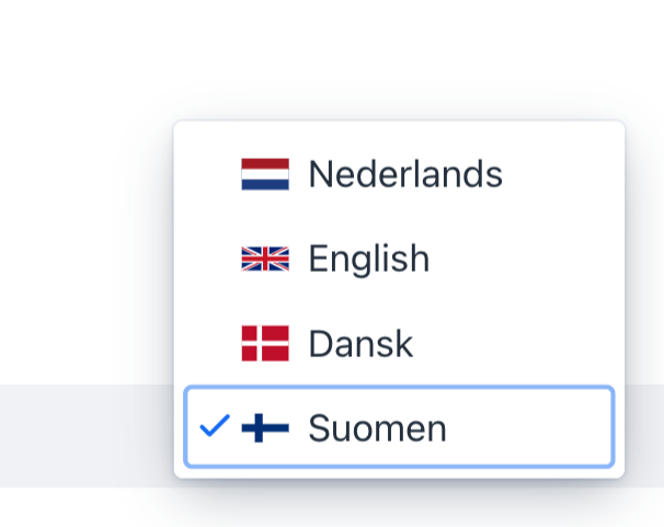
We now have a language selector component that lives in the footer, which had a light grey background color. We would now like to color this specific with the same light grey.

When looking at the various elements of the , it is not immediately obvious 1) which sub-elements to color and 2) how to actually do that for this <vaadin-select>-based component.

Much appreciated.
18537193.png

The Select component has its items inside vaadin-item component. You can style those selectively by first giving your Select Component a theme name:

select.getElement().setAttribute("theme", "my-styled-select");

Then in the global style module you can do something like:

[theme="my-styled-select"]
 vaadin-item {
	background-color: yellow;
}

And if you wish to only style the currently selected item, you can do

[theme="my-styled-select"]
 vaadin-item[selected]
 {
	background-color: yellow;
}

And if you want to apply the background also to the uncollapsed select component instead of only the collapsed items, I believe you could do

:host([theme="my-styled-select"]
) {
	--lumo-contrast-10pct: #YOUR_BG_COLOR;
	--lumo-body-text-color: #YOUR_TEXT_COLOR;
}

To import this and Tareks CSS you’ll need to annotate your language selector component class with
@CssImport(value = "./styles/customSelect.css", themeFor = "vaadin-select")

To import this and Tareks CSS you’ll need to annotate your language selector component class with @CssImport(value = “./styles/customSelect.css”, themeFor = “vaadin-select”)

Just to note, the styling I suggested doesn’t have to be in a vaadin-select style module, since the vaadin-item is in the light DOM. That is, it would be enough to apply the styles I suggested in a CSS file imported like so:

@CssImport("./styles/shared-styles.css")

Thank you for your suggestion, Tarek. Please note that I am talking about the Fusion world (!).

I note that it works to change the background via the class attribute, but nót via the theme attribute.

Note that the following snippet from the <select-language-component> contains both the theme and the class attribute, just to show how they are set:

render() {
  return html`
    <vaadin-select theme="my-styled-select" 
                   class="style-via-class" 
                   label="" value="nl" 
                   .renderer=${this._boundSelectRenderer}>
    </vaadin-select>
  `;
}

In this case, I have defined both in a component-specific css file that is imported as follows:

import componentStyles from "./select-language-component.css";
...
class SelectLanguageComponent extends LitElement {

static styles = [ Lumo, styles, componentStyles]
;
....

If it helps, I will put this component in a public repo.

I’m not sure I understand, but in a Fusion (18.0.6) project, when I add a Select (like the first example [here]
(https://vaadin.com/docs-beta/latest/ds/components/select/)), give it a theme attribute: theme="my-styled-select", and I add the following style to shared-styles.js

[theme='my-styled-select']
 vaadin-item[selected]
 {
        background-color: yellow;
      }

The selected item has a yellow background alright