How can I make the grid layout responsive just like bootstrap grid layout, such that as on resizing the window or change in resolution or changing device the components should be adjusting itself to the rows below instead of getting it overlapped on each other.
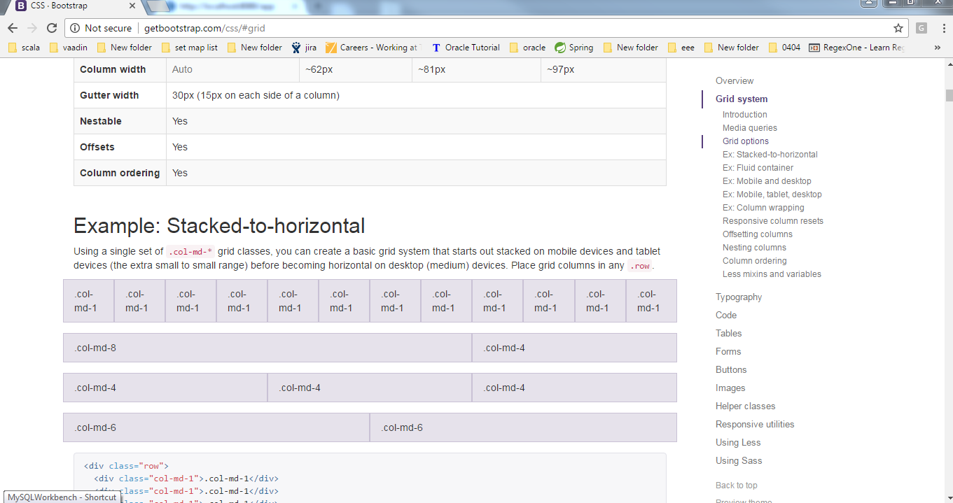
For ex, goto : http://getbootstrap.com/css/#grid
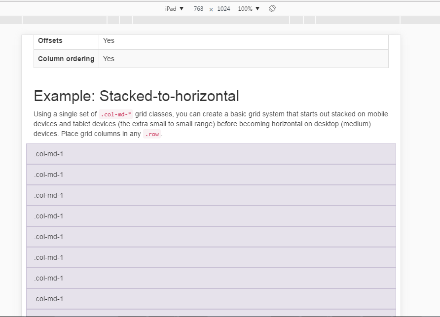
Under the topic “Example:Stacked-to-horizontal” we can see a grid layout with col-mid-1… etc components in a desktop.As we try resizing the window we can see the components alligns itself to the row below instad of overlaping.
Does Vaddin have this property?That is, after a limit of resizing, the gridlayout should align its components below in rows without overlaping each other.
Hoping for a reply.