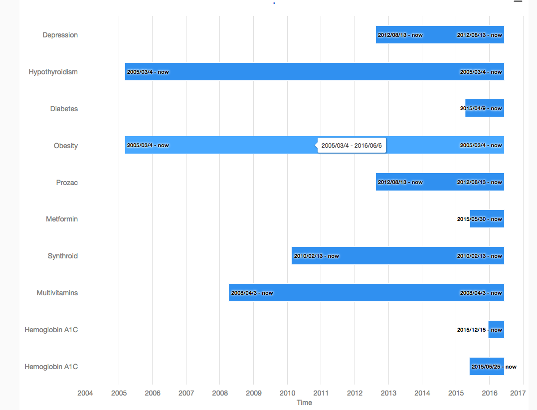
I am trying to get a category bar chart with timeline working using Google Polymer. I’ve tried vaadin-bar-chart and vaadin-columnrange-chart but can’t seem to get the timeline working properly. Attached is an image of what I have so far. I want the chart to look like as it currently does (horizontal bars with categories along the y-axis). Maybe there is a better chart element for what I am trying to show? Can you show me a working example? I have looked at the timeline and chart data documentation as well as the demos online at http://demo.vaadin.com/vaadin-charts/ but still unable to figure out how to get what I want. The demo at http://demo.vaadin.com/vaadin-charts/ for “Basic Bar” comes close but it isn’t in timeline mode. All help is appreciated!
Unluckily inverted option doesn’t work when combined with timeline mode. ColumnRange itself works with timeline, but it won’t work if you add the inverted option to see the columns as bars.
I did a simple example where the categories are given to the chart in the data (using axis type category). This example shows two alternatives to the timeline mode that are not really close to all that timeline provides.
First option would be to enable zoom and set a min-range to control the maximum zoom level
<chart inverted="true" zoom-type="y"> </chart>
The second option would be to use js API to contol the behavior and emulate the navigation buttons by using setExtremesMethod like it’s done in setMinListener.