Basic layout components
OrderedLayout component is a container for
laying out components either vertically or horizontally. An
application can change the orientation during runtime. Some
components, such as Window, always contain
an ordered layout component with vertical orientation.
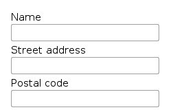
Typical use of the layout, using vertical orientation, goes as follows:
OrderedLayout orderedLO = new OrderedLayout (OrderedLayout.ORIENTATION_HORIZONTAL);
orderedLO.addComponent(new TextField("Name"));
orderedLO.addComponent(new TextField("Street address"));
orderedLO.addComponent(new TextField("Postal code"));
main.addComponent(orderedLO);
The text fields have a label attached, which will by default be placed above the field. The layout will look on screen as follows:
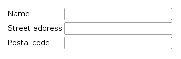
Using ORIENTATION_HORIZONTAL gives the
following layout:

Labels are attached to the text fields by default with a vertical
layout. The OrderedLayout component has a
special style called "form" that you can use for forms where the
components are laid out side-by-side with their captions. You can
control the appearance of the form style in a theme. By default,
the layout will look with
ORIENTATION_VERTICAL as follows:
GridLayout container lays components out
on a grid of defined width and height. The columns and rows of
the grid serve as coordinates that are used for laying out
components on the grid. Each component can use a certain area
(x1,y1,x2,y2) from the grid, although they typically take up only
a single grid cell.
The grid layout maintains a cursor for adding components in left-to-right, top-to-bottom order. Adding a component with the cursor automatically extends the grid by increasing its height.
The following example demonstrates the use of grid layout. The
addComponent takes a component and
optional coordinates. The coordinates can be given for a single
cell or for an area in x,y (column,row) order. The coordinate
values have a base value of 0. If coordinates are not given, the
cursor will be used.
/* Create a 4 by 4 grid layout. */
GridLayout gridLO = new GridLayout(4, 4);

/* Fill out the first row using the cursor. */
gridLO.addComponent(new Button("R/C 1"));
for (int i=0; i<3; i++) /* Add a few buttons. */
    gridLO.addComponent(new Button("Col " + (gridLO.getCursorX()+1)));

/* Fill out the first column using coordinates. */
for (int i=1; i<4; i++)
    gridLO.addComponent(new Button("Row " + i), 0, i);

/* Add some components of various shapes. */
gridLO.addComponent(new Button("3x1 button"), 1, 1, 3, 1);
gridLO.addComponent(new Label("1x2 cell"), 1, 2, 1, 3);
DateField date = new DateField("A 2x2 date field");
date.setStyle("calendar");
gridLO.addComponent(date, 2, 2, 3, 3);

main.addComponent(gridLO);
The resulting layout will look as follows. The borders have been made visible to illustrate the layout cells.
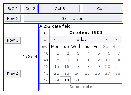
The layout follows the size of the components placed inside it. Some components, such as buttons, expand to fill their grid cell in horizontal direction.
A component to be placed on the grid must not overlap with
existing components. A conflict causes throwing a
GridLayout.OverlapsException.
For a complete example of grid layout, please see the section called “Calculator”.
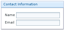
Panel is a simple container with a frame and an optional caption. Panel typically contains a layout component where other components are added.
Window main = new Window("Application window");
setMainWindow(main);

Panel panel = new Panel ("Contact Information");
OrderedLayout ordered = new OrderedLayout(
        OrderedLayout.ORIENTATION_VERTICAL);
ordered.addComponent(new TextField("Name"));
ordered.addComponent(new TextField("Email"));
ordered.setStyle("form");
panel.addComponent(ordered);
main.addComponent(panel);
The resulting layout will look as follows.
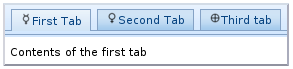
The TabSheet is a multicomponent container that
allows switching between UI components in a display area using "tabs". The
tabs are organized as a tab bar at the top of the tab sheet. Clicking on a
tab opens its contained component in the display area below.
New tabs can be added simply with the
addComponent() method, but doing so leaves them
without a caption. You can set the caption with
setTabCaption() or simply use the
addTab() method to create tabs and give them a
caption. In addition to a caption, tabs can contain an icon, which you can
define either in the addtab() call or set later
with setTabIcon().
The following example demonstrates creation of a simple tab sheet, where
each the tabs shows a different Label
component. The tabs have an icon, which are loaded as Java class loader
resources from the WAR package of the application.
TabSheet tabsheet = new TabSheet();

tabsheet.addTab(new Label("Contents of the first tab"),
                "First Tab",
                new ClassResource ("images/Mercury_small.png", main.getApplication()));
tabsheet.addTab(new Label("Contents of the second tab"),
                "Second Tab",
                new ClassResource ("images/Venus_small.png", main.getApplication()));
tabsheet.addTab(new Label("Contents of the third tab"),
                "Third tab",
                new ClassResource ("images/Earth_small.png", main.getApplication()));

main.addComponent(tabsheet);
The hideTabs() allows hiding the tab bar
entirely. This can be useful in tabbed document interfaces (TBI) when
there is only one tab. An individual tab can be made invisible by making
its component invisible with setVisible(false). A
tab can be disabled by disabling its component with
setEnabled(false). A tab can be selected
programmatically with setSelectedTab().
Clicking on a tab selects it. This fires a
TabSheet.SelectedTabChangeEvent, which can be
handled with the
TabSheet.SelectedTabChangeListener. The source
component of the event, which you can retrieve with
getSource() method of the event, will be the
TabSheet component. You can find out the currently
selected component with getSelectedTab().
The example below demonstrates handling TabSheet
related events and enabling and disabling tabs. The sort of logic used in
the example is useful in sequential user interfaces, often called
wizards, where the user goes through the tabs one by
one, but can return back if needed.
import com.itmill.toolkit.ui.*;
import com.itmill.toolkit.ui.Button.ClickEvent;
import com.itmill.toolkit.ui.TabSheet.SelectedTabChangeEvent;
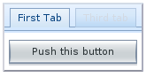
public class TabSheetExample extends CustomComponent implements Button.ClickListener, TabSheet.SelectedTabChangeListener {
TabSheet tabsheet = new TabSheet();
Button tab1 = new Button("Push this button");
Label tab2 = new Label("Contents of Second Tab");
Label tab3 = new Label("Contents of Third Tab");
TabSheetExample () {
setCompositionRoot (tabsheet);
/* Listen for changes in tab selection. */
tabsheet.addListener(this);
/* First tab contains a button, for which we listen button click events. */
tab1.addListener(this);
tabsheet.addTab(tab1, "First Tab", null);
/* A tab that is initially invisible. */
tab2.setVisible(false);
tabsheet.addTab(tab2, "Second Tab", null);
/* A tab that is initially disabled. */
tab3.setEnabled(false);
tabsheet.addTab(tab3, "Third tab", null);
}
public void buttonClick(ClickEvent event) {
/* Enable the invisible and disabled tabs. */
tab2.setVisible(true);
tab3.setEnabled(true);
/* Change selection automatically to second tab. */
tabsheet.setSelectedTab(tab2);
}
public void selectedTabChange(SelectedTabChangeEvent event) {
/* Cast to a TabSheet. This isn't really necessary in this example,
* as we have only one TabSheet component, but would be useful if
* there were multiple TabSheets. */
TabSheet source = (TabSheet) event.getSource();
if (source == tabsheet) {
/* If the first tab was selected. */
if (source.getSelectedTab() == tab1) {
tab2.setVisible(false);
tab3.setEnabled(false);
}
}
}
}