harrypotter-progress - Vaadin Add-on Directory
This is a Harry Potter themed progress web component made using Polymer 2 library.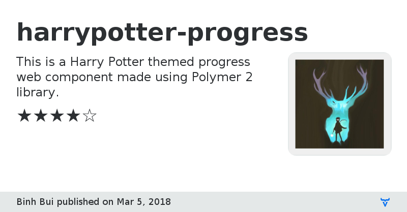
**[ This description is mirrored from README.md at [github.com/binhbbbb/harrypotter-progress](https://github.com//binhbbbb/harrypotter-progress/blob/v1.0.1/README.md) on 2019-05-14 ]**
[](https://www.webcomponents.org/element/vaadin/vaadin-button)
Vaadin Directory:
[](https://vaadin.com/directory/component/binhbbui411shields-badge)
[](https://vaadin.com/directory/component/binhbbui411shields-badge)
[](https://vaadin.com/directory/component/binhbbui411shields-badge)
[](https://vaadin.com/directory/component/binhbbui411shields-badge)
[](https://vaadin.com/directory/component/binhbbui411shields-badge)
[](https://vaadin.com/directory/component/binhbbui411shields-badge)
# <harrypotter-progress>
[Live Demo ↗]()
[<shields-badge>](https://vaadin.com/directory/component/binhbbui411shields-badge) is a [Polymer 2](http://polymer-project.org) web component for generating a Harry Potter themed progress.
```html
View on GitHubGitHub Homepage
Online Demo
Issue tracker
harrypotter-progress version 1.0.0
### Dependencies
* polymer#^2.3.1
harrypotter-progress version 1.0.1
### Dependencies
* polymer#^2.3.1