8.3. Creating and Using Themes
Custom themes are placed in VAADIN/themes folder of the
web application (in the WebContent directory) as
illustrated in Figure 8.1, “Contents of a Theme”. This location
is fixed. You need to have a theme folder for each theme you use in your
application, although applications rarely need more than a single theme. For
example, if you want to define a theme with the name mytheme,
you will place it in folder VAADIN/themes/mytheme.
A custom theme must also inherit a built-in theme, as shown in the example below:
@import "../reindeer/styles.css";

.v-app {
    background: yellow;
}
Vaadin 6.0 includes two built-in themes: reindeer and
runo. The latter is a compatibility theme for IT Mill
Toolkit 5; there is no longer a "default" theme. See Section 8.3.2, “Built-in Themes” and Section 8.3.4, “Theme Inheritance” below for details on inheriting
themes.
Each user interface component in Vaadin has a CSS style class that you can use to control the appearance of the component. Some components have additional sub-elements that also allow styling.
Table 8.1, “Default CSS Style Names of Vaadin Components” lists the style classes
of all Vaadin components, together with their client-side widgets. Notice
that a single server-side component can have multiple client-side
implementations. For example, a Button can be
rendered on the client side either as a regular button or a check box,
depending on the switchMode attribute of the
button. For details regarding the mapping to client-side components, see
Section 11.5, “Defining a Widget Set”. Each client-side component type has its
own style class and a number of additional classes that depend on the
client-side state of the component. For example, a text field will have
v-textfield-focus class when mouse pointer hovers over
the component. This state is purely on the client-side and is not passed
to the server.
Table 8.1. Default CSS Style Names of Vaadin Components
| Server-Side Component | Client-Side Widget | CSS Class Name |
|---|---|---|
| AbsoluteLayout | VAbsoluteLayout | v-absolutelayout |
| Accordion | VAccordion | v-accordion |
| Button | VButton | v-button |
| CheckBox | VCheckBox | v-checkbox |
| CssLayout | VCssLayout | v-csslayout |
| CustomComponent | VCustomComponent | v-customcomponent |
| CustomLayout | VCustomLayout | v-customlayout |
| DateField | VDateField | v-datefield |
| VCalendar | v-datefield-entrycalendar | |
| VDateFieldCalendar | v-datefield-calendar | |
| VPopupCalendar | v-datefield-calendar | |
| VTextualDate | ||
| Embedded | VEmbedded | - |
| Form | VForm | v-form |
| FormLayout | VFormLayout | - |
| GridLayout | VGridLayout | - |
| Label | VLabel | v-label |
| Link | VLink | v-link |
| OptionGroup | VOptionGroup | v-select-optiongroup |
| HorizontalLayout | VHorizontalLayout | v-horizontallayout |
| VerticalLayout | VVerticalLayout | v-verticallayout |
| Panel | VPanel | v-panel |
| Select | ||
| VListSelect | v-listselect | |
| VFilterSelect | v-filterselect | |
| Slider | VSlider | v-slider |
| SplitPanel | VSplitPanel | - |
| VSplitPanelHorizontal | - | |
| VSplitPanelVertical | - | |
| Table | VScrollTable | v-table |
| VTablePaging | v-table | |
| TabSheet | VTabSheet | v-tabsheet |
| TextField | VTextField | v-textfield |
| VTextArea | ||
| VPasswordField | ||
| Tree | VTree | v-tree |
| TwinColSelect | VTwinColSelect | v-select-twincol |
| Upload | VUpload | - |
| Window | VWindow | v-window |
| - | CalendarEntry | - |
| - | CalendarPanel | v-datefield-calendarpanel |
| - | ContextMenu | v-contextmenu |
| - | VUnknownComponent | vaadin-unknown |
| - | VView | - |
| - | Menubar | gwt-MenuBar |
| - | MenuItem | gwt-MenuItem |
| - | Time | v-datefield-time |
Please see the documentation of the particular components for a listing of possible sub-component styles.
Some client-side components can be shared by different server-side
components. There is also the
VUnknownComponent, which is a component that
indicates an internal error in a situation where the server asked to
render a component which is not available on the client-side.
Vaadin currently includes two built-in themes: reindeer
and runo. The latter is the default theme for IT Mill
Toolkit 5 (where its name is "default"); the default theme in Vaadin 6.0
is reindeer.
The built-in themes are provided in the respective
VAADIN/themes/reindeer/styles.css and
VAADIN/themes/runo/styles.css stylesheets in the
Vaadin library JAR. These stylesheets are compilations of the separate
stylesheets for each component in the corresponding subdirectory. The
stylesheets are compiled to a single file for efficiency: the browser
needs to load just a single file.
Various constants related to the built-in themes are defined in the theme classes in com.vaadin.ui.themes package. These are mostly special style names for specific components.
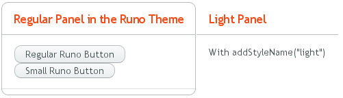
setTheme("runo");

Panel panel = new Panel("Regular Panel in the Runo Theme");
panel.addComponent(new Button("Regular Runo Button"));

// A button with the "small" style
Button smallButton = new Button("Small Runo Button");
smallButton.addStyleName(Runo.BUTTON_SMALL);

Panel lightPanel = new Panel("Light Panel");
lightPanel.addStyleName(Runo.PANEL_LIGHT);
lightPanel.addComponent(new Label("With addStyleName(\"light\")"));
The example with the Runo theme is shown in Figure 8.7, “Runo Theme”.
Serving Built-In Themes Statically
The built-in themes included in the Vaadin library JAR are served
dynamically from the JAR by the servlet. Serving themes and widget
sets statically by the web server is more efficient. You only need to
extract the VAADIN/ directory from the JAR under
your WebContent directory. Just make sure to
update it if you upgrade to a newer version of Vaadin.
Creation of a default theme for custom GWT widgets is described in Section 11.3.3, “Styling GWT Widgets”.
Using a theme is simple, you only need to set the theme with
setTheme() in the application object. The Eclipse
wizard for creating custom Vaadin themes automatically adds such call in
the init() method of the application class, as
explained in Section 8.4, “Creating a Theme in Eclipse”.
Defining the appearance of a user interface component is fairly
simple. First, you create a component and add a custom style name for it
with addStyleName(). Then you write the CSS
element that defines the formatting for the component.
When you define your own theme, you will need to inherit a built-in theme (unless you just copy the built-in theme).
Inheritance in CSS is done with the @import
statement. In the typical case, when you define your own theme, you
inherit a built-in theme as follows:
@import "../reindeer/styles.css";

.v-app {
    background: yellow;
}
You can even create a deep hierarchy of themes by inheritance. Such a solution is often useful if you have some overall theme for your application and a slightly modified theme for different user classes. You can even make it possible for each user to have his or her own theme.
For example, let us assume that we have the base theme of an application
with the name myapp and a specific
myapp-student theme for users with the student
role. The stylesheet of the base theme would be located in
themes/myapp/styles.css. We can then "inherit" it in
themes/myapp-student/styles.css with a simple
@import statement:
@import "../myapp/styles.css";

.v-app {
    background: green;
}
This would make the page look just as with the base theme, except for the green background. You could use the theme inheritance as follows:
public class MyApplication extends com.vaadin.Application {

    public void init() {
        setTheme("myapp");
        ...
    }

    public void login(User user) {
        if (user.role == User.ROLE_STUDENT)
            setTheme("myapp-student");
        ...
    }

    public void logout() {
        setTheme("myapp");
        ...
    }
}
In the above example, the User class is an
imaginary class assumed to hold user information.