5.13. Selecting Items
Vaadin gives many alternatives for selecting one or more items from a list, using drop-down and regular lists, radio button and check box groups, tables, trees, and so on.
The core library includes the following selection components, all based on the
AbstractSelect class:
Select-
In single selection mode, a drop-down list with a text input area,
which the user can use to filter the displayed items. In multiselect
mode, a list box equivalent to
ListSelect. ComboBox-
A drop-down list for single selection. Otherwise as
Select, but the user can also enter new items. The component also provides an input prompt. ListSelect- A vertical list box for selecting items in either single or multiple selection mode.
NativeSelect-
Provides selection using the native selection component of the
browser, typically a drop-down list for single selection and a
multi-line list in multiselect mode. This uses the
<select>element in HTML. OptionGroup- Shows the items as a vertically arranged group of radio buttons in the single selection mode and of check boxes in multiple selection mode.
TwinColSelect- Shows two list boxes side by side where the user can select items from a list of available items and move them to a list of selected items using control buttons.
In addition, the Tree and Table
components allow special forms of selection. They also inherit the
AbstractSelect.
The selection components are strongly coupled with the Vaadin Data
Model. The selectable items in all selection components are objects that
implement the Item interface and are contained in a
Container. The current selection is bound to the
Property interface.
Even though the data model is used, the selection components allow simple use in the most common cases. Each selection component is bound to a default container type, which supports management of items without need to implement a container.
See Chapter 9, Binding Components to Data for a detailed description of the data model, its interfaces, and built-in implementations.
New items are added with the addItem() method
defined in the Container interface.
// Create a selection component
Select select = new Select ("Select something here");

// Add some items and give each an item ID
select.addItem("Mercury");
select.addItem("Venus");
select.addItem("Earth");
The addItem() method creates an empty
Item, which is identified by its item
identifier (IID) object, given as the parameter. This item ID
is by default used also as the caption of the item, as explained in
the next section. The identifier is typically a
String. The item is of a type specific to the
container and has itself little relevance for most selection
components, as the properties of an item may not be used in any way
(except in Table), only the item ID.
The item identifier can be of any object type. We could as well have
given integers for the item identifiers and set the captions
explicitly with setItemCaption(). You could
also add an item with the parameterless
addItem(), which returns an automatically
generated item ID.
// Create a selection component
Select select = new Select("My Select");

// Add an item with a generated ID
Object itemId = select.addItem();
select.setItemCaption(itemId, "The Sun");

// Select the item
select.setValue(itemId);
Some container types may support passing the actual data object to the
add method. For example, you can add items to a
BeanItemContainer with
addBean(). Such implementations can use a
separate item ID object, or the data object itself as the item ID, as
is done in addBean(). In the latter case you
can not depend on the default way of acquiring the item caption; see
the description of the different caption modes later.
The following section describes the different options for determining the item captions.
The displayed captions of items in a selection component can be set
explicitly with setItemCaption() or
determined from the item IDs or item properties. This behaviour is
defined with the caption mode, which you can set
with setItemCaptionMode(). The default mode
is ITEM_CAPTION_MODE_EXPLICIT_DEFAULTS_ID,
which uses the item identifiers for the captions, unless given
explicitly.
In addition to a caption, an item can have an icon. The icon is set
with setItemIcon().
Caption Modes for Selection Components
ITEM_CAPTION_MODE_EXPLICIT_DEFAULTS_ID-
This is the default caption mode and its flexibility allows using it in most cases. By default, the item identifier will be used as the caption. The identifier object does not necessarily have to be a string; the caption is retrieved with
toString()method. If the caption is specified explicitly withsetItemCaption(), it overrides the item identifier.Select select = new Select("Moons of Mars"); // Use the item ID also as the caption of this item select.addItem(new Integer(1)); // Set item caption for this item explicitly select.addItem(2); // same as "new Integer(2)" select.setItemCaption(2, "Deimos"); ITEM_CAPTION_MODE_EXPLICIT-
Captions must be explicitly specified with
setItemCaption(). If they are not, the caption will be empty. Such items with empty captions will nevertheless be displayed in theSelectcomponent as empty items. If they have an icon, they will be visible. ITEM_CAPTION_MODE_ICON_ONLY-
Only icons are shown, captions are hidden.
ITEM_CAPTION_MODE_ID-
String representation of the item identifier object is used as caption. This is useful when the identifier is a string, and also when the identifier is an complex object that has a string representation. For example:
Select select = new Select("Inner Planets"); select.setItemCaptionMode(Select.ITEM_CAPTION_MODE_ID); // A class that implements toString() class PlanetId extends Object implements Serializable { String planetName; PlanetId (String name) { planetName = name; } public String toString () { return "The Planet " + planetName; } } // Use such objects as item identifiers String planets[] = {"Mercury", "Venus", "Earth", "Mars"}; for (int i=0; i<planets.length; i++) select.addItem(new PlanetId(planets[i])); ITEM_CAPTION_MODE_INDEX-
Index number of item is used as caption. This caption mode is applicable only to data sources that implement the
Container.Indexedinterface. If the interface is not available, the component will throw aClassCastException. TheSelectcomponent itself does not implement this interface, so the mode is not usable without a separate data source. AnIndexedContainer, for example, would work. ITEM_CAPTION_MODE_ITEM-
Stringrepresentation of item, acquired withtoString(), is used as the caption. This is applicable mainly when using a customItemclass, which also requires using a customContainerthat is used as a data source for theSelectcomponent. ITEM_CAPTION_MODE_PROPERTY-
Item captions are read from the
Stringrepresentation of the property with the identifier specified withsetItemCaptionPropertyId(). This is useful, for example, when you have a container that you use as the data source for aSelect, and you want to use a specific property for caption.In the example below, we bind a selection component to a bean container and use a property of the bean as the caption.
/* A bean with a "name" property. */
public class Planet implements Serializable {
    String name;

    public Planet(String name) {
        this.name = name;
    }

    public void setName(String name) {
        this.name = name;
    }

    public String getName() {
        return name;
    }
}

void propertyModeExample() {
    VerticalLayout layout = new VerticalLayout();

    // Have a bean container to put the beans in
    BeanItemContainer<Planet> container =
        new BeanItemContainer<Planet>(Planet.class);

    // Put some example data in it
    container.addItem(new Planet("Mercury"));
    container.addItem(new Planet("Venus"));
    container.addItem(new Planet("Earth"));
    container.addItem(new Planet("Mars"));

    // Create a selection component bound to the container
    Select select = new Select("Planets", container);

    // Set the caption mode to read the caption directly
    // from the 'name' property of the bean
    select.setItemCaptionMode(
            Select.ITEM_CAPTION_MODE_PROPERTY);
    select.setItemCaptionPropertyId("name");

    layout.addComponent(select);
A selection component provides the current selection as the property of
the component (with the Property interface). The
property value is an item identifier object that identifies the selected
item. You can get the identifier with getValue()
of the Property interface.
You can select an item with the corresponding
setValue() method. In multiselect mode, the
property will be an unmodifiable set of item identifiers. If no item
is selected, the property will be null in
single selection mode or an empty collection in multiselect mode.
The Select and NativeSelect
components will show "-" selection when no actual item is selected. This is
the null selection item identifier. You can set an
alternative ID with setNullSelectionItemId(). Setting
the alternative null ID is merely a visual text; the
getValue() will still return
null value if no item is selected, or an empty set in
multiselect mode.
The item identifier of the currently selected item will be set as the
property of the Select object. You can
access it with the getValue() method of the
Property interface of the component. Also,
when handling changes in a Select component
with the Property.ValueChangeListener
interface, the Property.ValueChangeEvent will
have the selected item as the property of the event, accessible with the
getProperty() method.
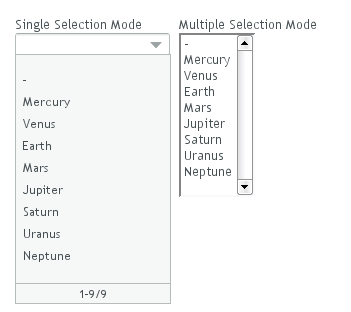
The Select component allows, in single selection
mode, selecting an item from a drop-down list. The component also has a
text field area, which allows entering search text by which the items
shown in the drop-down list are filtered.
In multiple selection mode, the component shows the items in a vertical
list box, identical to ListSelect.
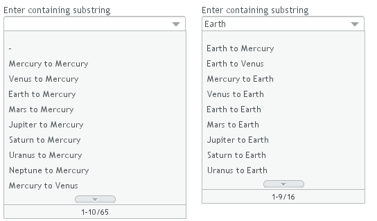
The Select component allows filtering the items
available for selection. The component shows as an input box for
entering text. The text entered in the input box is used for filtering
the available items shown in a drop-down list. Pressing
Enter will complete the item in the input
box. Pressing Up- and Down-arrows
can be used for selecting an item from the drop-down list. The
drop-down list is paged and clicking on the scroll buttons will change
to the next or previous page. The list selection can also be done with
the arrow keys on the keyboard. The shown items are loaded from the
server as needed, so the number of items held in the component can be
quite large.
Vaadin provides two filtering modes:
FILTERINGMODE_CONTAINS matches any item that
contains the string given in the text field part of the component and
FILTERINGMODE_STARTSWITH matches only items
that begin with the given string. The filtering mode is set with
setFilteringMode(). Setting the filtering
mode to the default value FILTERINGMODE_OFF
disables filtering.
Select select = new Select("Enter containing substring");

select.setFilteringMode(AbstractSelect.Filtering.FILTERINGMODE_CONTAINS);

/* Fill the component with some items. */
final String[] planets = new String[] {
        "Mercury", "Venus", "Earth", "Mars",
        "Jupiter", "Saturn", "Uranus", "Neptune" };

for (int i = 0; i < planets.length; i++)
    for (int j = 0; j < planets.length; j++) {
        select.addItem(planets[j] + " to " + planets[i]);
The above example uses the containment filter that matches to all items containing the input string. As shown in Figure 5.38, “Filtered Selection” below, when we type some text in the input area, the drop-down list will show all the matching items.
.v-filterselect { }
.v-filterselect-input { }
.v-filterselect-button { }
.v-filterselect-suggestpopup { }
.v-filterselect-prefpage-off { }
.v-filterselect-suggestmenu { }
.v-filterselect-status { }
.v-select { }
.v-select-select { }
In its default state, only the input field of the
Select component is visible. The entire
component is enclosed in v-filterselect style, the
input field has v-filterselect-input style and the
button in the right end that opens and closes the drop-down result
list has v-filterselect-button style.
The drop-down result list has an overall
v-filterselect-suggestpopup style. It contains the
list of suggestions with v-filterselect-suggestmenu
style and a status bar in the bottom with
v-filterselect-status style. The list of
suggestions is padded with an area with
v-filterselect-prefpage-off style above and below
the list.
In multiselect-mode, the styles of the component aere identical to
ListSelect component, with
v-select overall style and
v-select-select for the native selection element.
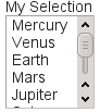
The ListSelect component is list box that shows the
selectable items in a vertical list. If the number of items exceeds the
height of the component, a scrollbar is shown. The component allows both
single and multiple selection modes, which you can set with
setMultiSelect(). It is visually identical in
both modes.
// Create the selection component
ListSelect select = new ListSelect("My Selection");

// Add some items
select.addItem("Mercury");
select.addItem("Venus");
select.addItem("Earth");
...

select.setNullSelectionAllowed(false);

// Show 5 items and a scrollbar if there are more
select.setRows(5);
The number of visible items is set with
setRows().
NativeSelect offers the native selection component
of web browsers, using the HTML <select>
element. The component is shown as a drop-down list.
// Create the selection component
final NativeSelect select = new NativeSelect("Native Selection");

// Add some items
select.addItem("Mercury");
select.addItem("Venus");
...

// Set the width in "columns" as in TextField
select.setColumns(10);

select.setNullSelectionAllowed(false);
The setColumns() allows setting the width of the
list as "columns", which is a measure that depends on the browser.
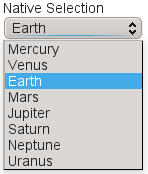
Multiple selection mode is not allowed; you should use the
ListSelect component instead. Also adding new
items, which would be enabled with
setNewItemsAllowed(), is not allowed.
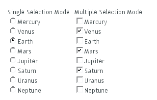
The OptionGroup class provides selection from
alternatives using a group of radio buttons in single selection mode. In
multiple selection mode, the items show up as check boxes.
OptionGroup optiongroup = new OptionGroup("My Option Group");

// Use the multiple selection mode.
myselect.setMultiSelect(true);
Figure 5.41, “Option Button Group in Single and Multiple Selection Mode” shows the
OptionGroup in both single and multiple selection mode.
You can create check boxes individually using the
CheckBox class, as described in Section 5.12, “CheckBox”. The advantages of the
OptionGroup component are that as it maintains the
individual check box objects, you can get an array of the currently
selected items easily, and that you can easily change the appearance of a
single component.
You can disable individual items in an
OptionGroup with
setItemEnabled(). The user can not select or
deselect disabled items in multi-select mode, but in single-select
mode the use can change the selection from a disabled to an enabled
item. The selections can be changed programmatically regardless of
whether an item is enabled or disabled. You can find out whether an
item is enabled with isItemEnabled().
The setItemEnabled() identifies the item to
be disabled by its item ID.
// Have an option group
OptionGroup group = new OptionGroup("My Disabled Group");
group.addItem("One");
group.addItem("Two");
group.addItem("Three");

// Disable one item
group.setItemEnabled("Two", false);
The item IDs are also used for the captions in this example. The
result is shown in Figure 5.42, “OptionGroup with a Disabled Item”.
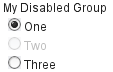
Setting an item as disabled turns on the v-disabled
style for it.
.v-select-optiongroup {}
.v-select-option.v-checkbox {}
.v-select-option.v-radiobutton {}
The v-select-optiongroup is the overall style for
the component. Each check box will have the
v-checkbox style, borrowed from the
CheckBox component, and each radio button the
v-radiobutton style. Both the radio buttons and
check boxes will also have the v-select-option
style that allows styling regardless of the option type. Disabled
items have additionally the v-disabled style.
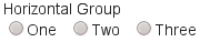
The options are normally laid out vertically. You can use horizontal
layout by setting display: inline-block for the
options. The nowrap setting for the overall element
prevents wrapping if there is not enough horizontal space in the
layout, or if the horizontal width is undefined.
/* Lay the options horizontally */
.v-select-optiongroup-horizontal .v-select-option {
    display: inline-block;
}

/* Avoid wrapping if the layout is too tight */
.v-select-optiongroup-horizontal {
    white-space: nowrap;
}

/* Some extra spacing is needed */
.v-select-optiongroup-horizontal
  .v-select-option.v-radiobutton {
    padding-right: 10px;
}
Use of the above rules requires setting a custom
horizontal style name for the component. The result
is shown in Figure 5.43, “Horizontal OptionGroup”.
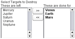
The TwinColSelect field provides a multiple
selection component that shows two lists side by side, with the left
column containing unselected items and the right column the selected
items. The user can select items from the list on the left and click on
the ">>" button to move them to the list on the right. Items can be
deselected by selecting them in the right list and clicking on the
"<<" button.
TwinColSelect is always in multi-select mode, so
its property value is always a collection of the item IDs of the selected
items, that is, the items in the right column.
The selection columns can have their own captions, separate from the
overall component caption, which is managed by the containing layout. You
can set the column captions with
setLeftColumnCaption() and
setRightColumnCaption().
 |
final TwinColSelect select =
    new TwinColSelect("Select Targets to Destroy");

// Set the column captions (optional)
select.setLeftColumnCaption("These are left");
select.setRightColumnCaption("These are done for");

// Put some data in the select
String planets[] = {"Mercury", "Venus", "Earth", "Mars",
        "Jupiter", "Saturn", "Uranus", "Neptune"};
for (int pl=0; pl<planets.length; pl++)
    select.addItem(planets[pl]);

// Set the number of visible items
select.setRows(planets.length);
The resulting component is shown in Figure 5.44, “Twin Column Selection”.
The setRows() method sets the height of the
component by the number of visible items in the selection boxes. Setting
the height with setHeight() to a defined value
overrides the rows setting.
.v-select-twincol {}
  .v-select-twincol-options-caption {}
  .v-select-twincol-selections-caption {}
  .v-select-twincol-options {}
  .v-select-twincol-buttons {}
    .v-button {}
      .v-button-wrap {}
        .v-button-caption {}
    .v-select-twincol-deco {}
  .v-select-twincol-selections {}
The TwinColSelect component has an overall
v-select-twincol style. If set, the left and right
column captions have
v-select-twincol-options-caption and
v-select-twincol-options-caption style names,
respectively. The left box, which displays the unselected items, has
v-select-twincol-options-caption style and the
right box, which displays the selected items, has
v-select-twincol-options-selections style. Between
them is the button area, which has overall
v-select-twincol-buttons style; the actual buttons
reuse the styles for the Button
component. Between the buttons is a divider element with
v-select-twincol-deco style.
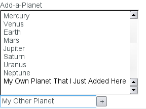
The selection components allow the user to add new items, with a user
interface similar to combo boxes in desktop user interfaces. You need to
enable the newItemsAllowed mode with the
setNewItemsAllowed() method.
myselect.setNewItemsAllowed(true);
The user interface for adding new items depends on the selection component
and the selection mode. The regular Select
component in single selection mode, which appears as a combo box, allows
you to simply type the new item in the combo box and hit
Enter to add it. In most other selection components, as
well as in the multiple selection mode of the regular
Select component, a text field that allows entering
new items is shown below the selection list, and clicking the
button will add the item in the list, as
illustrated in Figure 5.45, “Select Component with Adding New Items Allowed”.
The identifier of an item added by the user will be a
String object identical to the caption of the
item. You should consider this if the item identifier of automatically
filled items is some other type or otherwise not identical to the caption.
Adding new items is possible in both single and multiple
selection modes and in all styles. Adding new items may not be
possible if the Select is bound to an
external Container that does not allow
adding new items.
Setting the Select,
NativeSelect, or OptionGroup
components to multiple selection mode with the
setMultiSelect() method changes their appearance
to allow selecting multiple items.
SelectandNativeSelect-
These components appear as a native HTML selection list, as shown in Figure 5.45, “Select Component with Adding New Items Allowed”. By holding the Ctrl or Shift key pressed, the user can select multiple items.
OptionGroup-
The option group, which is a radio button group in single
selection mode, will show as a check box group in multiple
selection mode. See Section 5.13.5, “Radio Button and Check Box Groups with
OptionGroup”.
The TwinColSelect, described in Section 5.13.6, “Twin Column Selection with TwinColSelect”, is a special multiple
selection mode that is not meaningful for single selection.
myselect.setMultiSelect(true);
As in single selection mode, the selected items are set as the property of
the Select object. In multiple selection mode, the
property is a Collection of currently selected
items. You can get and set the property with the
getValue() and
setValue() methods as usual.
A change in the selection will trigger a
ValueChangeEvent, which you can handle with a
Propery.ValueChangeListener. As usual, you should
use setImmediate(true) to trigger the event
immediately when the user changes the selection. The following example
shows how to handle selection changes with a listener.
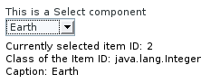
public class SelectExample
           extends CustomComponent
           implements Property.ValueChangeListener {
    // Create a Select object with a caption.
    Select select = new Select("This is a Select component");

    VerticalLayout layout = new VerticalLayout();
    Label status = new Label("-");

    SelectExample () {
        setCompositionRoot (layout);
        layout.addComponent(select);

        // Fill the component with some items.
        final String[] planets = new String[] {
            "Mercury", "Venus", "Earth", "Mars",
            "Jupiter", "Saturn", "Uranus", "Neptune"};
        for (int i=0; i<planets.length; i++)
            select.addItem(planets[i]);

        // By default, the change event is not triggered
        // immediately when the selection changes.
        // This enables the immediate events.
        select.setImmediate(true);

        // Listen for changes in the selection.
        select.addListener(this);

        layout.addComponent(status);
    }

    /* Respond to change in the selection. */
    public void valueChange(Property.ValueChangeEvent event) {
        // The event.getProperty() returns the Item ID (IID)
        // of the currently selected item in the component.
        status.setValue("Currently selected item ID: " +
                        event.getProperty());
    }
}
You can set an icon for each item with
setItemIcon(), or define an item property
that provides the icon resource with
setItemIconPropertyId(), in a fashion similar
to captions. Notice, however, that icons are not supported in
NativeSelect,
TwinColSelect, and some other selection
components and modes. This is because HTML does not support images
inside the native select elements. Icons are also
not really visually applicable.