Hi all,
has someone also seen his line chart “topple over”(both axes changing their places)
after adding two DataSeries with PlotOptionsBar each ?
The first DataSeries has PlotOptionsLine.
The chart was created with Chart( ChartType.LINE );
The chart does not topple over when the third DataSeries has PlotOptionsLine instead of PlotOptionsBar.
Things I’ve already tried to fix this:
Order of conf.addSeries(DataSeries) does not matter
– Last type wins? no!
– Majority wins? no! (I added more Series with PlotOptionsLine).
that snippet didn’t do it either:
ChartModel m= conf.getChart(); m.setType(ChartType.LINE);
I’m using Vaadin “7.4.2” and Add-On Vaadin Charts “2.0.0” on Ubuntu +Firefox
Any hints or comments welcome! Best regards, Daniel
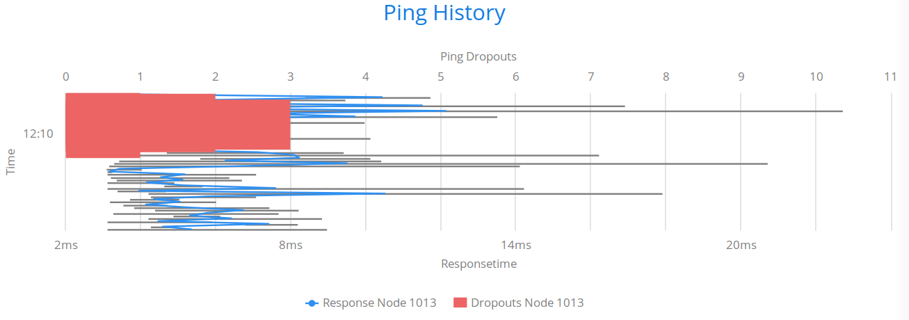
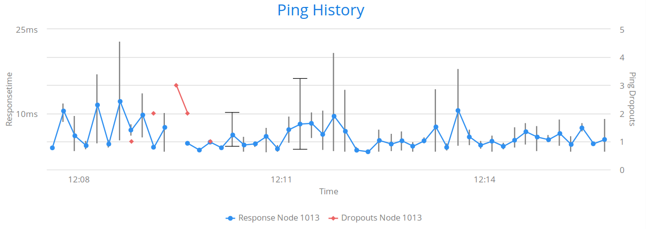
I’ll add 2015 words using two screenshots - one of my chart with 2 Line Series and 1 ErrorBar ,
the other with only one statement added: pingDropoutSeries.setPlotOptions( new PlotOptionsBar() ); → _1line_2bar.png
According to the API documentation, the logic should go so that if there’s a bar chart in a (mixed) chart, the axes are automatically inverted. As far as I’ve understood, it should also occur if you set “chart.getConfiguration().getChart().setInverted(false)”, as that is the default case where the automatic inversion is enabled. However, there could be a difference between undefined setting and explicitly set false, so you could try that.
I’m not sure what you wanted the behavior to be, but if you don’t want inversion of the axes to occur, the easy solution is to use column charts instead of bar charts.
My confusion came from PlotOptionsErrorBar which I added first: horizontal bars - you see?
Maybe you can add a new class PlotOptionsErrorRange as a not-confusing synonym?