Hey all,
I’ve been playing with the responsive layouts, but CSS / styling in general is not exactly my forte.
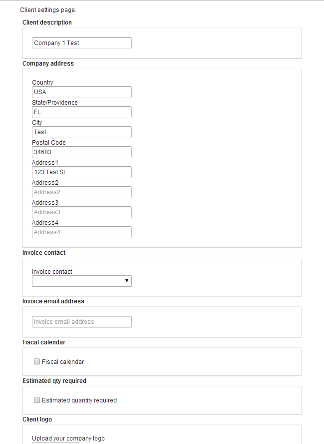
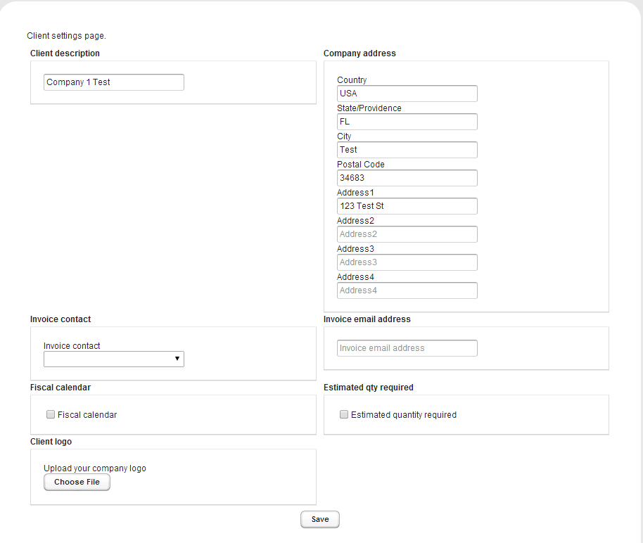
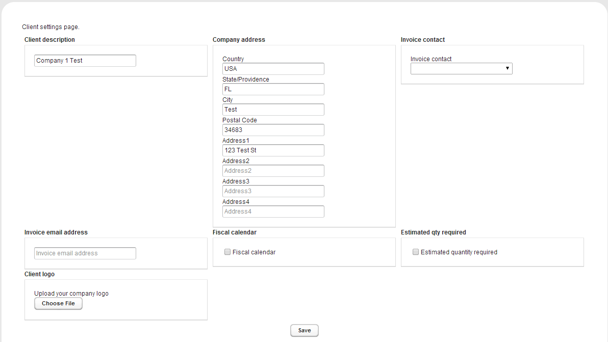
Attached are three screenshots, 3 columns wide, 2 column, and 1 column.
As you can see in the 3/2 column examples, it looks pretty bad. How can I make it so if a component is longer than the rest, the rest of the components will fill the spaces on the sides, instead of being pushed down?
My CSS is pretty much taken from the blog post / book examples with minor tweaking. Like I said, this is where I am weakest.
  .responsive5col {
    overflow: visible;
    .v-panel {
      vertical-align: top;
    }

    // Width ranges

    &[width-range~="0-600px"]
 {
      .v-panel {
        width: 100%;
      }
    }

    &[width-range~="601-900px"]
 {
      .v-panel {
        width: 50%;
      }
    }

    &[width-range~="901px-1300px"]
 {
      .v-panel {
        width: 33.3%;
      }
    }

    &[width-range~="1301px-1600px"]
 {
      .v-panel {
        width: 25%;
      }
    }

    &[width-range~="1601px-"]
 {
      .v-panel {
        width: 20%;
      }
    }

    // Height ranges

    &[height-range~="0-350px"]
 {
      .v-panel {
        height: 100%;
      }
    }

    &[height-range~="351-700px"]
 {
      .v-panel {
        height: 50%;
      }
    }

    &[height-range~="701px-"]
 {
      .v-panel {
        height: 33.3%;
      }
    }
  }