We (Jouni actually) did quite a bit of work in Vaadin 6.1 to make custom component theming easier. Thus you should ensure that you are using 6.1. See
release notes about the new button DOM structure and style-names.
Unfortunately I have not tried to theme buttons myself with 6.1, but my intuition would be to first see the
CSS implementationin reindeer and how button is
divided to images . I would create my own theme extending reindeer and add a custom button style to it. So keep the widget implementation and DOM structure, but add your own stylename, CSS and images.
Bit of a warning. Even though button seems to be a simple thing, it actually isn’t. See the above links
Thank you Joonas,
I actually already read these resources and had a look at Reindeer regarding buttons, and it indeed seems a complex thing for the CSS dummy that I am.
I’ll probably start with some other simpler design task that I’ve to do, and keep buttons for the end. I’ll try to come up with a tutorial on that, and a set of web2.0 black buttons that should be popular. That’s not much, regarding all the benefits I had from using Vaadin and the great support you gave me.
In the meanwhile, any other suggestion/path on extening Reeinder buttons is welcome
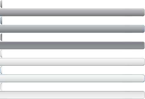
I did two new buttons styles on top of Reindeer recently, and just thought I’d share the CSS that resulted. Basically the buttons don’t look much different but hopefully you can get a better picture of what you need to override when defining new button styles.
I’ll attach the sprite image as well, so you can see how to create those (not recommended by hand, but by using some generator like SmartSprites).
That’s it. Notice the order of the selectors: focus and active/down styles come before the normal and disabled styles. That way you don’t have to create a more specific selector for the disabled style, since you don’t want the active and focus styles to be applicable to a disabled button.