we are using the vaadin-app-layout in our application. If we use it from an touch-device the drawer/menue goes to the bottom. I identified, that it is possible to change the touch-optimized value, but this would have some other bad effects. We only want to disable that the slot “nav-bar” changes to “navbar-bottom”.
What other effects do you see? The only thing that the navbar touch-optimized slot should affect is the placement of those slotted elements on small touch devices.
Note, that there isn’t a drawer touch-optimized slot available. The drawer always collapses/opens from the same position.
I changed the parameter “touch-optimized” and now it works fine. I saw some problems with trying to change the viewport size by google chrome development tools. But now everything is ok. Maybe it was an other problem.
Thanks.
In my post before i wrote “drawer” but i meant the navbar
I saw some problems with trying to change the viewport size by google chrome development tools
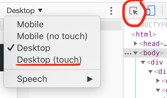
Right. Note, that the “touch-optimized” navbar only works on touch devices. When you use the Chrome dev tools, you have the option to emulate touch or not (see attached screenshot). Also, when you click the “Select an element in the page to inspect it” button (outlined with a red circle) it momentarily disables touch emulation.