Hi together,
I want to create a Button like this:
![Button]
(https://i.stack.imgur.com/Lwqzm.png)
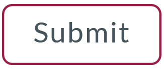
I want, that every button is like that. I haven’t found a --lumo- variable to modify the borders. What is your prefered solution for this?
Hi together,
I want to create a Button like this:
![Button]
(https://i.stack.imgur.com/Lwqzm.png)
I want, that every button is like that. I haven’t found a --lumo- variable to modify the borders. What is your prefered solution for this?
Hello thomas,
you can just edit the css properties for that vaadin-button component:
<dom-module id="main-view">
    <template>
        <style>
            #button {
                background-color: white;
                border: solid 2px;
                border-color: red;
                color: black;
                border-radius: 6px;
            }

        </style>
		...
	</template>
</dom-module>
You can also do it from Java:
getElement().getStyle().set("background-color","white")
if you need to edit the style of the parts of a Vaadin component, that are hidden in the shadow dom, you can create a theme for that vaadin component:
<dom-module id="button-style" theme-for="vaadin-button">
    <template>
        <style>
            :host(.my-button),
            :host(.my-button) [part="label"]
 {
                background-color: white;
            }
		</style>
		...
	</template>
	...
</dom-module>
and then include the button-sytle module in your polymer template.
“and then include the button-sytle module in your polymer template.”
How do I do that? I usually just use the java classes but also have some open todos for the shadow dom.
I want, that every button is like that.
You should use a style/theme module for this. Here’s a quick example:
<dom-module id="my-button-styles" theme-for="vaadin-button">
  <template>
    <style>
		:host {
			border: 1px solid red;
		    background-color: #fff;
		}
    </style>
  </template>
</dom-module>
Read more about the styling mechanism here: https://github.com/vaadin/vaadin-themable-mixin/wiki
What is the simplest way to get started with a style/theme module? Where should they be placed in the project hierarchy on the file system?
They should be placed somewhere under the frontend folder.
If you’ve started your project using a Vaadin starter app, you should already have a shared-styles.html file. You can place style modules there directly as well.
As a best practice, you should structure your styles so that only the ones needed by the user are loaded into the browser. So try to avoid putting all styles in that shared-styles.html file, although that is the path of least resistance 
Jouni Koivuviita:
I want, that every button is like that.
You should use a style/theme module for this. Here’s a quick example:
<dom-module id="my-button-styles" theme-for="vaadin-button">
  <template>
    <style>
		:host {
			border: 1px solid red;
		    background-color: #fff;
		}
    </style>
  </template>
</dom-module>
Read more about the styling mechanism here: https://github.com/vaadin/vaadin-themable-mixin/wiki
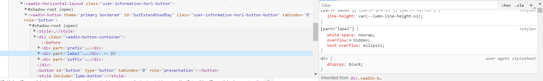
Hi Jouni Koivuviita,
I use a style/theme module for vaadin-button
<dom-module id="button-style" theme-for="vaadin-button">
    <template>
        <style>
			[part="label"]
 {
		        white-space: normal;
			    overflow: hidden;
			    text-overflow: ellipsis;
	      	}
		</style>
	</template>
</dom-module>
I want edit css label but it is not working.
How do I fix it?