I created the bubble chart using your suggestion.
I set as the X as the Y categories.
conf.getxAxis().setCategories(new String { “2018/07/18”, “2018/07/17”, “2018/07/16”, “2018/07/15” });
conf.getyAxis().setCategories(new String { “2017/07/18”, “2017/07/17”, “2017/07/16”, “2017/07/15” });
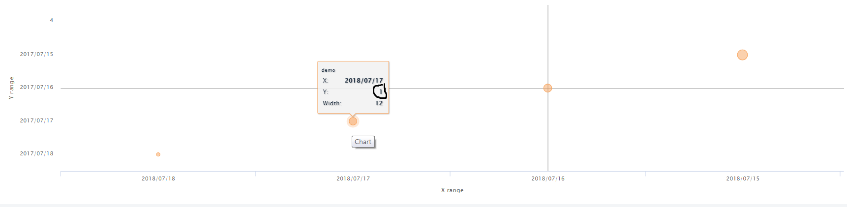
Do you know if there is a way to show categories values on bubble tooltip?
Currently I was able to show only the value of x using point.category, but I can not find a way to display the y
This is my current code:
Chart actualChart = new Chart(ChartType.BUBBLE);
		Configuration conf = actualChart.getConfiguration();
		conf.setTitle((String) null);

		conf.getxAxis().setTitle("X range");
		conf.getyAxis().setTitle("Y range");

		conf.getxAxis().setMin(0);
		conf.getyAxis().setMin(0);

		conf.getxAxis().setCategories(new String[] { "2018/07/18", "2018/07/17", "2018/07/16", "2018/07/15" });
		conf.getyAxis().setCategories(new String[] { "2017/07/18", "2017/07/17", "2017/07/16", "2017/07/15" });

		conf.getLegend().setEnabled(false);

		DataSeries dataSeries = new DataSeries((String) null);
		dataSeries.setName("demo");

		for (int i = 0; i < 4; i++) {

			DataSeriesItem3d item = new DataSeriesItem3d(i, i, RandomUtils.nextInt(7, 20));
			item.setColorIndex(RiskUtility.getColorIndex(55d));

			dataSeries.add(item);
		}

		PlotOptionsBubble opts = new PlotOptionsBubble();
		opts.setMaxSize("20");
		opts.setMinSize("7");

		conf.setPlotOptions(opts);

		conf.addSeries(dataSeries);

		Tooltip tooltip = new Tooltip();
		tooltip.setAnimation(true);
		tooltip.setUseHTML(true);
		tooltip.setHeaderFormat("<small>{series.name}</small><table>");
		tooltip.setPointFormat("<tr><td style=\"color: {series.color}\">X: </td><td style=\"text-align: right\"><b>{point.category}</b></td></tr>" +

				"<tr><td style=\"color: {series.color}\">Y: </td><td style=\"text-align: right\"><b>{point.y} </b></td></tr>" +

				"<tr><td style=\"color: {series.color}\">Width: </td><td style=\"text-align: right\"><b>{point.z}</b></td></tr>"

		);
		tooltip.setFooterFormat("</table>");
		conf.setTooltip(tooltip);
		actualChart.drawChart();
As you can see in the bubble.png I’m not able to show the correct y value mapped with the related category.
I tried with point.key, point.value without good result.
Can somebody help me to find the right command?
I looked to https://github.highcharts.com/highcharts.js but I didn’t find anything