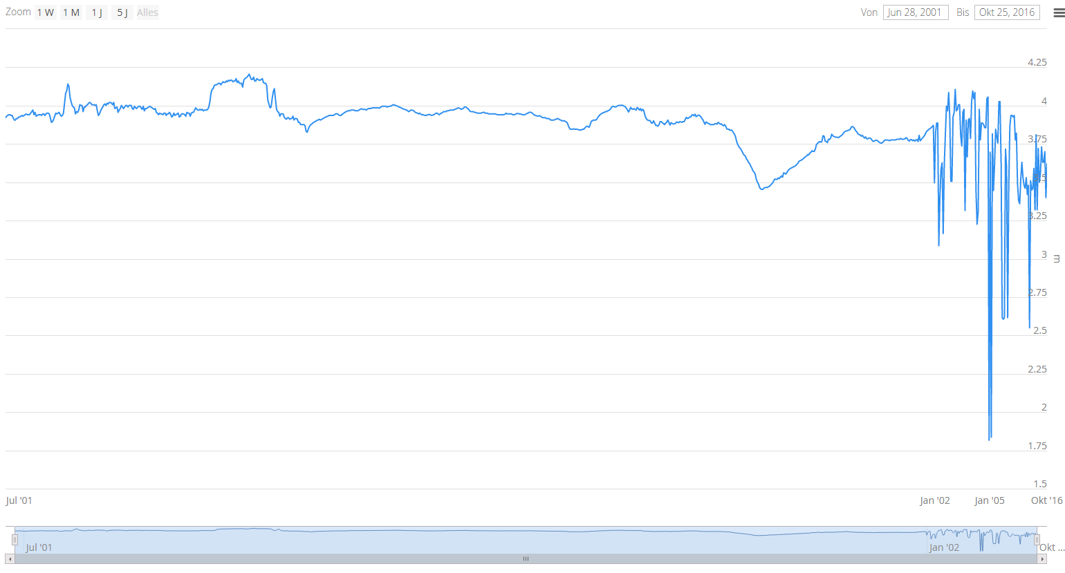
In the attached screenshot the X Axis of the Chart is really messed up. We are looking at a timespan of about 16 years, yet most of the space is taken up by about 6 months:
No I haven’t set ordinal at all. I did set it to false which seems to cure this problem. But I’m still skeptical about the timeline mode of the chart. How can this variable have been changed like that? If I use a none timeline chart and set the axis to
AxisType.DATETIME it looks non ordinal. If I do the samething with timeline: timeline + AxisType.DATETIME it scales it ordinally. Seems odd…
Anyway thank you for helping that solves this issue for now for me.
I’m glad it worked. And I understand it’s not super clear, by definition a timeline chart always has datetime XAxis but can be ordinal or not, it’s mostly related to visualization of large data sets.