We are on version 3.0.0.beta1
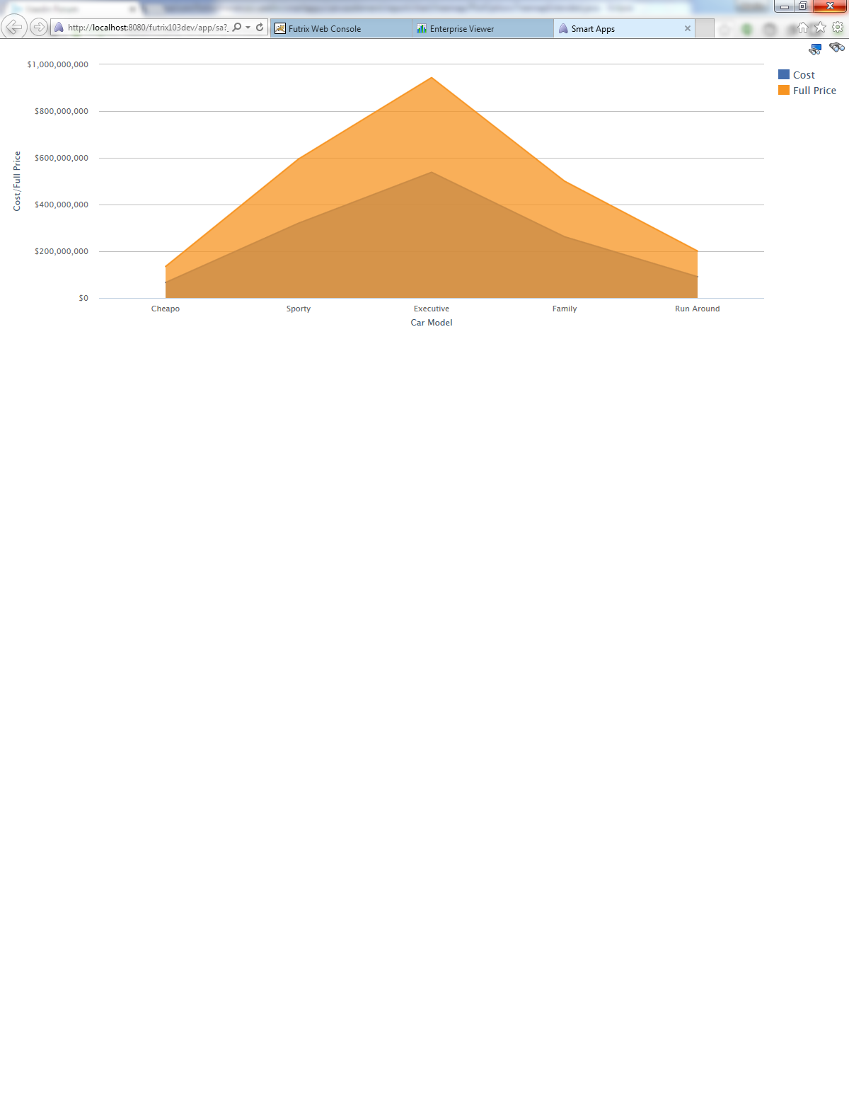
If we have a multi-series area or areaspline charts the colors used do not match between chart and legend.
If we change(only change) the chart type to line, bar column etc. the colors match.
We are on version 3.0.0.beta1
If we have a multi-series area or areaspline charts the colors used do not match between chart and legend.
If we change(only change) the chart type to line, bar column etc. the colors match.
Hi,
I wonder - is the “Full price” series overlaid on top of the “Cost” series? If so, the color looks wrong because it’s seen through the semitransparent larger area. Maybe you could try removing the “Full price” series temporarily, or adding the series to the chart in a different order.
Hello,
I want to change colors of my pieChart with java. could anyone help me please ?