I want to create a chart that displays the events coming in during a specific time frame. A bit like this:
https://qzprod.files.wordpress.com/2014/09/tim-cook-keynote-chart-watch.png?w=640
.
The online charts demo has an example that looks to fit my requirements:
http://demo.vaadin.com/charts/#ColumnRangeResourceUsage
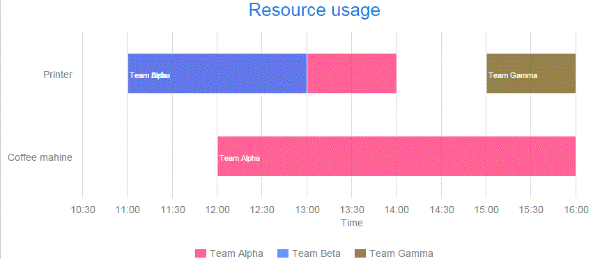
. I my case there will be many more teams than the two in this example. My problem is that when I add more teams, the bars are displayed on the wrong Y axis. To illustrate my problem I have changed the chart example and added one more team. The new team, Gamma, is displayed correctly but somehow the Coffee Machine bar for Team Beta is moved to the Printer row.
Does anybody know what I am doing wrong? Attached are the example code and an image of the incorrect chart.
22903.java (2.56 KB)