Thanx, Iain, I higly appreciate your reply, but that didn’t work.
I checked it in the code below grabbed from the official demo
http://demo.vaadin.com/charts/#ColumnWithNativeDrilldown
:
package skpharmacy.components.analysis;
import com.vaadin.addon.charts.ChartOptions;
import com.vaadin.addon.charts.Chart;
import com.vaadin.addon.charts.model.AxisType;
import com.vaadin.addon.charts.model.ChartType;
import com.vaadin.addon.charts.model.Configuration;
import com.vaadin.addon.charts.model.Cursor;
import com.vaadin.addon.charts.model.DataSeries;
import com.vaadin.addon.charts.model.DataSeriesItem;
import com.vaadin.addon.charts.model.Labels;
import com.vaadin.addon.charts.model.PlotOptionsColumn;
import com.vaadin.addon.charts.model.Tooltip;
import com.vaadin.addon.charts.model.XAxis;
import com.vaadin.addon.charts.model.YAxis;
import com.vaadin.addon.charts.model.style.SolidColor;
import com.vaadin.addon.charts.model.style.Style;
import com.vaadin.ui.Component;
@SuppressWarnings("serial")
public class ColumnWithNativeDrilldown {
public String getDescription() {
return "Column chart with eager loading drilldown";
}
public Component getChart() {
ChartOptions.get().setTheme(new GrayTheme());
final Chart chart = new Chart(ChartType.COLUMN);
chart.setId("chart");
final Configuration conf = chart.getConfiguration();
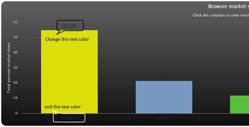
conf.setTitle("Browser market share, April, 2011");
conf.setSubTitle("Click the columns to view versions. Click again to view brands.");
conf.getLegend().setEnabled(false);
XAxis x = new XAxis();
x.setType(AxisType.CATEGORY);
conf.addxAxis(x);
YAxis y = new YAxis();
y.setTitle("Total percent market share");
conf.addyAxis(y);
PlotOptionsColumn column = new PlotOptionsColumn();
column.setCursor(Cursor.POINTER);
// ===== The piece of code supposed to change font color ====
Labels out = new Labels(true);
if (out.getStyle() == null) {
out.setStyle(new Style());
}
out.getStyle().setColor(SolidColor.RED);
out.getStyle().setFontSize("8pt");
column.setDataLabels(out);
// ===============================================================
column.getDataLabels().setFormatter("this.y +'%'");
conf.setPlotOptions(column);
Tooltip tooltip = new Tooltip();
tooltip.setHeaderFormat("{series.name}");
tooltip.setPointFormat("{point.name}: {point.y:.2f}% of total");
conf.setTooltip(tooltip);
DataSeries series = new DataSeries();
series.setName("Browser brands");
PlotOptionsColumn plotOptionsColumn = new PlotOptionsColumn();
plotOptionsColumn.setColorByPoint(true);
series.setPlotOptions(plotOptionsColumn);
DataSeriesItem item = new DataSeriesItem("MSIE", 55.11);
DataSeries drillSeries = new DataSeries("MSIE versions");
drillSeries.setId("MSIE");
String[] categories = new String[]
{ "MSIE 6.0", "MSIE 7.0",
"MSIE 8.0", "MSIE 9.0" };
Number[] ys = new Number[]
{ 10.85, 7.35, 33.06, 2.81 };
drillSeries.setData(categories, ys);
series.addItemWithDrilldown(item, drillSeries);
item = new DataSeriesItem("Firefox", 21.63);
drillSeries = new DataSeries("Firefox versions");
drillSeries.setId("Firefox");
categories = new String[] { "Firefox 2.0", "Firefox 3.0",
"Firefox 3.5", "Firefox 3.6", "Firefox 4.0" };
ys = new Number[] { 0.20, 0.83, 1.58, 13.12, 5.43 };
drillSeries.setData(categories, ys);
series.addItemWithDrilldown(item, drillSeries);
item = new DataSeriesItem("Chrome", 11.94);
drillSeries = new DataSeries("Chrome versions");
drillSeries.setId("Chrome");
categories = new String[] { "Chrome 5.0", "Chrome 6.0", "Chrome 7.0",
"Chrome 8.0", "Chrome 9.0", "Chrome 10.0", "Chrome 11.0",
"Chrome 12.0" };
ys = new Number[] { 0.12, 0.19, 0.12, 0.36, 0.32, 9.91, 0.50, 0.22 };
drillSeries.setData(categories, ys);
series.addItemWithDrilldown(item, drillSeries);
item = new DataSeriesItem("Safari", 7.15);
drillSeries = new DataSeries("Safari versions");
drillSeries.setId("Safari");
categories = new String[] { "Safari 5.0", "Safari 4.0",
"Safari Win 5.0", "Safari 4.1", "Safari/Maxthon", "Safari 3.1",
"Safari 4.1" };
ys = new Number[] { 4.55, 1.42, 0.23, 0.21, 0.20, 0.19, 0.14 };
drillSeries.setData(categories, ys);
series.addItemWithDrilldown(item, drillSeries);
item = new DataSeriesItem("Opera", 2.14);
drillSeries = new DataSeries("Opera versions");
drillSeries.setId("Opera");
categories = new String[] { "Opera 9.x", "Opera 10.x", "Opera 11.x" };
ys = new Number[] { 0.12, 0.37, 1.65 };
drillSeries.setData(categories, ys);
series.addItemWithDrilldown(item, drillSeries);
conf.addSeries(series);
return chart;
}
}
Any idea what’s gone wrong?
May CSS do the trick?