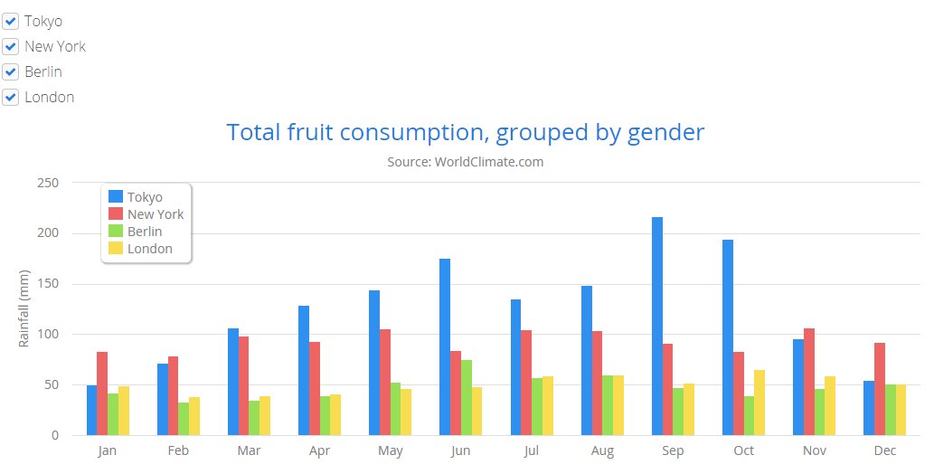
I am using the vaadin chart. In the chart I want to apply filter in XAxis. For an example the X axis is having value like Jan, Feb, all the month. If I select Jan means Jan will only display on XAxis and viceversa. How I can achive this. Please help. please find the attachment.
Thanks for quick update. But I want in different scenario. Like All the XAxis values will be in checkboxes. According to the checkbox selection the chart will behave. I saw the demo here:
http://demo.vaadin.com/charts/#ToggledSeriesVisibility .
But this chart is working on the values , lets say london. If I select or deselect the london bar will appear or dissappear. Similarilly I want for XAxis valus let say Jan means the jan portion will dissappear . So the chart will display from Feb to Dec. Again if I select means then jan should come.