DateField
The DateField component is for providing input of date
and time. The field comes in two styles: a default style with numeric
input fields and a calendar style that lets the user pick the date
from a month view. Also the default view provides such a view, but
behind a button.
The example below illustrates use of the
DateField with the default style. We set the
time of the DateField to current time with the
default constructor of the java.util.Date
class.
/* Create a DateField with the default style. */
DateField date = new DateField();

/* Set the date and time to present. */
date.setValue(new java.util.Date());
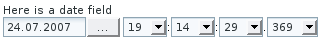
The default style provides date input using a text box for the date and combo boxes for the time, down to milliseconds. Pressing the "..." button right of the date opens a month view for selecting the date.
You probably will not need milliseconds in most applications, and
might not even need the time, but just the date. The visibility of
the input components is controlled by resolution
of the field which can be set with
setResolution() method. The method takes as
its parameters the lowest visible component, typically
RESOLUTION_DAY for just dates and
RESOLUTION_MIN for dates with time in hours
and minutes. Please see the API Reference for full list of resolution parameters.
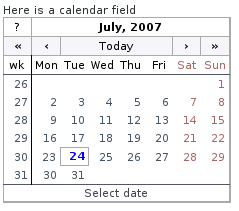
The calendar style of the
DateField provides a date picker component
with a month view, just like the one in the default style that opens
by clicking the "..." button. User can navigate months and years by
clicking the appropriate arrows.
/* Create a DateField with the calendar style. */
DateField date = new DateField("Here is a calendar field");
date.setStyle("calendar");

/* Set the date and time to present. */
date.setValue(new java.util.Date());

main.addComponent(date);