Creating a Custom Widget
Creating a new Vaadin component usually begins from making a client-side widget, which is later integrated with a server-side counterpart to enable server-side development. In addition, you can also choose to make pure client-side widgets, a possibility which we also describe later in this section.
A Basic Widget
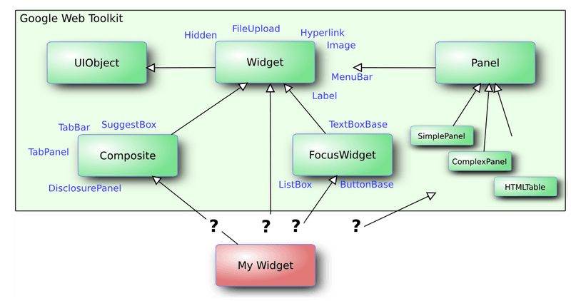
All widgets extend the Widget class or some of its subclasses. You can extend any core GWT or supplementary Vaadin widgets. Perhaps typically, an abstraction such as Composite. The basic GWT widget component hierarchy is illustrated in GWT widget base class hierarchy. Please see the GWT API documentation for a complete description of the widget classes.

For example, we could extend the Label widget to display some custom text.
package com.example.myapp.client;

import com.google.gwt.user.client.ui.Label;

public class MyWidget extends Label {
    public static final String CLASSNAME = "mywidget";

    public MyWidget() {
        setStyleName(CLASSNAME);
        setText("This is MyWidget");
    }
}
The above example is largely what the Eclipse plugin generates as a widget stub. It is a good practice to set a distinctive style class for the widget, to allow styling it with CSS.
The client-side source code must be contained in a client package under the package of the descriptor file, which is covered later.
Using the Widget
You can use a custom widget just like you would use any widget, possibly integrating it with a server-side component, or in pure client-side modules such as the following:
public class MyEntryPoint implements EntryPoint {
    @Override
    public void onModuleLoad() {
        // Use the custom widget
        final MyWidget mywidget = new MyWidget();
        RootPanel.get().add(mywidget);
    }
}