Figma Libraries
A list of official Vaadin Figma libraries.
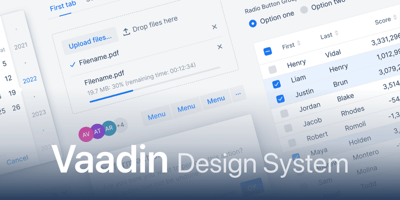
Designers can create pixel-perfect UI designs and prototypes, that are easy for developers to implement, using the popular design tool Figma and the official Vaadin Figma libraries. The components in the libraries use the default Lumo styling, and you can adapt them to suit your branding and vision.
Figma Community
You can follow Vaadin in the Figma community as well as duplicate, like, and comment the libraries.
How to Use
If you are unfamiliar with Figma libraries, you can start by reading Figma’s official guide to libraries.
B8E8C699-91A9-44CE-BCDB-C200DE5DEB6B


